
We’re republishing some of our favorite stories from the year that best encapsulate 2020. Happy reading!
Sometimes the design scene can feel like a Eurocentric monolith. Does every app need to look as if it were designed by someone in the Bay Area? Or can it reflect the location in which it was built and the people it’s meant to serve? Does design education need to rely so heavily on the Bauhaus model, or can there be regionalized models of visual inquiry? And when we design, why do our cultural backgrounds and identities end up being merely in the “background” of our work, never intrinsic to it?
Westernized pedagogy and practices prevail in the design industry all over the world, but they are not the only models to look towards. I’ve been interested in following the makers and thinkers whose practices speak to possibilities outside of a Eurocentric mode of designing and instead shifts in between global and regional cultural context. The work I’ve found affirms that design isn’t only good for furthering corporate competition and success, but also for telling our own personal narratives, rich histories, and dynamic geo-local realities. These practices also tell a different narrative of design, one that allows for rich collaborations and cultural nuance, that incorporates local visual culture and values at the core of a process rather than a surface treatment, and that shows design’s utility outside of and beyond industry.
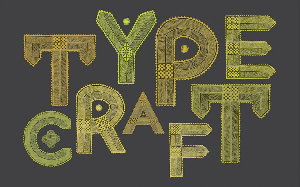
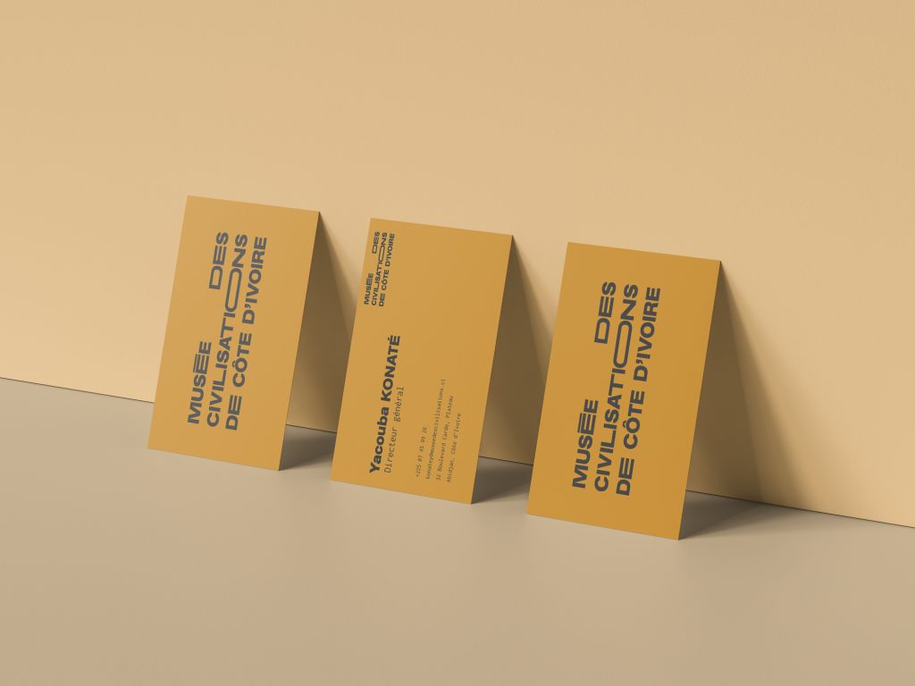
I sat down with three such designers—Kresna Dwitomo of Bandung, Indonesia-based design and creative strategy studio Projek Agni; Ivorian artist and designer O’Plerou Grebet; and the New Delhi-based designer, researcher, and visual artist Ishan Khosla of Ishan Khosla Design LLP and The Typecraft Initiative—to talk about how they’re forming a practice that is enspirited, locally engaged, yet still in dialogue with the broader design world.
Why did you choose to be a graphic designer? And do you feel that the role of a graphic designer in your respective countries differs from the general notion of graphic designer?
Khosla: I briefly lost my eyesight when I was studying computer science in my undergrad, I was legally blind for two weeks, and after surgery I didn’t have the disposition to do computer science anymore. I recovered most of my vision in one eye, and I decided that I would like to work in a visual field. Since graphic design has visual and linguistic components embedded into it, I found the medium to be multifaceted and appealing in that I was able to create powerful messaging. Perhaps growing up in a home where advertising was discussed and practiced had some effect: My mother, a creative director of Ogilvy Benson & Mather (now Ogilvy) would often bring work home and share it with us.
“Graphic design is a medium that needs to be put to use to understand, engage with, interpret, and shape local cultures and society.”
Both in terms of pedagogy and in practice, the role of graphic design in India is very commercial. It is a medium to promote something, and isn’t a means in itself. There aren’t any national forums like AIGA that emphasize critical thinking and self-reflection on what Indian graphic design is or should be. Communication designers are still largely influenced by western design trends. This could be due to India’s heavy colonial hangup and the weight of Modernism and the Bauhaus, which have left a deep impression into the nation’s psyche in terms of design pedagogy and practice. However, with a new generation of designers, this is changing.
I believe communication design is a powerful medium; it’s not only enabled us humans to evolve and grow, it is a part of our DNA as social animals. While the commercial aspects of graphic design are inevitable, I truly believe that it’s a medium that needs to be put to use to understand, engage with, interpret, and shape local cultures and society.
Grebet: I used to love drawing as a child and after high school I wanted to get a creative job. Graphic design was a good mix of skill sets where I could draw, create, and visually solve problems. In Ivory Coast, most of the designers work for ad agencies. Not a lot of designers get to work on personal projects the way I do. That kind of work doesn’t always get encouraged.
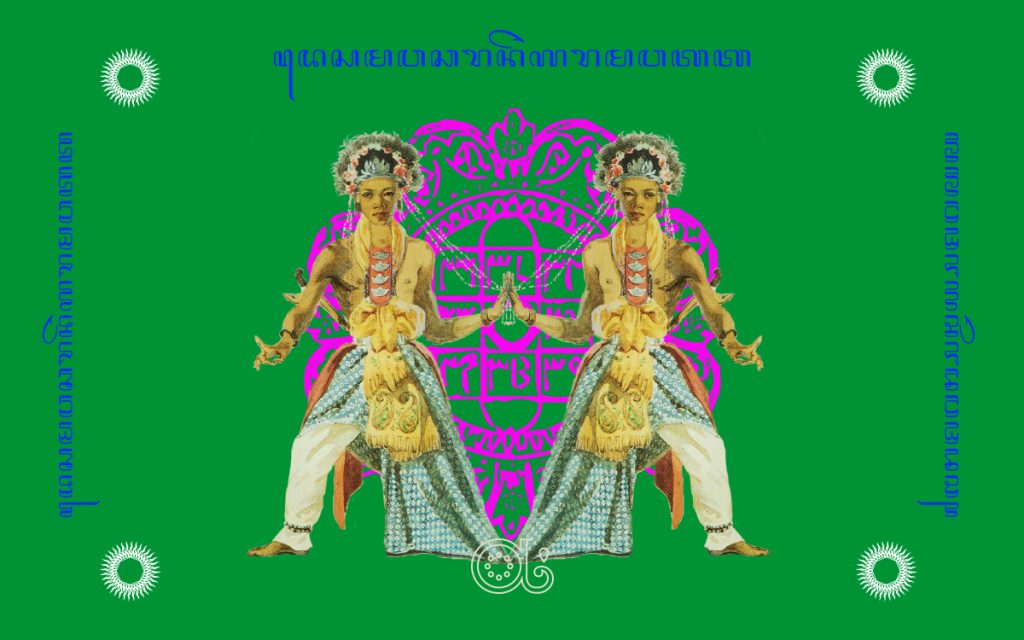
Dwitomo: Indonesia had waves of colonization: The European, the Arab, the Indian, and the Chinese. The visual culture is very rich. Early graphic design in Indonesia was from Dutch commercial influence, then it was war propaganda by different Indonesian regimes. Graphic design for me is somewhere in between storytelling and visual arts. I also loved the rebellious and chaotic nature of it, such as the broad spectrum of underground vernacular approach or sacred values. Sometimes it’s also very weird and quirky, but full of richness and care—and of course, there are also the usual commercial agency-pipeline projects.
All of you engage in cultural nuance as well as contemporary design discourse in your work. You also have practices outside the usual “agency model.” How did that come to be, and was it a conscious choice from the get go?
Khosla: During 2004 and 2005 I was doing my Master’s degree in the U.S., and I was questioning what Indian graphic design is. Not just aesthetically, but also from a conceptual basis. Like how Kenya Hara talks about principles of Japanese aesthetics such as Wabi Sabi and Kintsugi, which have an intrinsic link to Shinto and Buddhist philosophies at their core. I was trying to challenge how India looked at itself, not to make everything look like it was from Bollywood’s eyes. Because I was interested in Indian culture, there had to be a balance between commercial projects that paid the bills and culturally nuanced projects. I also decided to heavily travel across India and document and photograph what I was seeing. Over time, some of these documentations started turning into projects.
Also, to answer why I’m interested in merging cultural nuance with contemporary design—there are hardly any opportunities to do that. Design education in India is a Western import; it’s Swiss and Bauhaus schools of thinking. They talk about less is more, but that’s not always part of Indian visual thinking—maybe it’s more is more, or more with less, what we call jugaad, a way of improvisational making that comes from a lack of material and infrastructure. To sum it up, I try to figure out how I can use design to interact with the real people of India, and how they think about design and visuals.
Grebet: Ivory Coast is deeply impacted by Western culture in general; our own traditional culture is less present. I notice that most of the young people aren’t really aware of the cultural wealth that Africa holds. It’s like we are constantly trying to be like the West, not usually observing the richness of thinking and visuals around us. I want to use design to remind ourselves that we could be more than just copies of the West. I also want to show the rest of the world that Africa is more than hunger and wars. Most mainstream media only focuses on the bad side of Africa, contributing to the stereotypes about the continent, but I want to show what I see everyday and promote our traditional and contemporary cultures to show a different side of the story.
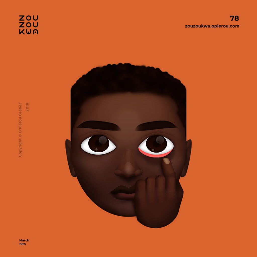
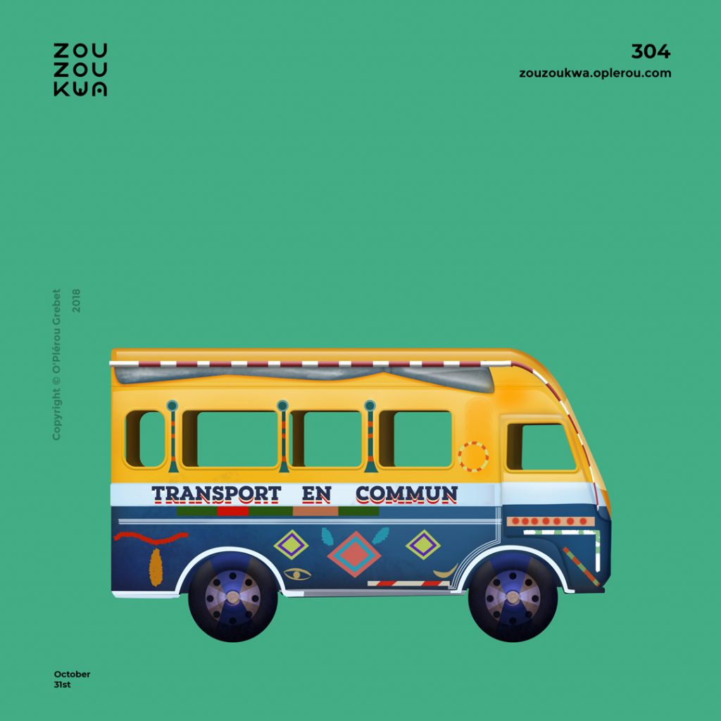
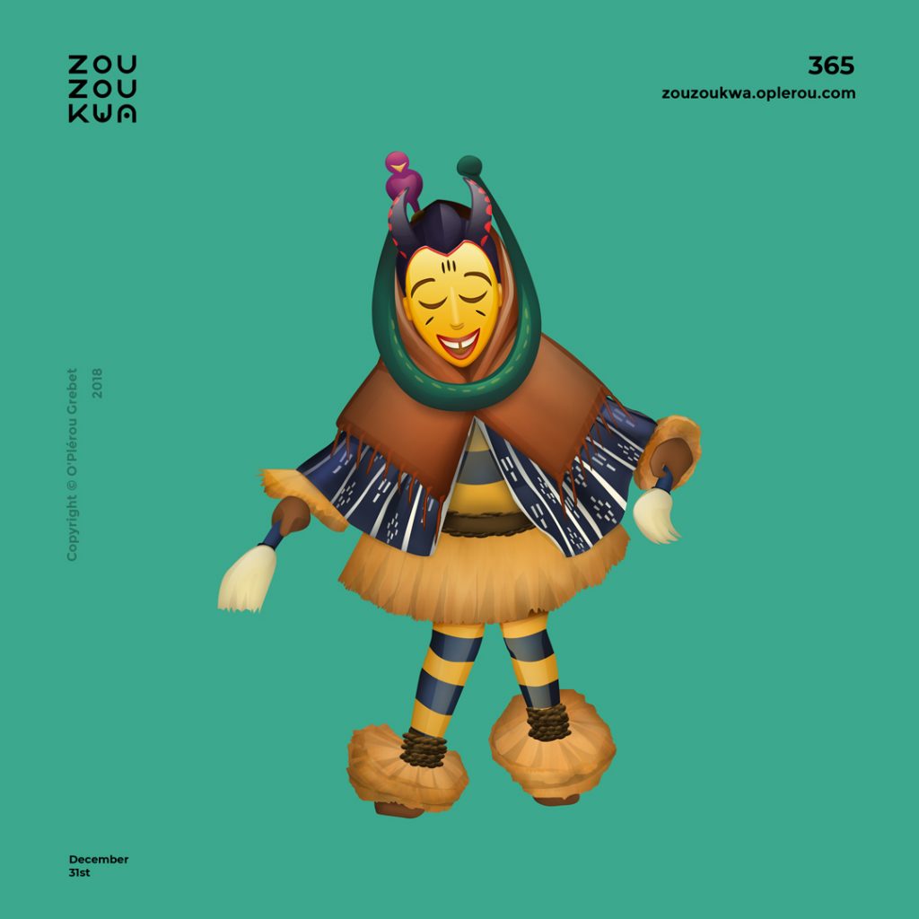
The project I get asked about the most is the emoji project that I started in an effort to represent African cultural elements in a modern way. The very first emoji I designed was the Zaouli mask. Zaouli is a mask and a dance that the Gouro people of Ivory Coast used to commemorate harvest and other ceremonies. I get to work with culture, technology, and design through my work.
Dwitomo: All three of us either come from a commonwealth country or a previously colonized country. For Indonesia, there is a history of 400 years of colonization, so we tend to see everything from an Orientalist lens. These Western impositions usually tell us what to value and how to behave; it can dampen our vision. So our job is to tap into that. A lot of local visual richness and creative expression lies within the folk culture. Lately in Indonesia there is a sense of re-awakening, an awareness of nostalgia but also inquiry towards the vision for the future. There are influences from Islam but also syncretism of more animistic and folk rituals. One of the approaches is to take the order and structure of a Westernized gaze and try to blend it with the elements of current cultural contexts, with high research and honest narrative concepts.
“A lot of local visual richness and creative expression lies within the folk culture.”
You engage with your respective socio-geographic aesthetics in a wholesome enspirited way. It’s not just used as a USP— you actually work with small businesses and artisans in your region. How do you incorporate these aesthetics and regional ways of thinking as the core values of your practice?
Grebet: To me, it’s really simple: I am literally observing and reproducing what I see in a slightly stylized way. It’s like a visual translation, to stay close to the truth. For example, many think of Africa and think “starvation,” but I think of a variety of urban and rural food dishes. Rather than focusing on what is thought about Ivory Coast or Africa, I just start by what’s really around me.
Dwitomo: In the Global South, the vernacular way of thinking is very important. It’s spontaneous, it isn’t always “form follows function.” Historically, we have the first sacred-built structure in the 8th century, then the colonial era of Walter Spies and Rudolf Bonnet, then the advent of the digital, which brings visual chaos and mixture of all kinds. At Projek Agni, our overall workflow is rooted in the local concept of Tridaya: Cipta (visioning, researching, planning), Rasa (exploration, trial and error, consultation) and Karsa (manifestation, production, evaluation). It differs in the sense that not every expression or creative outcome is logical and calculated, it emerges from a deeper feeling.
Khosla: Design is not only a means to represent culture, the way we do when we design annual reports for NGOs, but how do you actually use it to decipher, to articulate, and even influence culture?
I think the key to avoiding a sort of cultural pastiche is through building a meaningful relationship with the culture you represent and the people one interacts with. In this sense, design sometimes also starts to become anthropological. Design is humanist at its core, so there must be an interest and compassion in the people one designs for or with. From the industrial revolution onwards, design started to be more in service of industry, but actually the history of design is very socialist in its essence. Not socialism with a capital S, but something in service of the larger society. True collaboration always holds some risk, and it may not always look aesthetically pleasing to a Western eye. But then we wonder what standards are we holding “good design” to?
“Design is humanist at its core, so there must be an interest and compassion in the people one designs for or with.”
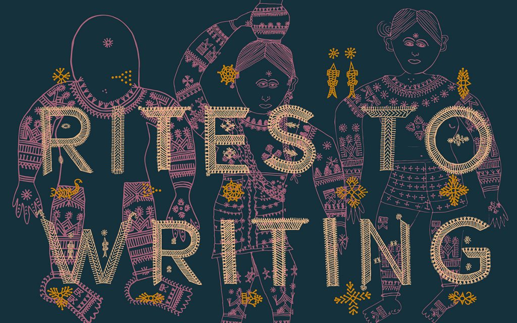
Formally speaking, it comes down to the manifestation of a concept: is it a font, or is it something else? I am currently designing a typeface inspired by an Indian craft with botanical forms, but there are visual parallels you can draw with ornate forms of the Art Nouveau, even though this craft might predate Art Nouveau. Forms can unfold strange connections that people from various cultures can understand. For me, the core value of my practice is to invest the time to deeply understand niche aspects of a particular craft culture, and then use my design sensibility, but also work with craft people and/or other collaborators, to create something that is authentic, hearty, and of value to that community too.

How do you understand the role of collaboration? I feel in your own work it differs quite a bit from the general notion of a collaborative process. You are collaborating with non-English speakers and craftsmen who don’t necessarily work together with graphic designers.
Dwitomo: In 2019, I joined a project called IKKON set up by the Indonesian Agency for the Creative Economy (BEKRAF), which encourages collaborations of 12 creative disciplines with the craftsmen and artisans of the respective regions of Indonesia. The intention was empowerment through creative collaboration. Designers worked and lived with the artisans and craftsmen for months. The artisans are farm laborers during the day and only after sunset practice crafts.
Usually the market-driven impulse is to just copy whatever is trending. The challenge for the designer who collaborates with a craftsman is to come up with a local business model that is economically sustainable and designs that are locally rooted. The essence of collaboration comes from the sharing of knowledge from both ways.
Like most bureaucratic endeavors, the project ends up shutting down as soon as the government shifts after five years, but our hope is to continue these revolutionary ideas where local skills and knowledge are valued.

Khosla: Collaboration is key in making something that is complex, nuanced and relevant for the stakeholders. The stakeholders can be a craftsperson or a corporate client. Collaboration leads to meaningful and participatory ownership of a design process—it’s democratic. Sometimes that process leads to imperfect, messy results because there is such a complexity in the types of people, languages, and religions in places such as India, Ivory Coast, or Indonesia.
Graphic design itself started as a craft-based profession, with punch cutters, letterpresses, binderies, and foundries. Subconsciously, combining type and craft has always been a part of graphic design history. The people I collaborate with are embroiderers, tribal tattoo artists, type developers, or coders whose skills and abilities enrich the design process. Collaboration allows me to do work I couldn’t have done on my own.
Dwitomo: I am curious how you conduct a collaboration process with someone who is a non-English speaker. There is a challenge to always be organic in your approach and not get too heavy, or theoretical, you know?
Khosla: I started working with craftspeople in 2011 when I was designing an identity for Sangam: the Australia India Design Platform. This was an event to promote more connections between craftspeople and designers. I decided to create the identity with a rural craftswoman instead of just working on it in our studio in the city. This was, to my knowledge, never done until then. At that time, my process of working was very top-down. Since then, and via The Typecraft Initiative, our process of working with craftspeople is more egalitarian and organic.
Instead of asking a craftsperson to start implementing our designs based on their craft, we work together on a ‘craft-design methodology workshop’ where we learn about their craft and its significance and context to their community while we inspire them to learn design-thinking skills by making with simple building blocks that allow them to make mistakes and remake quickly. Since some craftswomen working in embroidery can’t draw, we have come up with various systems to enable them to manipulate forms through paper-based kits based on their own craft. The craftspeople, instead of being treated as mere implementers, now are respected as authors, partners, and collaborators in the creative process.
What is unique about working with a second language that isn’t a Latin-based script? How does the process of bilingualism enrich a design project?
Khosla: Sadly, in India there’s not a lot of bi-scriptural or bilingual graphic design projects, but we have done a few over the years. This goes back to the colonial aspect of how different demographics of people were segregated based on the language they spoke. Even now, if you know English, you’re considered more educated versus if you know a regional language. This is most apparent in advertising and packaging—the ones for the urban market are mainly in English, and rural ones are in a regional script, seldom bilingual.
Because of regional variety in scripts, sometimes we design in three scripts, including the Latin script. It’s challenging to typeset Latin with Devanagari because Devanagari has features like diacritics and conjuncts, so it’s tough to work with in smaller sizes. Also, until recently, most keyboard softwares didn’t even have the full Devanagari character set, which meant that everything needed to be done manually. This added greatly to the time needed to finish a project. Clients usually don’t compensate for this additional effort.
However, Indic scripts have a lot more curves compared to the Latin script, which makes the former more fun to work with as their complex curvilinear forms are more expressive and bold, which makes them great for larger formats such as posters.
Dwitomo: Language in Indonesia is a very enriching prospect. We have more than 600 languages and sub-languages in Indonesia, 1000 tribes and sub-tribes. The Indonesian script is called Aksara, it means the same in India. As a designer, my endeavor is to convince the client to let us use the Aksara with pride and embrace its little details and nuances. If the brand owner is Javanese or from Borneo I would want to use its respective local script in constructing the brand identity. Most of the Indonesian scripts are born from the Tamil script of South India. In the two years that I’ve had my own studio, I try to reintroduce these Aksara to my clients because it directly represents the typographic culture and history of the region.
Grebet: A lot of times, people tend to forget that not all cultures pass down information textually; historically, there is more of an oral tradition in Ivory Coast. So to me, the principle of writing came here with colonization and it isn’t really that tied to our sense of identity. We have more than 60 languages between different regions, but we use French as the common tool of communication. I personally speak Beté at home. Script is not an important element in my work; it’s just a tool to be understood. The important part is in the symbols and visuals.
“People tend to forget that not all cultures pass down information textually.”
How do you find clients who let you stay true to your socio-geographic ethos and identity?
Dwitomo: A lot of that comes when we remind our clients to recognize and cherish the value of the visual language and ways of making and seeing that surrounds them. There is this rich visual vocabulary that is present—let’s celebrate and use it together, instead of doing the same old visual treatments. Your brand or your project will be that much more original.
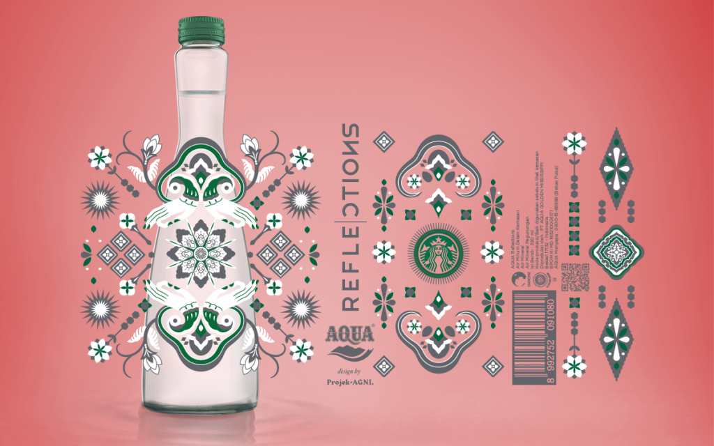
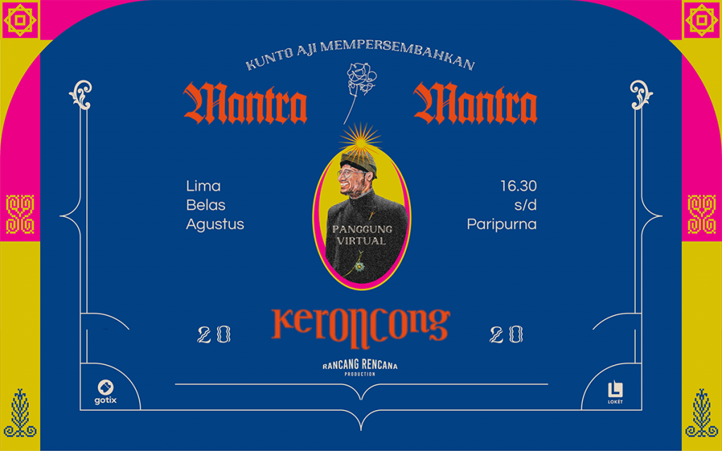
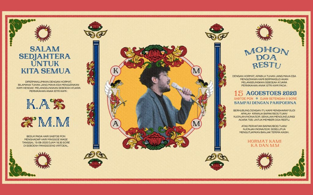
We have this client who is a local musician in Indonesia, Kunto Aji, and they wanted to do a virtual concert series during the pandemic. The music is also popular in Suriname; it’s called Keroncong. We collaborated with them to give their promotion materials a vernacular feeling, forms that belong to their own culture. When other partners then want to collaborate with Projek Agni, the process gets more curated organically.
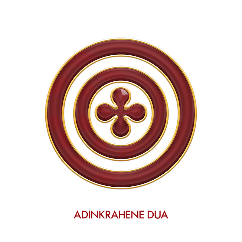
Grebet: Clients like that reach out to me on Instagram. I recently worked on this jewelry collection based on ancient Adinkra symbols by Afle Bijoux, a German-Ghanian designer whose work is deeply rooted in the Akan culture. Clients who let you promote cultural values gravitate to you because there is a similarity of vision.


Khosla: Ironically, most of the clients who approach us for our deep interest in the various niche aspects of our socio-cultural and geographical ethos tend to be from outside of India. Most international clients give us the freedom to express our own ideas and allow us to create work we can be proud of. For instance, we were approached by a Japanese client to develop an identity for the craft-rich district of Kutch for an exhibition of handmade crafts in Osaka, Japan.
Convincing clients who have a certain fixed mindset is difficult, so we either drop those projects, or if they are well-paying projects, we treat it as “commercial work.” This then enables us to do our own self-initiated work where we can delve deeply and fully express ourselves by working with various aspects of our own culture.

What is something you wish you could change about graphic design as a field?
Grebet: Sometimes I feel like there is a pattern or a model of what design works, and everyone on Behance or Dribble is trying to fit into that. Design really doesn’t have to be so singular. We can have different styles and still be useful and beautiful.
Khosla: I agree, design sometimes lacks freshness. But what bothers me more about it is two things: How today we as designers are so enmeshed in the capitalist economy. The origins of design are socialist—again, not socialism with a capital S, but social in nature. Today, design has become relegated to wasteful practices such as creating visual identities for thousands of bottled water brands using plastic that ends up in landfills. Graphic design here becomes part of the problem—and it has become not only wasteful, but also superfluous and impotent. Design in this sense is not used to solve a problem, but instead to compound it. Good design should not end up in a landfill.
“The complexity, rawness, and reality of this world are overlooked for elegant solutions.”
Secondly, design tends to be showcased in a slick manner. But the complexity, rawness, and reality of this world are overlooked for elegant solutions. Maybe it’s because there’s so much emphasis on winning awards and prizes that we forget to remain authentic. There’s too much gloss and eye candy. The real world can be a messy place, and that needs to be celebrated.
Dwitomo: I agree with the residency of over-polishing our work. But how long will these trends last? Our graphic design history in Indonesia is quite young, it’s still in its emergent phase. We struggle to make something look like it’s out of the Bauhaus, but there remains a huge untapped potential of visual ways of making. So whatever change may come, it will always be a work in progress for us.
How can graphic design be more receptive to non-European makers and thinkers? What advice would you give to design students who want to look beyond a Eurocentric design practice?
Khosla: Most design conferences, awards, and publications are in the West and the focus is predominantly on a Western perspective. There wasn’t a single Indian designer in AGI (Alliance Graphique International) until 2018. We need more inclusivity from the Global South in the design discourse. I point students who are curious for a non-European perspective to Japan, Korea, and Iran, all of which have a rich design tradition that is enmeshed into their own cultures while still being contemporary.
“We need more inclusivity from the Global South in the design discourse.”
I would also encourage students to look beyond the obvious notion of what the functionality in design—as defined by the post-industrialized West—could mean, and instead look at the meaning of utility in the Eastern context. In the East, utilitarianism is a more nuanced concept and is related to spiritual (personal), social (community), and natural (environmental) balance and harmony.
The kolam, a highly geometric floor design from Tamil Nadu is an example. Created by the woman of the house daily, outside her home, it is a performative ritual act that comes out of the belief of bringing auspiciousness to the home. Being made of rice paste, it also helps feed birds, squirrels, and insects. The mathematical nature of the Kolam are valued in Indian culture as being reflections of cosmic diagrams.
Dwitomo: At Projek Agni we worked on an essay called Neo-Indonesiana. It seeks to redefine the identity of Nusantara or the archipelago through a renewed cultural consciousness towards past forms and future vision to behold the new decade. Similar to Neo-Nihongo. We try to codify the multi-layered and visually complex narratives of Indonesian visual vocabulary. Sometimes it intersects with Western figures such as Walter Spies, who have significant cultural contribution, like inventing the dance form Kecak. It is transdisciplinary and includes various mediums from film to fashion—we want to show Indonesians and the world that we can move forward by keeping the traditional forms and values of the archipelago in mind and also by transcending that creativity in boundless ways.
Grebet: A lot of Western design thinking and communication is about rules, restrictions and structure, but if I look at Ivory Coastal aesthetics, it is often more about emotional principles and openness.
I immediately think of the Korhogo Cloth or Toile de Korhogo as an example. There are patterns like the borders of the clothes and the perspectives of the represented elements, but the craftsmen are free to draw like they want, and we see that they don’t use rulers or compasses to create perfection.
Design is tied to the ways people think, and there are many ways of thinking—none of them is the “right” one. To look beyond Eurocentric design practices, we can focus on these ways of thinking and start from them to see how they could be used in design.

