
After spending 11 years in Baltimore, Type Nite finally came to NYC for the very first time, giving a whole new crowd a reason to collectively fawn over font choices, this time at legendary downtown bookstore the Strand’s Rare Book Room. The evening’s theme was “Mess-ups and Do-overs” and the crowd eagerly awaited news of how the big guys fall down (and, perhaps more importantly, how they get back up again). The speakers didn’t disappoint: typeface designer Tobias Frere-Jones, Pentagram partner J. Abbott Miller, and Alfred A. Knopf art director and book cover designer Peter Mendelsund, in a panel discussion moderated by Ellen Lupton, the Cooper Hewitt’s senior curator of contemporary design and author of two new books, Graphic Design: The New Basics, 2nd Edition and How Posters Work, both out this summer.
The long narrow space quickly filled to standing-room only a full half hour before the speakers were to go on. On a typically steamy New York July day, the air conditioning struggled mightily to counter the heat thrown off by fervent type geeks and design fans old and young who crowded along both walls and crouched below shelves bearing first editions of William S. Burroughs’ Naked Lunch, one-of-a-kind portfolios of Japanese prints, and 10-volume sets of Jane Austen’s oevure. International students from the School of Visual Arts’s summer intensive residency program Type as Language were spotted hunkered down near the very front of the room. The din before the panelists went on was as loud as a bar at 5 p.m.; truly, this was typographic happy hour.


In her introduction, Lupton charmed the audience with quips like:
Typefaces are “the air we breathe, the water we drink, and the pot we smoke.”
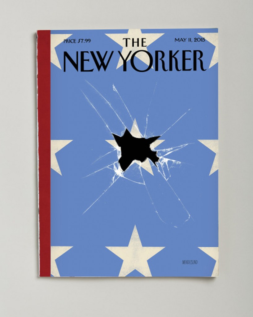
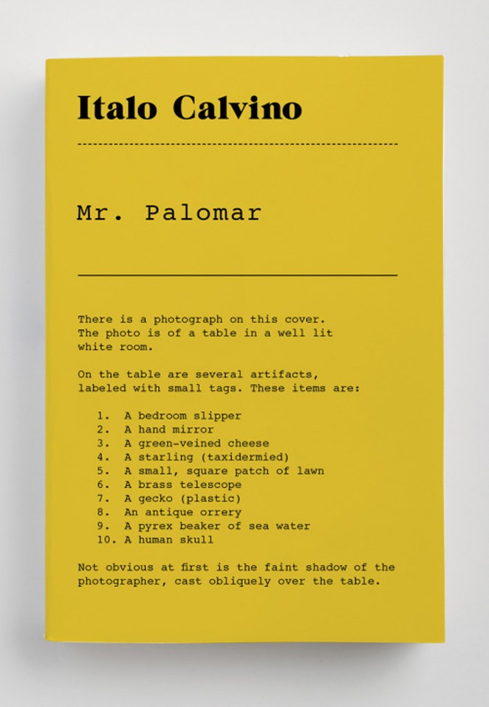
Mendelsund, up first, confessed to mess-ups including a recent cover for The New Yorker depicting a close up of an American flag with the stars arranged in neat rows, not staggered as they should be; a cover for James Joyce’s A Portrait of the Artist as a Young Man without the first “A” (but seriously folks, where were the editors on that one?); and his favorite idea ever, an all-type design for an Italo Calvino cover that got rejected because “it wouldn’t look good on Amazon,” and he didn’t fight back enough to prevail (below).
Later Mendelsund advised, “Don’t do Frankenwork—combining parts of one idea with parts of another. Just start over. Remember, to the client, we’re all a little downstairs: we come on bended knee to present our ideas and then bow gracefully out of the room. We need to pull our shit together and be a little more hard-nosed.”
Next up was Miller, whose five minutes covered the design of environmental type for Longwood Gardens in Wilmington, DE, a former DuPont family estate-turned-public-arboretum with plantings based on the gardens at Versailles. Design firm 2×4 created the graphic identity, and in 2013 Pentagram was charged with creating the outdoor signage and environmental graphics. Miller admitted that he got so carried away with research and inspirations ranging from early 20th-century lattice work desk accessories designed by Josef Hoffman to repeating mesh patterns and stenciled typefaces that before long he’d lost sight of the project’s ultimate goal.
“I fell in love with an idea that just didn’t work, and didn’t recognize it soon enough. We had 530 pages of undisciplined sketches born of excitement, and were completely lost—and the client knew it. At that point, we were forced to embrace the paradox of starting over. Fortunately we ended up with something much more suitable, based on storybook letterforms perched on rails that incorporate nicely into the plantings, inspired by the way the Hollywood sign in L.A. just sits in the landscape as an integral component.”
Closing out the visual presentations, Frere-Jones pointed out the value of making errors as long as you learn your lesson. As a student at RISD, his first attempt at a typeface based on Janson resulted in “a spindly, sickly looking thing,” because he was designing the characters at a very large size instead of the scale they’d be used in text. Lesson? The value of optical sizes.

He eventually turned the anaemic font into one of his earliest commercial typefaces, Hightower, which he completed in 1994 for AIGA’s former print publication, the Journal, and released by Font Bureau. He also showed examples of failed attempts to draw heavier and heavier weights of Reiner Script (“I could not control the shapes at all”), and a version of Cafeteria Italic that was “tripping over its own feet.” When asked how to develop a truly new and original typeface, he responded, “The real challenge is to work within the narrow scope of recognizable letters with cultural resonance and find something that’s not already out there. That’s the needle to thread.”
As the crowd spilled back out onto Broadway in the still-hot July twilight, a large gentleman in a sky-blue checked gingham shirt headed towards the subway, toting a heavy shopping bag stuffed with books. He said happily to another departing attendee, “He signed them all!” It turned out he had lugged all of his Peter Mendelsund-designed books in from Connecticut in hopes of having them inscribed. He continued on down the stairs to the 4 train to Grand Central, just another design fan trudging back home, loaded down with typographic treasure.

