
There’s a new trend report out from Monotype, the mother of all type foundries (they own Helvetica, for starters), that breaks down the current state of type design and makes a few predictions for how brands will use type in the future. The trends and challenges that lay ahead in 2020 and beyond won’t come as too much of a surprise—with one exception. More on that in a bit.
The report comes on the heels of Monotype’s inaugural Type Champions Award, a new program that highlights exceptional uses of typography and lifts them up above the logo-bashing fray in your Twitter feed and into a space for more thoughtful conversation. But before we share the winners, we need a bit of context for why these 12 brands were selected out of the 60+ nominations.
Let’s begin with some basics. One of the most important things an identity system can do is create a consistent experience for the consumer or the user. It’s hard enough for one brand to establish a clear visual language and speak it across the many platforms and applications that we exist on today, but as companies grow and acquire smaller brands and launch new products or services, their messaging can get really messy, really fast. Luckily, design can fix that. One of the oft-cited points from the recent McKinsey report is that design-led companies consistently outperform their competitors and show higher revenues and returns for their shareholders. And while the average consumer might not understand why certain logos are more memorable than others, or why some user experiences feel so seamless, they know it when they see it.
In addition to an ever-growing array of platforms and technologies that identity systems have to lasso together into one big, happy, cohesively branded family, companies have to speak clearly and consistently in hundreds of languages, too. As any type designer will tell you, translating a Western font into non-Latin languages is one of the biggest challenges they face today. As the Monotype report notes, brands also “need to create typographic harmony in situations where two different languages are shown alongside one another, which is quite common in countries such as Korea and China.” It may not be easy, but it’s a huge opportunity for ambitious type designers (especially those who are fluent in a non-Latin language or two) in a growing global economy.
One solution that addresses multi-platform systems head on is the rise of variable fonts, which Monotype predicts is going to increase dramatically in the next decade. (We tend to agree.) More than a trend, variable fonts offer designers a wider range and greater freedom when it comes to creating a consistent brand language and voice across print, digital, AR, VR, and of course, IRL. “In the past, designers might have been restricted to four or five fonts for a website, but variable fonts give them a much broader typographic palette, resulting in far greater control over a brand’s identity,” notes Monotype.
Another type trend that’s not going anywhere soon? Geometric sans serifs. They’re “relatively neutral” “workhorses” that play well with most branded elements (complex visuals, flashy display fonts, etc.) and, like any good typeface, they can do a lot of the talking for a brand. “It seems the geometric sans serif has become a kind of identity for the digital world, tech companies, startups and such,” type designer Gunnar Vilhjálmsson told Creative Review. For better or for worse, “by using the same style of typeface, companies immediately link themselves with this world, and all of its associated relevance and innovation.”
We’ve witnessed the backlash to this play out over the past few years, with friendly, chubby serifs coming to the fore to inject a little personality into products like yogurt and newsletters. And while we won’t be sad to see millennial minimalism go, we also don’t want to see it replaced by even more “sleek,” tech-y branding.
But if millennial minimalism grows up into a more evolved version of itself, we hope it’s not, as Monotype is predicting, a resurgence in scripty, flourish-y inline and engraving fonts. When done well, they are beautiful things to behold (and we would never deny beauty a place in design), but they can also get twee very, very easily. We understand that the pendulum swings from one extreme to the other, and while there will always be a place for ornamental, decorative type, we’re not sure we can stomach a return to the hand-lettered, mason-jar-and-mustache era of type design.
But if you go down the wrong path on your quest for the perfect logo system, don’t worry—you can always rebrand. In fact, brands should always be rebranding. We’re talking about micro adjustments and updates, not major overhauls. “For many, a total rebrand is too much of an undertaking to happen with any regularity, not to mention the threat of losing consumer trust or your sense of self,” says Monotype. “Instead, branding has had to adjust to a state of constant flux, which maintains a company’s identity but allows it to expand into new markets, or adapt to new technology or trends.”
Gone are the days when a major corporation could pay Paul Rand to design a single logotype that worked for the sides of buildings, atop letterheads, and in the lower-thirds of our TV screens, and that would go untouched and un-tinkered with for decades on end. While the constant pressure to keep up with times might, on the one hand, mean that logos simply don’t have enough time to acquire the significance and memorability that the logos of years past did, it also means that logos can now be more integrated into a brand’s identity than before. With more applications come more opportunities to constantly be improving upon an original identity system, tweaking it, and optimizing it along the way.
Of the 12 brands that did it best this year, roughly half used custom typefaces, and the other half used “out of the box” fonts. Across all the winners, the judges noted the expressiveness and flexibility of these typefaces, and how they deliver a clear and consistent brand personality over multiple touchpoints. We present the winners here in alphabetical order; you can read the full commentary and see more images on the Type Champions Awards page.
& Other Stories
“A brand image that reflects a world full of creative energy and possibility.”
Alibaba
“For for a passionate, powerful, and future-forward brand.”
Audi
“A flexible type system is at the heart of the Audi brand identity.”
Dropbox
“The right amount of expressiveness for every situation.”
The Guardian
“An eye-catching, purposeful, and type-driven visual identity.”
Juventus
“A universal symbol for perseverance, ambition, and premium Italian style.”
Mailchimp
“Consistent and grounded, yet playful and expressive.”
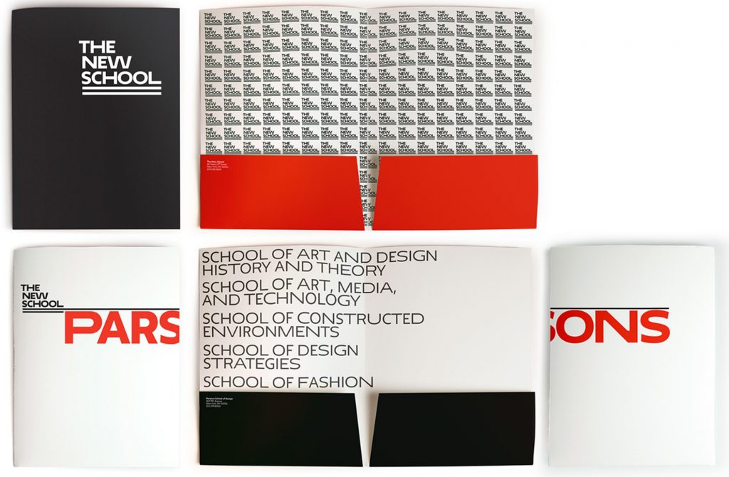
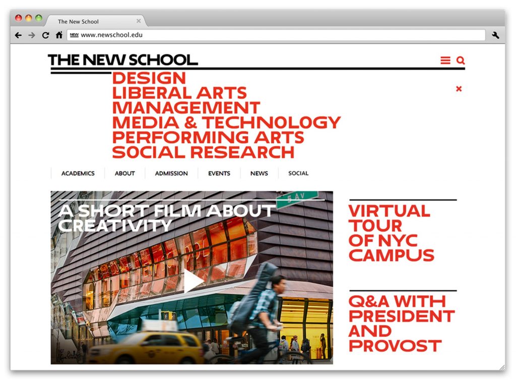
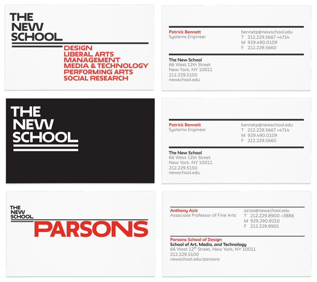
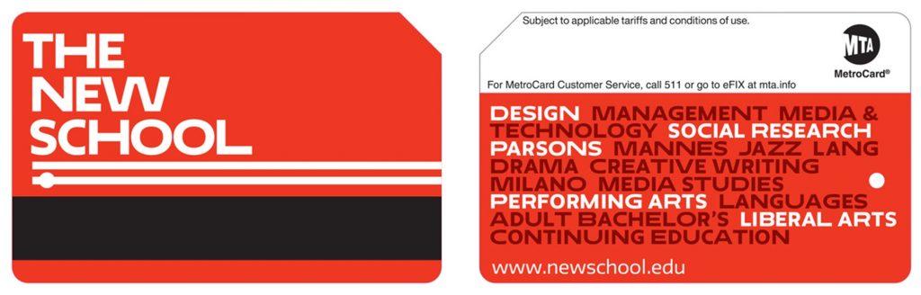
The New School
“An identity grounded in a technologically sophisticated typeface.”
The New York Times
“Expertly curated typography that unifies every touchpoint.”
Ogilvy
“A renewed emphasis on craft with type at the forefront.”
Southwest Airlines
“A contemporary brand persona, across the full customer experience.”
Squarespace
“Uniquely positioned to expand the value of type to millions of creator sites worldwide.”

