
You wouldn’t necessarily associate the typographic design process with dreaming, exploring, and walking, yet these are the daily routines that inform the letter shapes by London-based graphic designer Alice Donadoni.
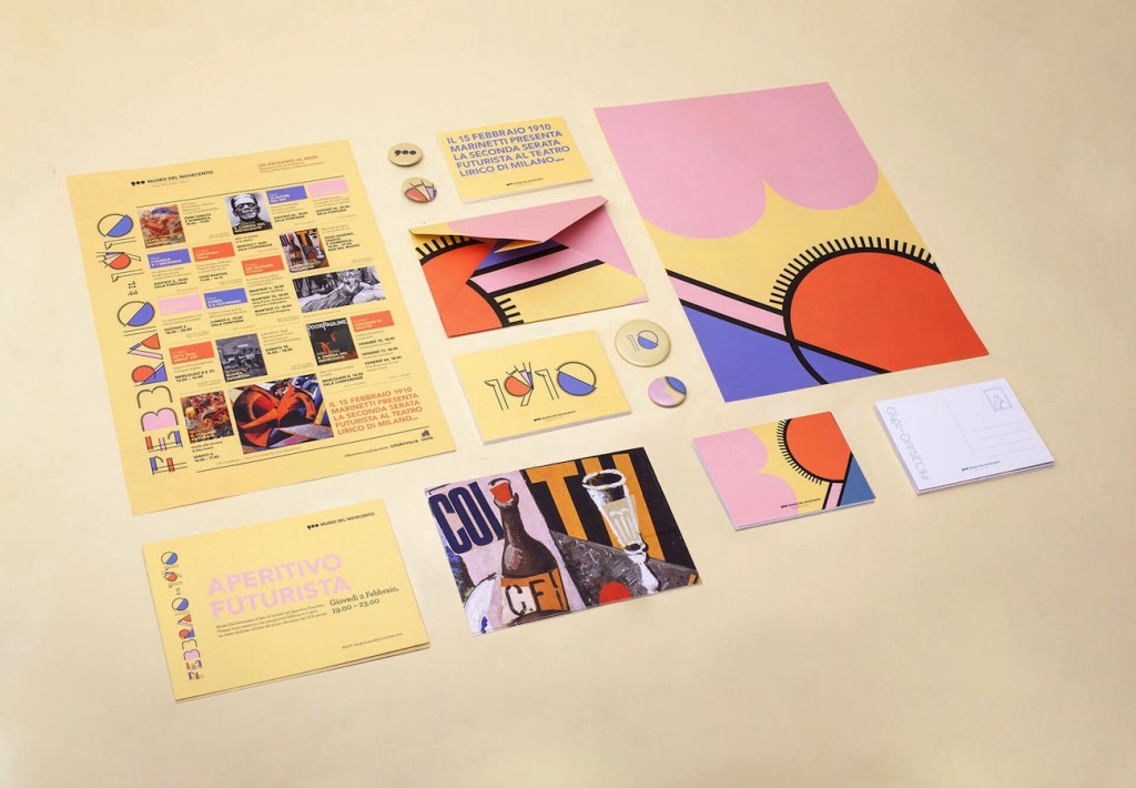
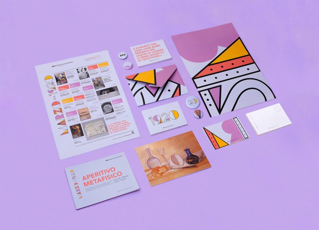
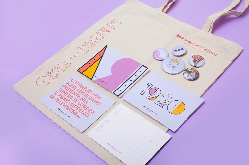
When approached to create the annual program for the Museo del Novecento in Milan, Donadoni began by wandering the halls of the art gallery, later deciding to smuggle her experience into the project. The brief asked Donadoni to match each month’s design to a different decade of the 20th century, so the young designer manipulated a single typeface to evoke the tone of each decade’s most significant artistic movement. “As I walked through the rooms, all the inspiration I needed was there,” Donadoni recalls. “I had to run to the gift shop to buy a notepad as I had forgotten mine at home.”
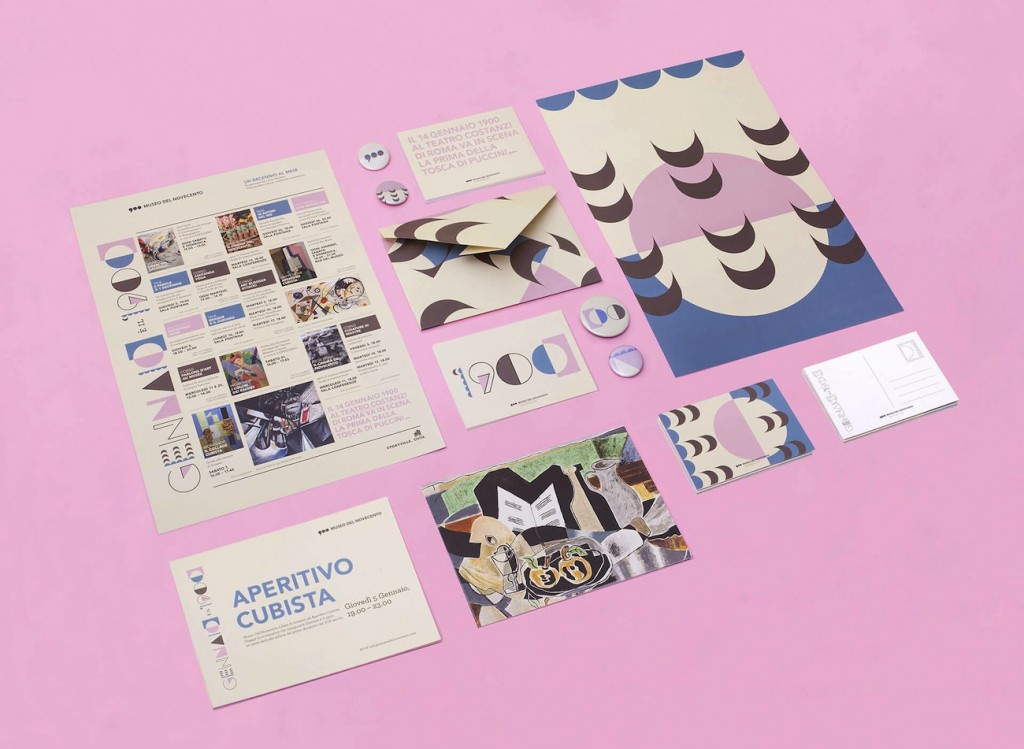
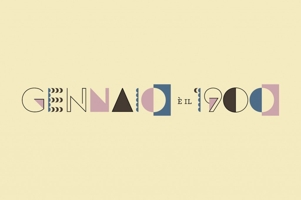
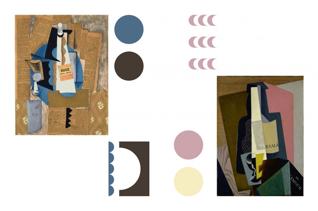
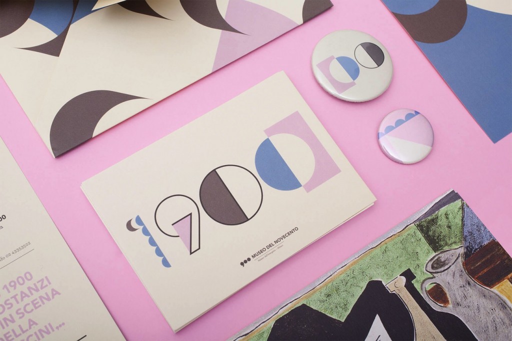


Scribbling notes on the use of typography, pattern, and printing technique in the displayed artworks, Donadoni mapped out the recurring elements of the different movements, which then became the basis of each identity. “I was particularly attracted to the shy elegance of the tones of the first decade,” Donadoni says, and you can see the palette, the multiple perspectives, and “half” shapes from works like Picasso’s La Bouteille de Bass, echoed in the choppy January design. Consider it a typographic time warp: in February you see the energetic lines of the 1910 Futurists, giving way to industrial bolts and Deco flourishes for the 1920s of March.
Since her project for the Museuo del Novecento, Donadoni always carries a notebook with her for ideas that spring to mind on the go. “Some of my notepads are very hard to read. I’ll be writing while walking, with an eye on the sidewalk to prevent me from tripping.” Recently though, Donadoni has been inspired by sleep, and the experience of becoming so obsessed by a project that it slips into your subconscious. “In the worst dreams, I’d end up adjusting the same design over and over; in the best ones, I’d be able to solve any problem with a CMD+Z,” Donadoni recalls.
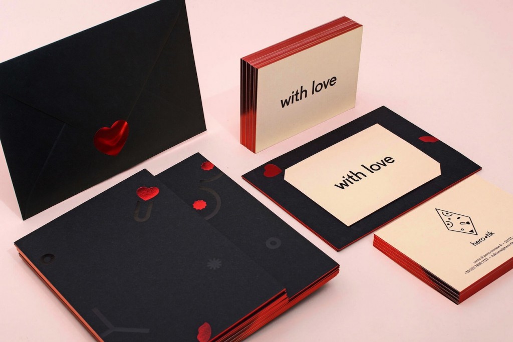
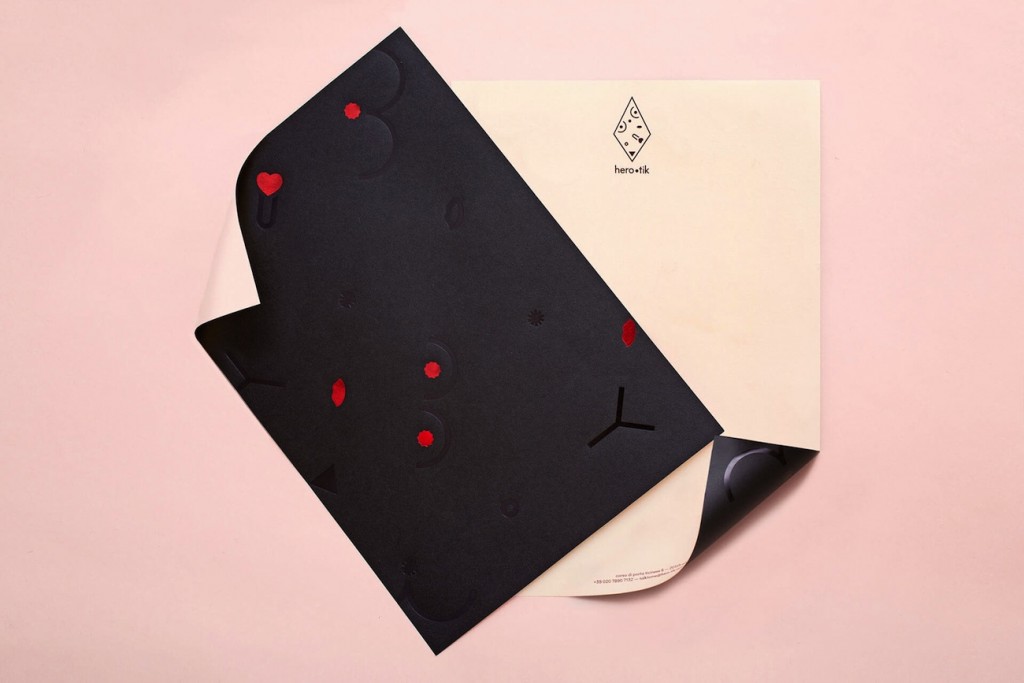
By switching the experience around so that her dreams influenced her design work instead, Donadoni create her CMD+REM typeface: it plays with InDesign strokes to create an ever-changing character system, an ephemeral set that never remains completely legible or sturdy, just like a dream. Donadoni also turned to her subconscious and intuition for her identity for an erotic gift shop called hero-tik, which uses a series of black and metallic symbols to subtly represent erogenous zones, and a nude background to evoke skin.
“I strongly believe that the immediate links the mind makes before getting influenced by somebody else’s knowledge or point of view can be very precious material for a designer,” explains Donadoni. Her elegant identities are connected to her personal responses and experiences with a brand or idea, and she uses design to carefully unpack the meaning behind her initial reactions.

