Name: F37 Bobby
Designer: Rick Banks
Foundry: Face37
Release Date: August, 2018
Back Story: “F37 Bobby is a reaction to all the geometric sans-serifs that are going around,” Rick Banks, who goes by the moniker Face37, explains. After noticing the ubiquity of such typefaces in logos and branding of late, the graphic design and typographer says that he wanted to make serifs great again. It was partly inspired by the success of the Chobani rebrand, though drawings of Bobby were already in place before that design hit shelves. “We need more character and personality in serif fonts,” says Banks. As such, Bobby was inspired by the “very warm and popular serifs” from the 1970s, like Windsor, Bookman, and Cooper Black.
Why’s it called F37 Bobby? Ready? Awwww. Bobby is named after Banks’ son, as this is the first font F37’s released since his birth around 15 months ago. Take a glance at his library and you’ll notice a trend: Bella is named after Banks’ wife Annabella; Ginger is a reference to the designer’s hair color. “I always try and find a personal touch,” says Banks. “It’s more memorable and unique than some clever play on ‘Helvetica Next.’” It should be noted that Banks is no relation to Swedish director Ingmar Bergman, after whom another of his fonts is named.

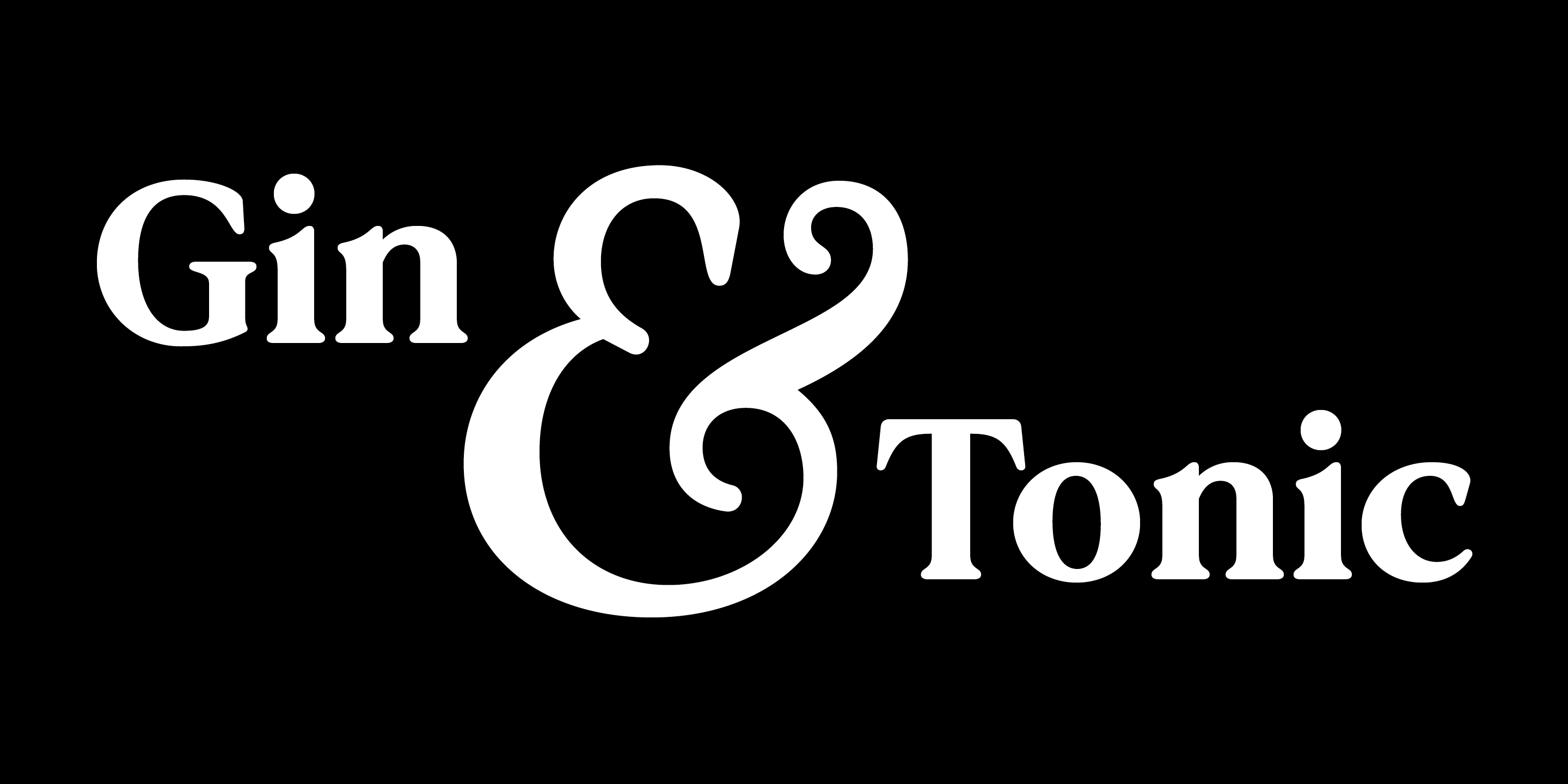
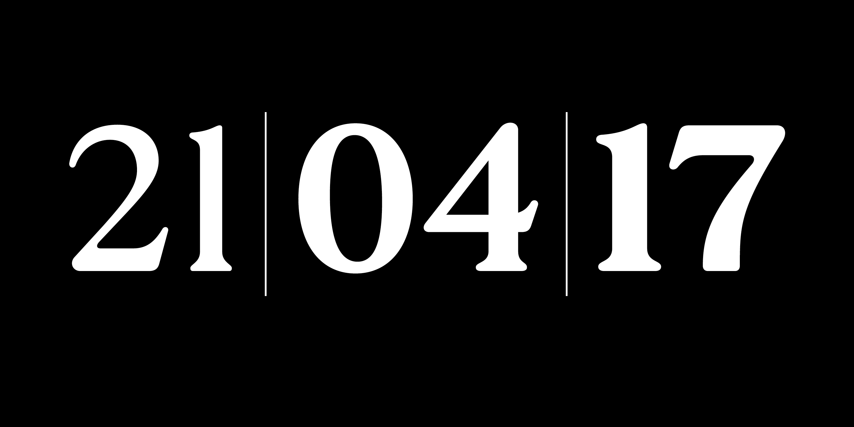
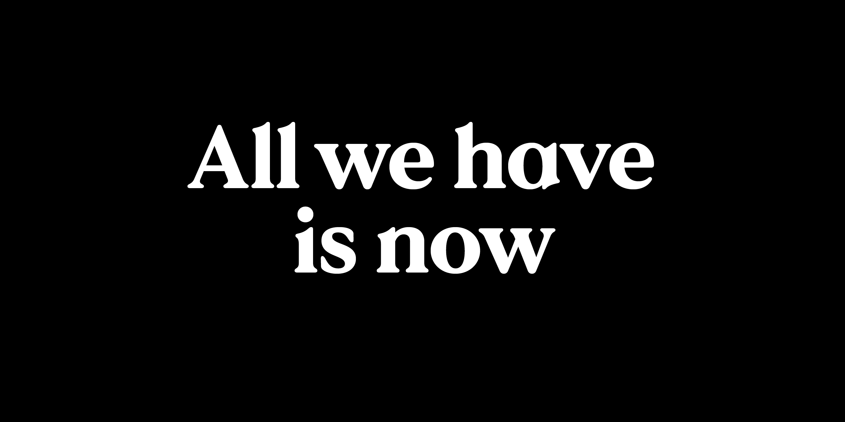
What are its distinguishing characteristics? F37 Bobby is a contemporary geometric serif. The family comes in six weights with matching true italics—a first for F37. “There was a lot of learning involved in making it with matching italics rather than just obliques,” says Banks. “Would I do it again? I don’t know. It took about double the amount of time. But it’s a good thing to have for the foundry.” The “a” stands out as a geometric character, while the entire typeface is noted for its soft terminals and soft serifs, designed to give it a bit of charm. Lovely ampersand, to boot.
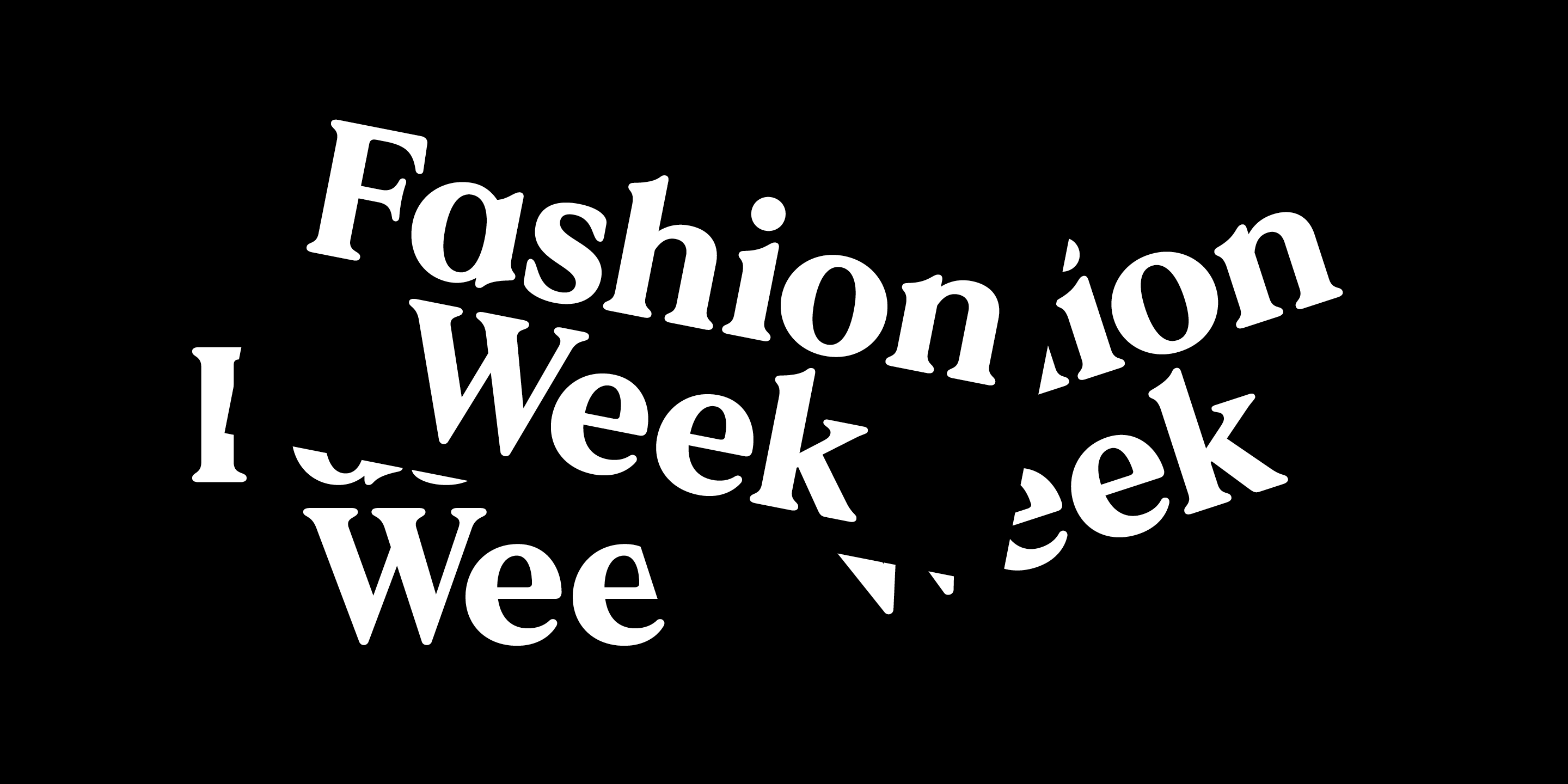
What should I use it for? This is a font with brands in mind: if you’re looking for a cool font that’ll work well for identity work, with a bit of standout, Bobby might be your boy. Banks reckons it’ll work well for luxury or fashion stuff, and that it’s a good headline typeface too.
What other typefaces do you like to pair it with? Certain characters, like the geometric “a,” mean that Bobby isn’t necessarily right for body copy, but it’ll pair nicely with serif fonts, and maybe a neutral Swiss sans.