
We’ve all been there before: you’re browsing through your favorite online store and a pop-up window appears with an alert reading, “Only three items left! Buy now!” We can’t know for sure if the shop’s inventory is actually running low, but if the message triggers a desire to purchase the item ASAP for fear of losing out, congratulations, you’re experiencing something known as the Scarcity Principle, a concept in social psychology and economics that means we place a greater value on objects we perceive to be in short supply or high demand. It’s one of the many behavioral responses marketers, advertisers, and user experience designers often exploit to increase revenue, and to those in the UX industry it’s called a dark pattern. So what does it take for a visually persuasive design to go over to the dark side, and become manipulative?
Katie Swindler (yes, she’s aware of the irony), the director of UX design at ad agency FCB Chicago, explains, “As with most moral issues, it’s impossible to draw a stark line between manipulation and persuasion; these two ideas exist along a continuum. But as a general rule, designs that are considered manipulative have a conscious component of trickery or deceit to them, or they leverage heightened emotion to get someone to be less likely to make a rational decision (Only 3 items left!)”
Swindler spoke recently at SXSW’s Interactive conference about manipulative design and how it’s found in everything from apps and websites to Las Vegas slot machines. In many cases the attempts at coercion seem either so basic or so obvious, it’s a wonder why we’re still so susceptible to them. So why do dark patterns continue to get the better of us, and should we hold people like the UX designers who create them accountable, or do we blame our own naiveté?
“The majority of dark patterns leverage common human behaviors against us,” Swindler continues. “Knowing that people don’t read long pages of legal text, designers might bury a critical opt-out checkbox at the bottom of legal terms and conditions. Knowing that people will abandon a process if it’s too difficult, they make it very easy to opt into a subscription (by tacking it onto the end of an online checkout process, for example), but make it very hard to cancel that subscription.
“Sometimes it’s just a subtle nudge in a direction that’s good for the business, but terrible for the user, like pre-checking “Pay minimum amount due” on a credit card online bill pay form. We know from studies on pre-checked forms that even a nudge that subtle can have a huge effect on a user’s behavior. It could have a large impact on the number of people who pay their full balance that month vs. paying only the minimum and racking up tons of interest debt.”
In 2010, Harry Brignull, a London-based UX designer with a PhD in cognitive science, created Dark Patterns, an online archive that document examples of manipulative design. These aren’t just poorly designed websites, they’re deliberate UX strategies that are “carefully crafted with a solid understanding of human psychology, and they do not have the user’s interests in mind.”
One common practice Brignull cites is how UX designers rely on cognitive biases for consumers to construct their own “subjective social realities.” Take Price Anchoring, which occurs when we perceive one item to be a bargain when placed next to an item with an inflated price, even if the former is still marked higher than its actual value. Dark patterns that exploit our cognitive biases can manifest as disguised ads, misdirection, bait and switch, or so-called roach motels.
“I think when most people encounter these kinds of patterns, they tend to blame themselves,” says Brignull. “I wanted to create a website to show the world what’s essentially an industry secret, and not only inform people, but discourage companies from doing it. I thought if there was a public platform where they would be shamed then maybe it would stop it from happening so often.”
Swindler and her colleague Dennis Ellis have also made it part of their work to educate the public about dark patterns, and to lobby against their use from an economic perspective. “Making a business case against manipulative design (and for delightful customer experiences) is actually a conversation we have often with our teams and our clients. We can’t just point to a manipulative design and make a moral argument against it, we have to make an argument that it’s bad for business.”
And business is definitely bad when your company gets caught using a dark pattern. Last year, LinkedIn agreed to pay a $13 million dollar settlement for spamming its users with too many Add-Connection emails without their consent. Brignull, however, doesn’t think the penalty was high enough to do any lasting damage given the size of the company. “You could look at that as a victory for the whole dark patterns initiative, or you could look at it and say, ‘you know what they’ve proved that if your business is willing to accept a tarnished reputation, than it’s an economic viable thing to do.”
While dark patterns exist primarily on the web, manipulation can enter all forms of design. Swindler’s favorite examples of deceptive design in packaging relate to any brand that uses, “forest imagery or plants, and proclaim in large text, “‘100% All Natural!’ with a clear implication that the product is good for the user and/or the environment.”
In 2009, PepsiCo was forced to remove, “all natural” from its Naked Juice labels because some of the ingredients weren’t verified as non-GMO, violating California’s false advertising laws. More recently, the company was accused of bait-and-switch marketing tactics in a lawsuit filed by consumer advocacy group the Center for Science in the Public Interest, which alleges that the company knew consumers would pay more for their products by emphasizing nutrient-rich superfoods in the label designs of its Kale Blazer and Green Machine, when in reality the drinks are mostly comprised of apple and orange juice.

PepsiCo’s brand manager for Naked Juice, Andrea Theodore, even said in an interview that their target audience—“Dynamic Doers” with active lifestyles—“believe that foods and beverages are part of what is going to help them live long and vibrantly. Because of that, they’re willing to spend more. There’s value in [the Naked Juice brand proposition]. It’s worth its weight in gold and resonates with these consumers because we have the same values they have.”
Reps for PepsiCo are calling the claims “baseless,” but recurring lawsuits and allegations will erode the customer confidence in any company, no matter how established. Swindler says, “Brand loyalty is created by building trust and long-term relationships with consumers. When consumers feel they’re being tricked, that undermines your brand reputation and decreases their likelihood to choose your product in the future.”
Transparency has become a major point of concern for designers and journalists in regards to corporate influence over the news. Don’t even get me started on native advertising (a.k.a. the bane of every respectable journalist’s existence), paid content designed to integrate aesthetically into the editorial content of print and online magazines. It’s way less annoying than banner ads or pop-ups, and that’s part of the problem. Even when properly labeled, viewers might not be able to tell where the news ends and the ad begins.
Take the 2013 native ad fumble of the year, when the Atlantic ran an advertorial paid for by the Church of Scientology, praising their “ecclesiastical leader” and touting the expansive global reach of their church community. Aside from the highly pro-Scientology editorial voice, the only indication that the article was paid for was the small, euphemistically labeled Sponsor Content link, which is easily misleading to the casual reader or someone unfamiliar with digital ad jargon. The Atlantic faced swift internet retribution, and pulled the ad from the site by the end of the day, replacing it with an apology for the “mistake, [or] possibly several mistakes,” they had made.

Since then, the Federal Trade Commission (FTC) has released a set of native advertising guidelines everyone is supposed to adhere to, but annual audits have surfaced many examples of misleading or deceptive native ads. While some journalists and editorial designers feel like the rise in sponsored content is potentially compromising to an independent press, others feel like this is just a natural evolution for print, as digital ad revenue has become the lifeblood of news organizations that were on the brink of collapse less than a decade ago.
So if native advertising is here to stay, who’s doing it right? I spoke with Alicia Hallett-Chan, creative director of T Brand Studio, the New York Times’ in-house brand marketing unit. Hallett-Chan says the mission of T Brand is “to bring audiences and brands together on our platform and beyond, with talent that’s drawn from a mix of journalism, media, and marketing backgrounds. The studio was founded with five members in 2013 and has grown to over 100 employees today—the fastest growing department within the Times.”
Hallett-Chan is cognizant of the fact that “Publishers need to be explicit when it comes to branded content, and many aren’t yet. T Brand Studio has always been about creating strong design frameworks that are Timesian, but can also stand on their own. We take inspiration from the newsroom, but never imitate.” To its credit, the Times is so strict about the distinction between marketing and editorial, the departments are kept physically separate as well, with two different elevator banks that send staffers up to opposite sides of the building.
When it comes to specific graphic design strategies T Brand uses for upholding that distinction between ads and the news, Hallett-Chan says, “We are very purposeful with our labeling so that branded content is not confused with editorial content. All of our digital and printed paid post work is clearly labeled “PAID FOR AND POSTED BY…” and includes the client name. In products that take inspiration from the newsroom or promotions that live on NYT editorial pages, we use a sans serif typeface as opposed to the serif used by the newsroom, and in some cases we even invert the page from white to black. Native advertising shouldn’t make the reader feel tricked. A post that is minimally labeled and mimics an editorial layout is deceptive.”
One particularly compelling story produced by T Brand Studio was for Nest, the home monitoring system that alerts residents if smoke or Co2 is detected in the air. The design narrative begins with a dark screen and a stop clock set for three minutes. As the user scroll down, the stop clock is activated and a line of ember-red typography appears reading, “A fire has started. You have three minutes to evacuate your home.”


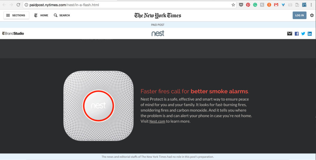
This elicits an immediate, emotional response from viewers, and they realize that within the time it takes them to browse through the photos, infographics, and written content of the post, their house could hypothetically go up in flames. Users are left wondering things like: what would I take with me? Where would I go? Yes, the narrative is a paid-for advertisement, but it’s an effective marriage of storytelling and design nonetheless.
The Wall Street Journal is also raising the bar for native advertising with its brand marketing unit, WSJ Custom Studios, most notably with the digital site it created for the Starz series, The Girlfriend Experience, a long-form immersive experience called Business of the Heart. It simultaneously promotes the premise of the show in which a young attorney leads a double life as a high-end sex worker, while chronicling the cost of love and lust throughout history, from the price of a wedding dress in 1850 ($500) to the current global revenue from prostitution ($186 billion).


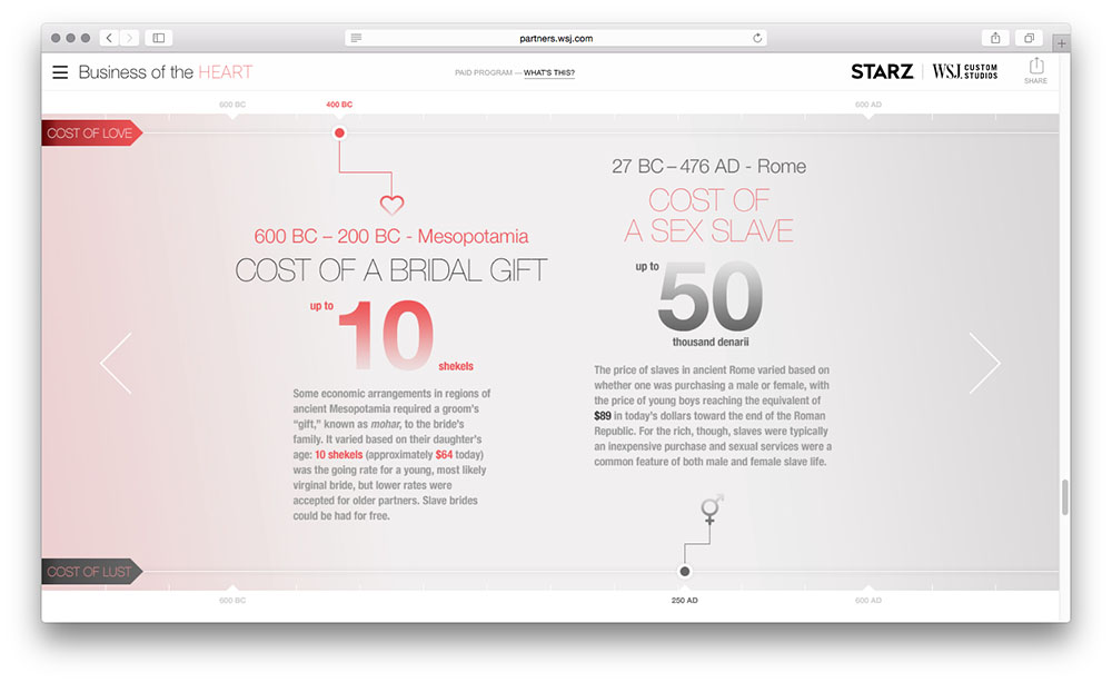


Senior design director Nam Le says their strategy was about, “combining deep reporting of the complex and cyclical nature of relationships and money with digital interactive flourishes like timelines, a snap poll, and 3D animation to keep the user engaged. The visual approach is clean and modern without feeling too overtly branded. This was a large team effort between editors, writers, designers, developers, 3D animators, and the final product is a real showcase for us and our ability to tackle the entertainment space in a way that appeals to the WSJ reader.”
As for the multitude of websites still intent on generating more clicks per month through manipulation and deception, Katie Swindler says it just isn’t worth it in the long run. “These days, with social media, every consumer has a megaphone to shout to the world when a brand has done them wrong. And as the saying goes, ‘You can’t fool all of the people all of the time.’ Eventually, when you set out to deceive consumers, someone will find out, they will call you out, and you’ll have to deal with the consequences.”

