
Credit: H55
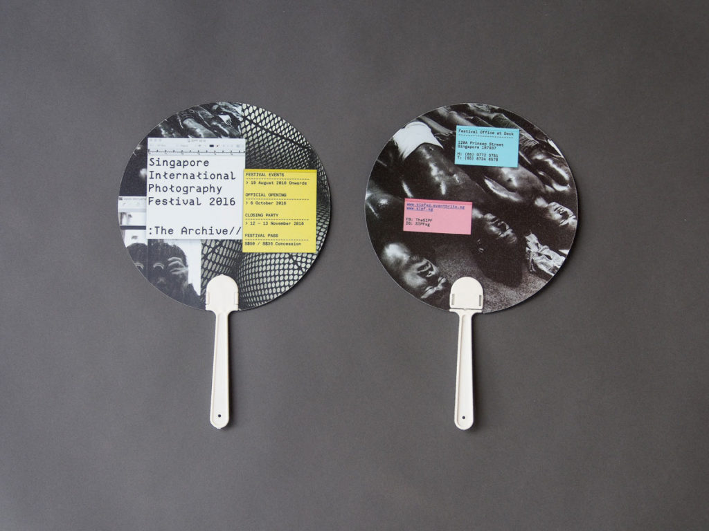
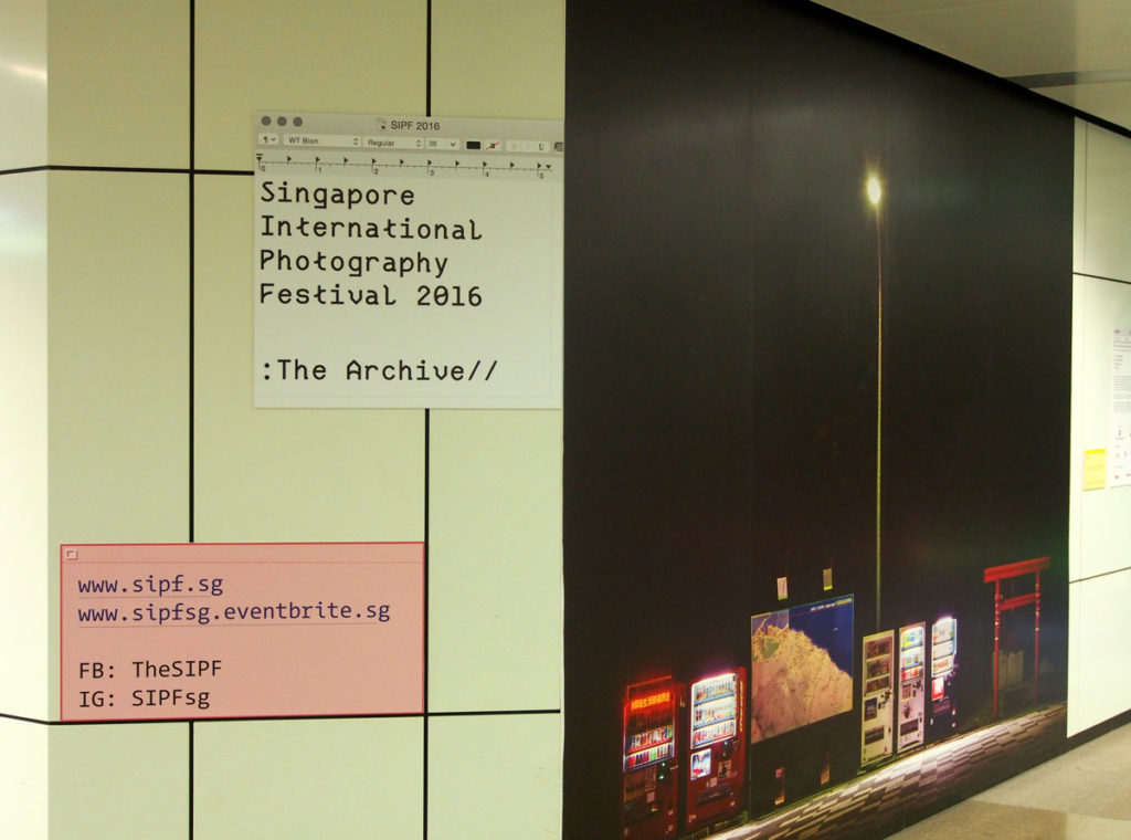
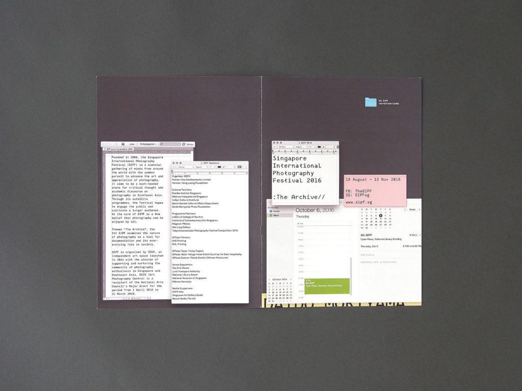
Featuring virtual desktop windows, stickies, folder icons and even an open iCal calendar, the campaign collateral for this year’s Singapore International Photography Festival resembles a series of Mac screen shots. Well, that’s because they are.
In response to the biennial’s theme The Archive, Singapore-based design consultancy H55 created this visual identity to challenge the traditional image of archives as “dusty boxes of physical materials” and make a statement on photography and its digital nature today.
“Photographs are circulated more than ever online. You may not even have a gallery space or a museum showcase, you can just circulate them on Facebook and Instagram or email your work to somebody,” explains the studio’s creative director Hanson Ho. “A lot of photographs are actually stored in desktop folders, not so much on shelves.”

Credit: H55
Credit: H55
According to Ho, this means photographs and their archives can no longer be thought of as records of truth. Instead, they are “constructs” that anyone can create, Photoshop and disseminate—an idea that Ho frames by presenting the desktop interface and its elements across the festival’s invites, banners, passes, and catalog. The virtual TextEdit window was even recreated as physical frames to hold wall texts for the festival’s public exhibitions of photographs from around the world.
While screen shoting a design sounds easy (just hold command+shift+4, right?), Ho had to recreate the design whenever the client asked for changes. Even though the identity uses unconventional elements, typical design rules such as balance and hierarchy were still needed to deliver the messages clearly. For instance, event details were placed on stickies and these were juxtaposed over images of the photographers, a familiar sight on a desktop. To give the campaign an overall “odd” touch, Ho used the mono-spaced WT Bion typeface as headline type, a creation by young designers Shannon Lim and Giang Nguyen.
Credit: H55
Credit: H55
The resulting cluttered desktop look seems at odd with H55’s body of more minimal designs. But look beyond the aesthetic, says Ho, and the identity fits into his approach of appropriating the everyday. Previously, he had created a branding for the Lee Kuan Yew World City Prize with the “ring” icon used on maps to symbolise cities. Two years ago, H55 also executed a similar concept for the cover of a design magazine to reveal the creation process.
“The hope is for people to have a new relationship with familiar details or objects. It’s really about making the familiar look unfamiliar,” he says. “Hopefully, it’ll make people question what this new relationship means, in this case, between them and the digital platforms and the photos that they view through the screen everyday.”

Credit: H55

