
Our weekly look at a favorite new typeface. Share yours with us on Twitter @AIGAeyeondesign and Instagram @AIGAeyeondesign with #TypeTuesday.
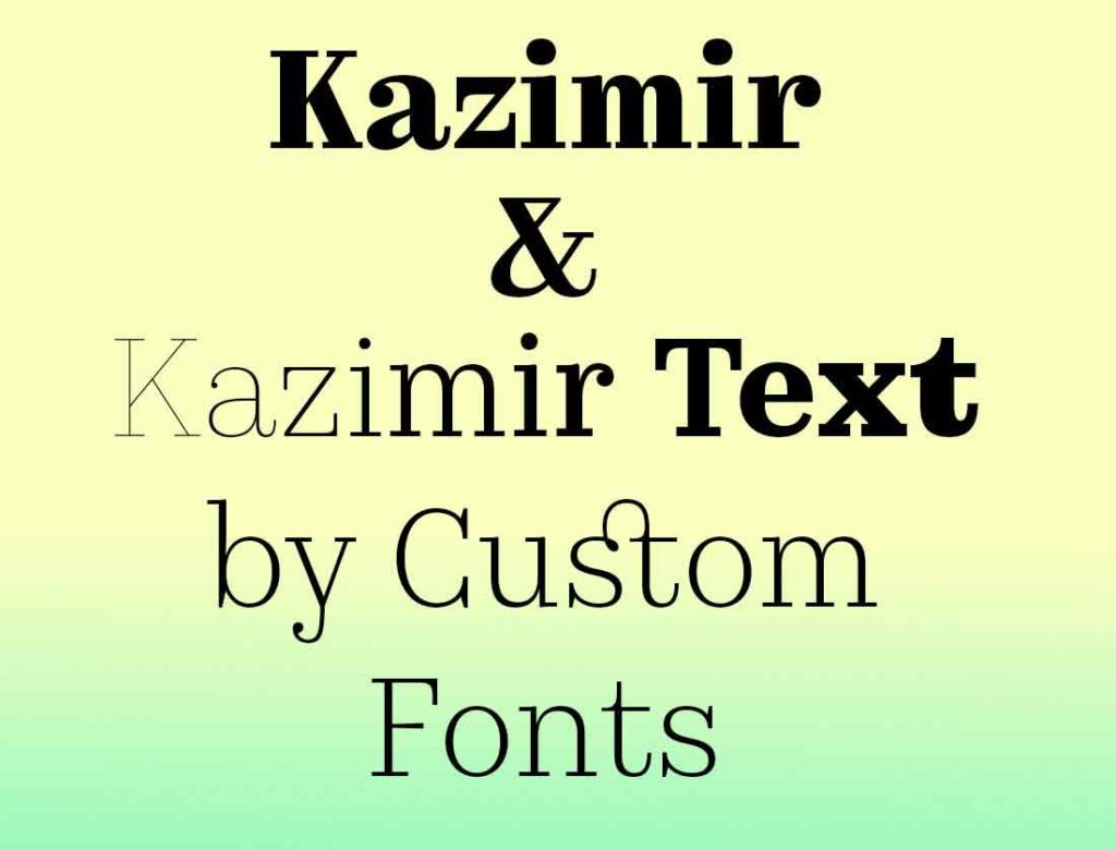
Name: Kazimir and Kazimir Text
Designers: Ilya Ruderman and Yury Ostromentsky
Foundry: CSTM Fonts, available on type.today
Release Date: 2015–16
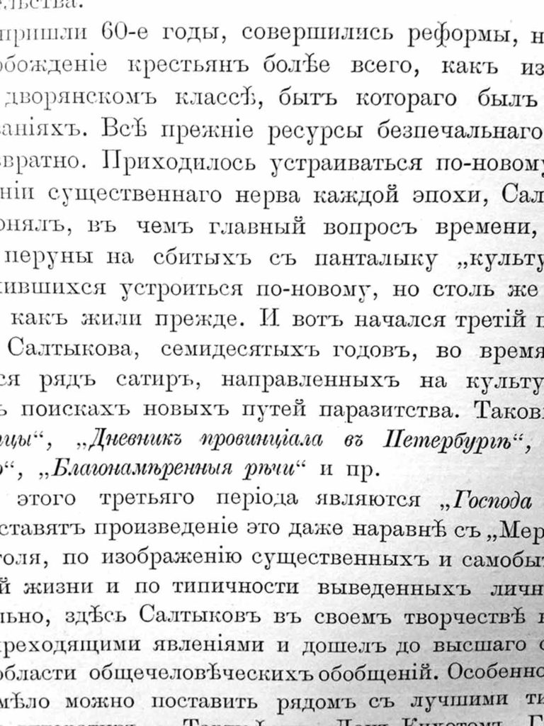
Back story: For two fonts that combine features of pre-revolutionary Russian typography with more contemporary notions of fashion, form, and harmony, designers Ruderman and Ostromentsky hit the books—specifically the type found in books from the late 19th and early 20th centuries. Eventually the pair zeroed in on the text typeface used in the three-volume set, History of Russian Literature From the Ancient Times to Our Days, by P. N. Polevoy, published in 1900.
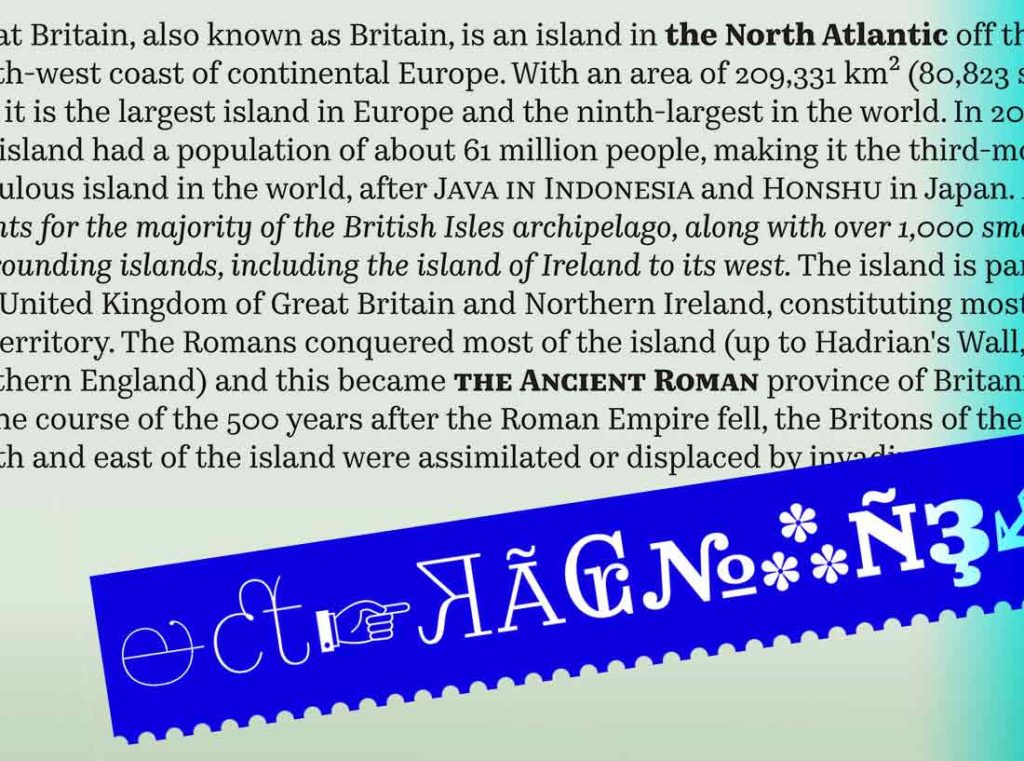
Kazimir draws upon some of the strange letterforms seen 100 years ago in Russia, when printing was often outsourced to foreign shops in places like Prague, Warsaw, or Finland, where the character sets didn’t reliably include Cyrillic. Undeterred by such minor difficulties, the ever-resourceful printers just invented their own Cyrillic letterforms, and the details they added led to some odd-looking alphabets.
“Although the History of Russian Literature was an inspiration and we very much wanted to connect our project with ideas from the past, Kazimir is not a revival at all,” says Ruderman. “We didn’t even look at the shapes of the old characters; we took the idea of sudden errors and based Kazimir on this sort of unexpected typography. We were not interested in carefully translating the past into a cleaned up version for the 21st century.”
Why’s it called Kazimir? “We were looking for a name that sounded both personal and proper,” says Ruderman. “Sometimes you see old photos of dandies who look surprisingly contemporary. We imagined that such a dandy could be named Kazimir.”
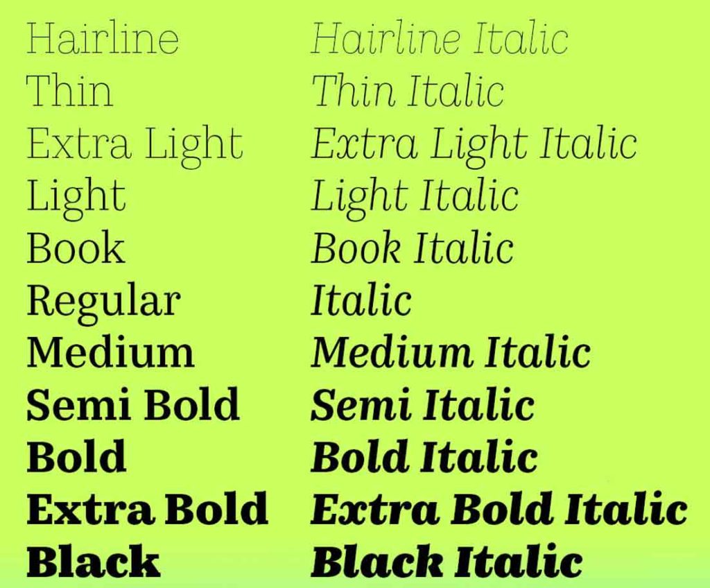
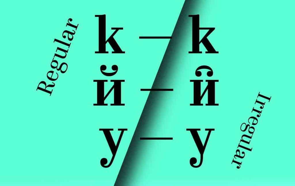
What are its distinguishing characteristics? This modern, serif-style typeface has slightly narrowed proportions, long extenders, and dynamic strokes that recall the rhythms of transitional serif faces. Playful contextual ligatures and alternates (Regular and Irregular) add spirit to the characters in both the Cyrillic and Latin alphabets. The hairline weight in Kazimir Text is just gorgeous. Hat tip to both families’ exceptionally pretty italic x!
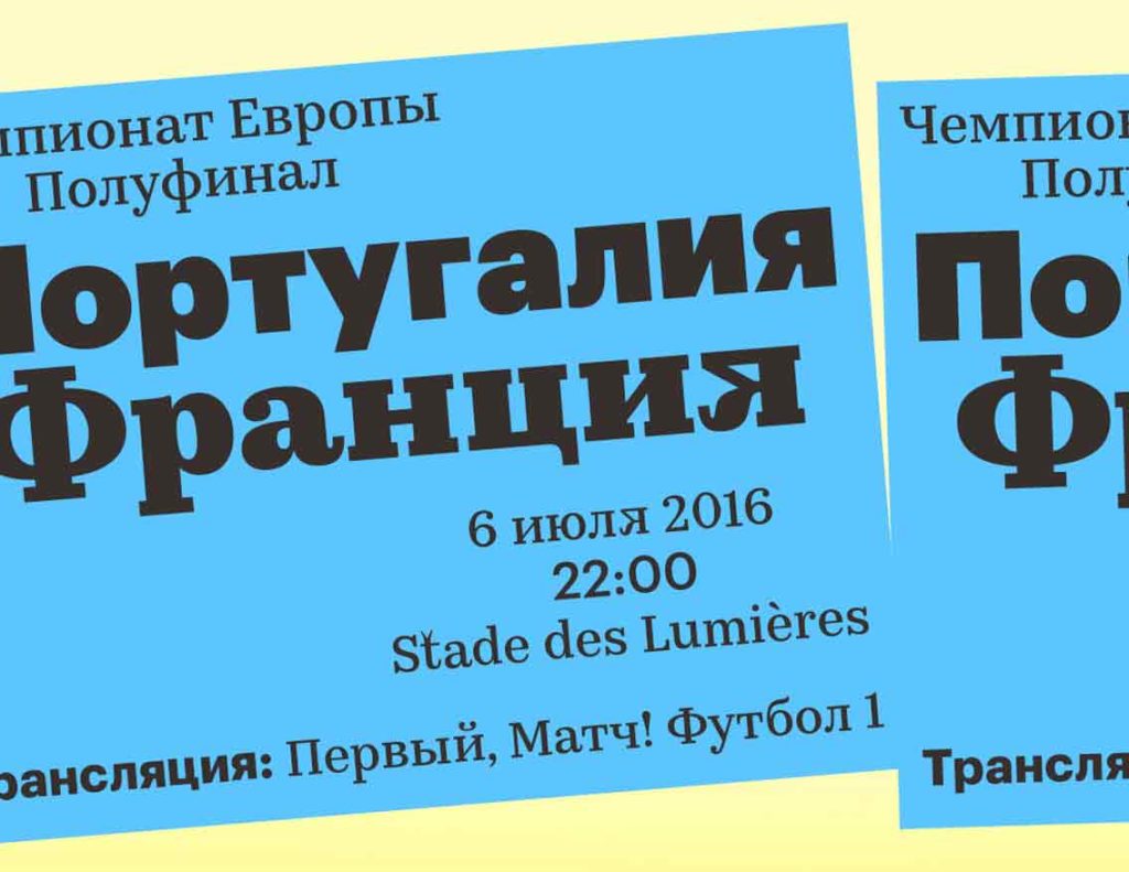
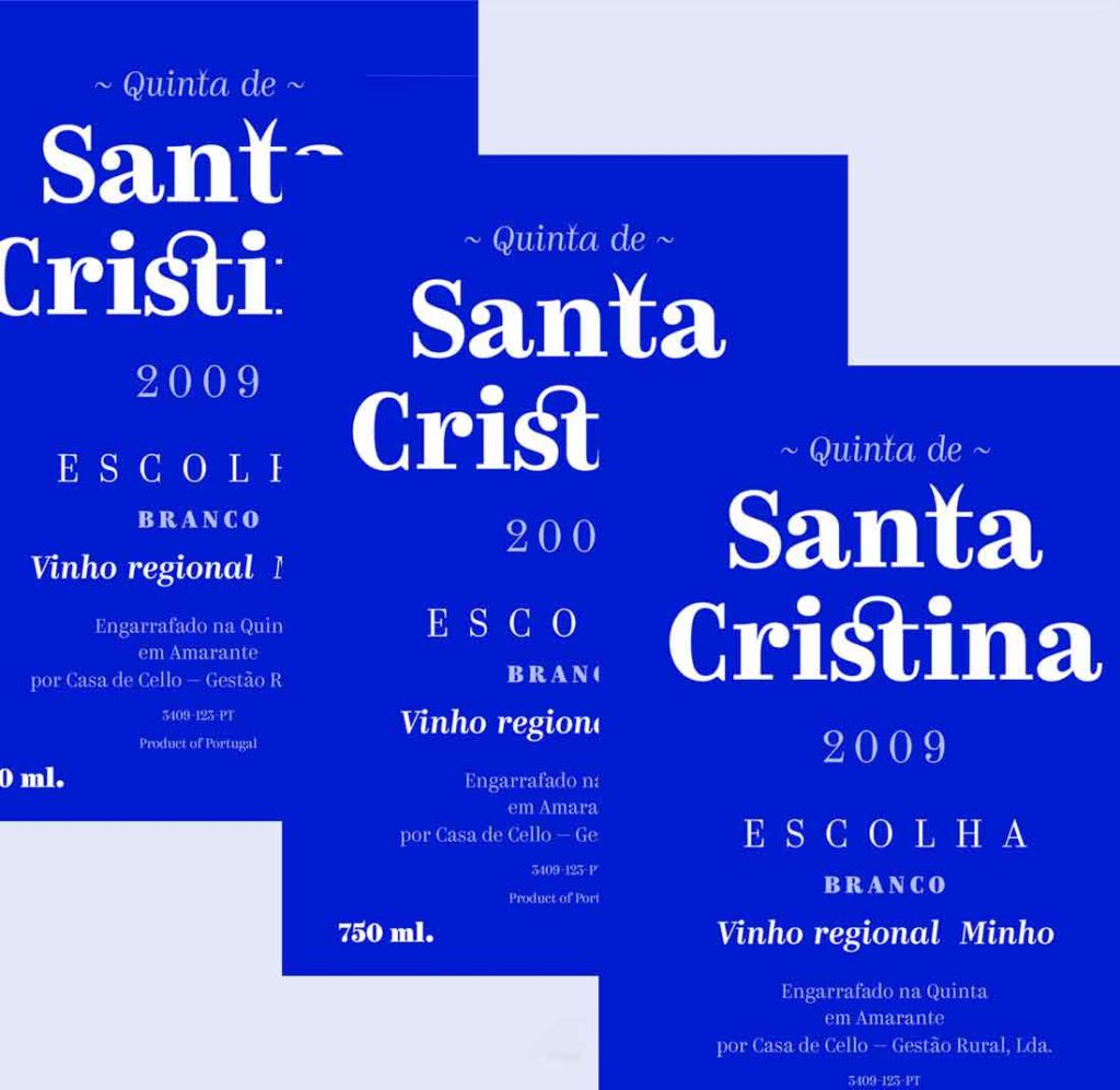
What should I use it for? The designers note that they’ve seen their latest release used in quite a lot of identity design, for projects ranging from lighthearted (craft beers) to superserious (news agencies). Bookmate, the e-book subscription service popular in Russia, requested a version that would work for their app, leading to the development of Kazimir Text.
Who’s it friends with? Kazimir cozies up well with Graphik, from the good people at Commercial Type, in both Latin and Cyrillic.

