
Our weekly look at a favorite new typeface. Share yours with us on Twitter and Instagram @AIGAdesign with #TypeTuesday.
Name: FS Aldrin
Designer: Phil Garnham
Foundry: Fontsmith
Release Date: April 2016

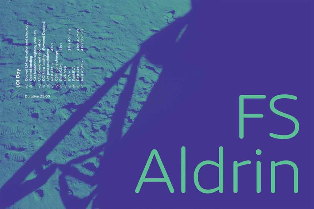
Back story: Fontsmith’s design director Phil Garnham combined two longstanding desires in FS Aldrin: creating an elegant, rounded typeface and honoring his self-described inner space geek. “The personality of this font presented a great opportunity to honor one of my boyhood heroes,” he says, referring of course to the second man to walk on the moon, astronaut Buzz Aldrin.
When Fontsmith contacted Aldrin’s management team to make sure there were no intellectual property issues to be addressed, they were thrilled to receive this reply: “Buzz and his team love the fonts and have been using them in his presentations. We hope everyone likes them as much as Team Buzz does!”
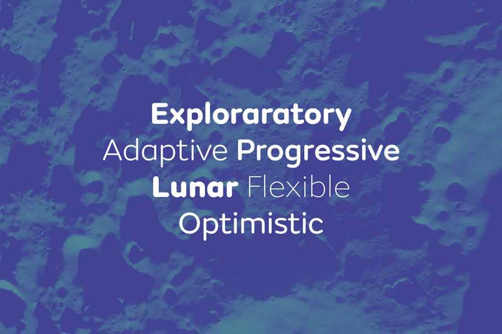
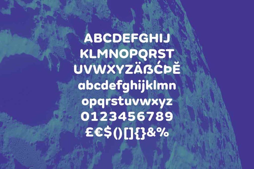
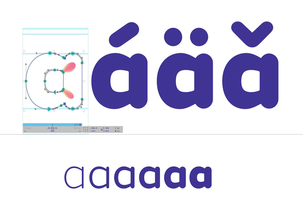
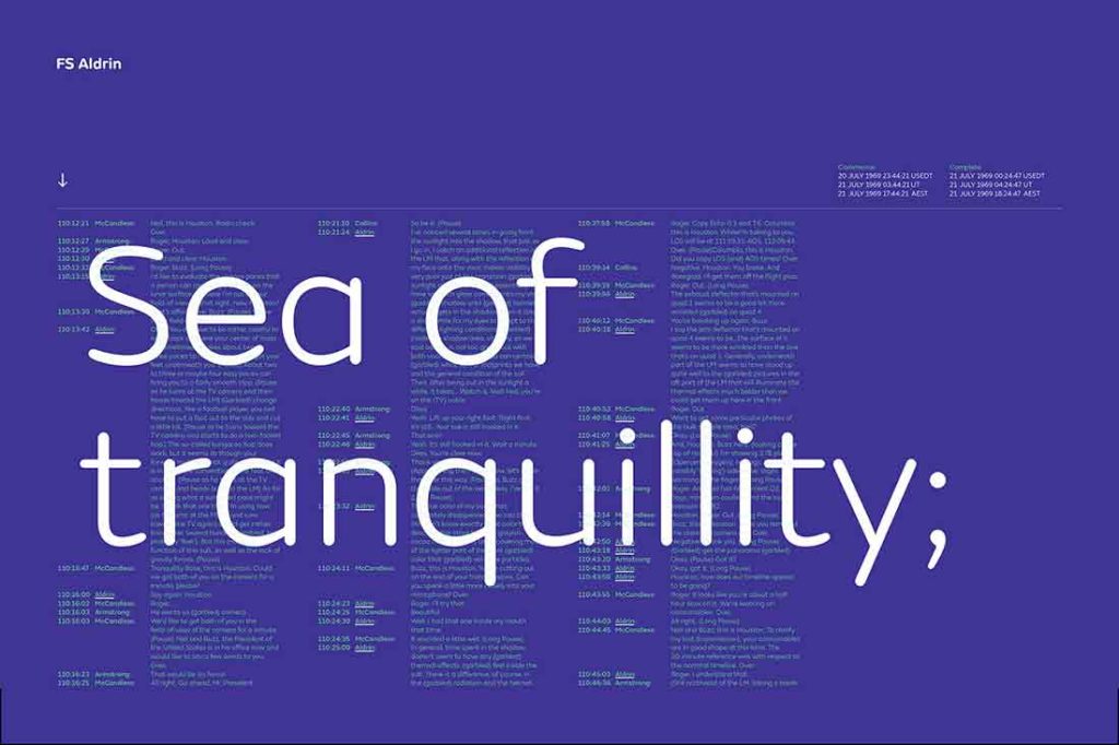
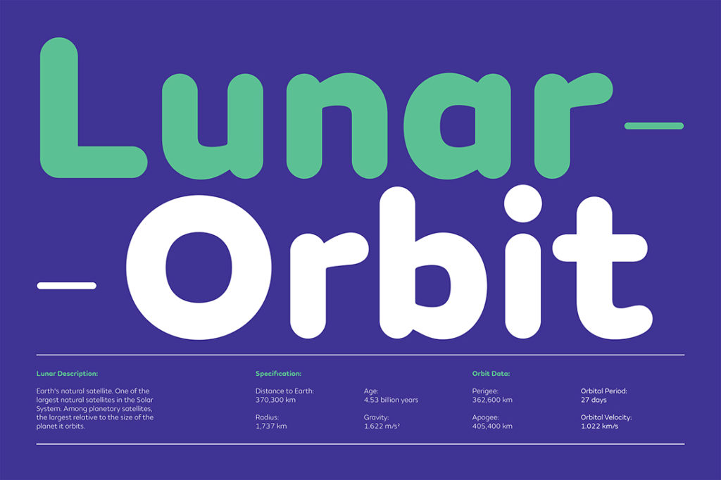
What are its distinguishing characteristics? FS Aldrin is based on the 2013 font FS Emeric, adapted with less sharply defined inner counters and increased fluidity. Garnham says,“I wanted to add a fresh interpretation to the rounded font canon and give FS Emeric a sibling, one with a softer, more amiable character while retaining the family’s astuteness and crispness. Every curve and transition has been crafted by hand, and that’s what gives FS Aldrin its unique strength.” The character set includes a suite of 268 icons that span themes like weather, currency, and navigation, plus 30 “Buzz Specials:” rockets, shuttles, and lunar modules, as well as one depicting the 86-year-old space explorer.
What should I use it for? The letterforms are well-suited for presenting complex data, where they add a little softness that’s easy on the eyes, and are just as comfortable in a brief, bold headline. The thinner weights in particular have a precision and elegance that works beautifully in a technical environment.
Who’s it friends with? FS Aldrin looks great with a blocky, heavy sans serif typeface such as the upper weights of Knockout for contrast, or with a more angular serif face such as Skolar. A slab serif like Sentinel is also a good match.

