

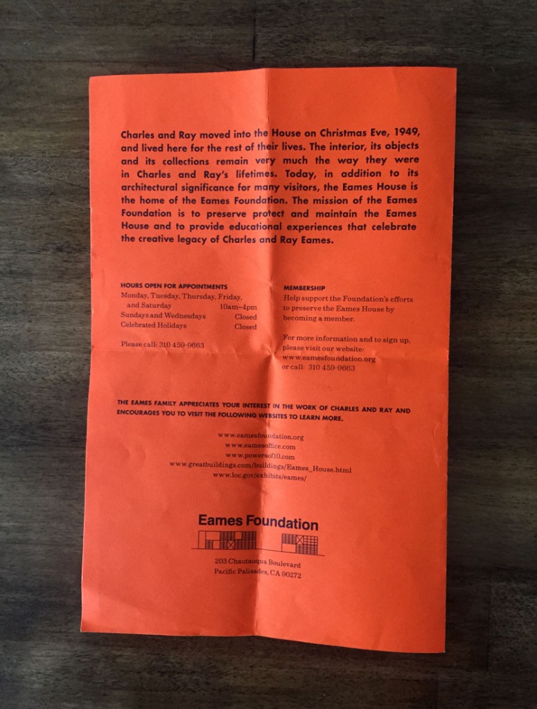
The guidelines are simple: photography is permitted for souvenir purposes only, and reservations must be made in advance. A rite of passage for any design-minded local or visiting practitioner, a trip to the Eames House, nestled on a winding hillside just above the Santa Monica Bay, will cost you $10 and the better part of an afternoon. What you get in return—beyond a glimpse inside Case Study House #8—is a view into the life, work, and playful imagination behind one of modernism’s most famous partnerships (and a bright orange flyer you can take home).
Designed by Charles and Ray Eames and built in 1949, #8 is one of 25 Case Study homes commissioned by Arts & Architecture magazine between 1945 and 1966. Led by publisher John Entenza, the magazine posed as a stand-in “client” to some of the most acclaimed mid-century architects, with the aim of determining the shape and form of post-war domestic life in America. According to the brief published by the magazine in 1945, “every consideration will be given to new materials and new techniques in house construction,” and each home, once built, would be open to the public for a period of six to eight weeks (nearly all the completed projects are located in Southern California).


Photos of the Eames House aren’t difficult to come by in books and online, but the essence of the iconic site is harder to capture unless you’re standing on the grounds, dirt beneath your feet. Built with pre-fabricated, off-the-shelf materials (mostly glass and steel), the integrity and design of the two-story, rectangular structure is striking, even 65 years after it was built. A wide open meadow unfurls before the many windows that make up the home’s façade, and ocean breezes drift up through the eucalyptus trees. Protected yet open, the house and accompanying studio elicit immediate fantasies of working and living in this remarkable space.
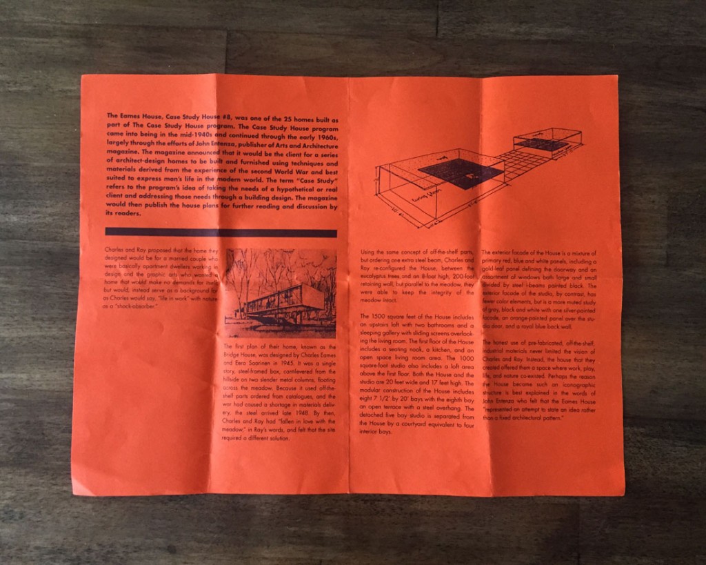
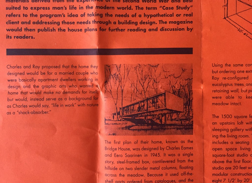
A docent is on hand to outline the site’s rules, answer any questions, and hand each visitor a bright orange bi-fold brochure. A letter-sized page folded in half, the flyer contains background information on the house, including a sketch of the original plan created by Eero Saarinen and Charles in 1945 (known as the Bridge House), an overview of the Case Study Program, and a few paragraphs about Charles and Ray. The brochure design is unfussy and straightforward—a nice, if unremarkable mix of type and image—yet I found myself carting this paper around for weeks after my visit, making sure it was safely packed for my return trip to New York, and then moving it carefully from bag, to desk, and back again. As a designer, I do this often, collecting examples of nicely designed postcards, flyers, or other ephemera. But this felt different.

“Charles and Ray Eames said the role of the designer was basically that of a good host who anticipates the needs of a guest,” says Eames Demetrios, chairman of the Eames Foundation board and the couple’s grandson. “I think we identified the right need,” he adds, referring to the brochure. “The right need was not to show off or tell everything, but to show something that was very light on the land, in a way like the house itself.”
Created in 2000, four years before the formation of the Eames Foundation, the flyer is intentionally economical and easy to print. Both are important considerations for a non-profit foundation whose precious funds are earmarked for maintenance, repair, and restoration projects. The front of the flyer, with an oversize “8” and an abstract drawing of the floor plan, references the look and feel of the original Arts & Architecture articles. The layout was handled by designer Keith Knueven, though the project was a group effort overseen by the board and the foundation’s first director, Bernadine Styburski. The hue, a vibrant orange, is intended to connect directly with the orange panels on the building’s exterior, and is also a reference, according to Demetrios, “that the story of the house includes color.” For everyone involved, the spirit of the flyer didn’t warrant glossy pages or the heft of a book—just the opposite. “If it’s something we’re giving to everybody, it needs to leave room for people’s own experiences,” says Demetrios.
Nearly 370,000 people visited the case study houses during the first three years of the program, and no doubt imagined themselves, just as I did, occupying, living, and working inside the modern home. Today, Charles and Ray Eames are recognized for their numerous contributions to architecture, filmmaking, and the fields of graphic and industrial design, but their legacy is perhaps best felt and understood while walking the perimeter of Case Study #8 and peering into the world they once inhabited.
“The fascinating thing to me about the Eames’ work is you can really see the ideas in the design, and the house is an extreme example of that,” says Demetrios. His statement echoes the sentiment of Arts & Architecture editor John Entenza, who once explained that the Eames House, “represented an attempt to state an idea rather than a fixed architectural pattern.”
The flyer then becomes an example of what Charles and Ray referred to as “way-it-should-be-ness.” A simple, understated attempt to deliver necessary information, without intruding on a visitor’s unique experience. Whether or not you imbue the leaflet with added value (as I certainly did), is entirely up to you.
“The house does mean a lot to a lot of people,” says Demetrios. “Therefore the flyer is something that they want to have. A little talisman, a keepsake.”

