
Name: Ansage
Designer: Alejandro Freitez
Foundry: Sudtipos
Release Date: January 2020
Back Story: A well-worn chestnut of wisdom in the design world holds that there are no new ideas, just infinite ways of expressing the same basic truths. It’s within this context that Ansage makes a welcome appearance. This sans serif font with a robust personality emerged from type and graphic designer Alejandro Freitez’s meticulous study of a wide variety of 19th century Gothic type specimens. By looking closely at the landscape of gothic fonts and why they evolved the way they did, Freitaz was able to build something extremely well-informed yet entirely fresh. He cherry-picked the most interesting aspects of several typefaces, then selectively combined and adapted them (a process Tobias Frere-Jones calls “atomized history”) to yield a clean, modern font with a far more distinct personality than the thousands of other Gothic sans serifs available today.
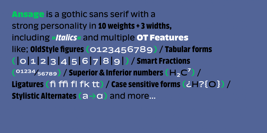
Why’s it called Ansage? Ansage means “announcement” in German—a perfect name for a typeface intended to convey clear messages in a loud voice. No whispering here.
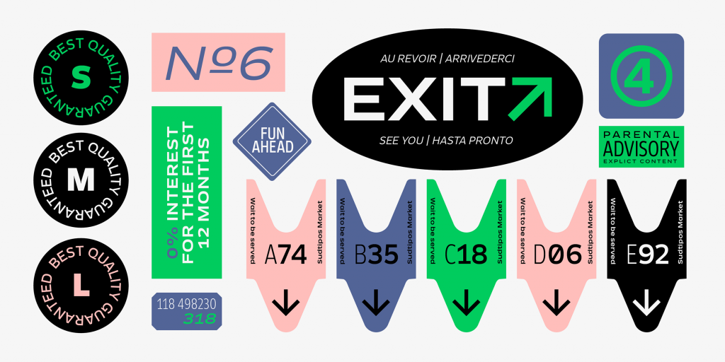
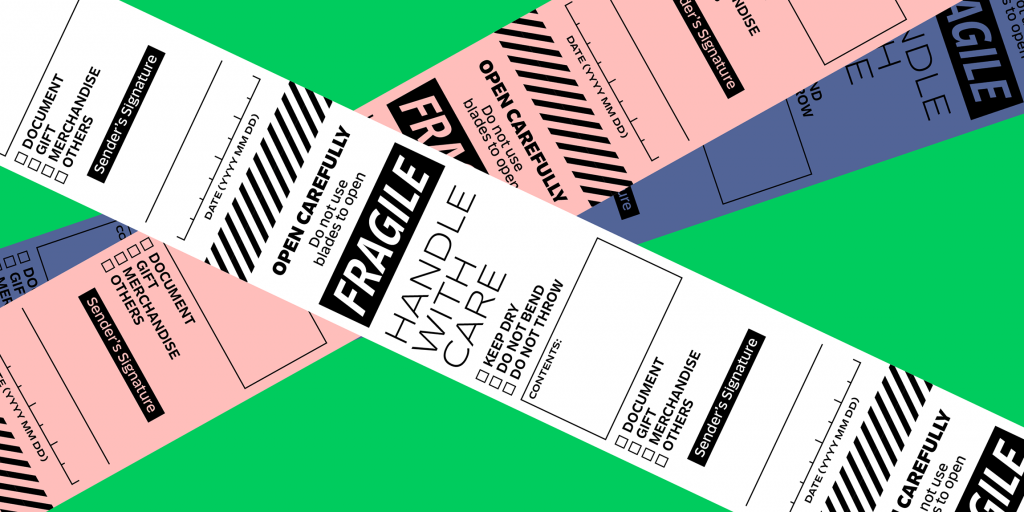
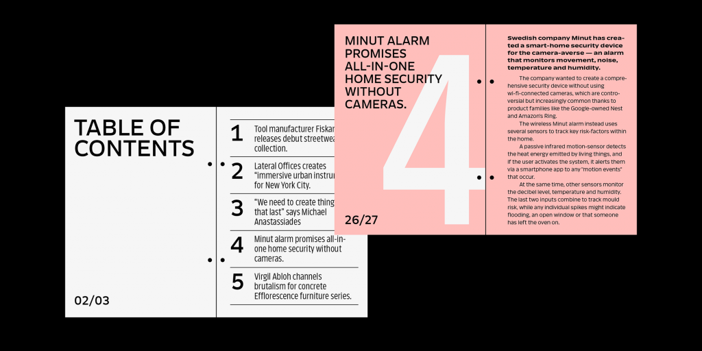
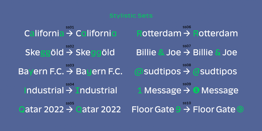
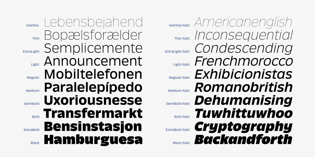
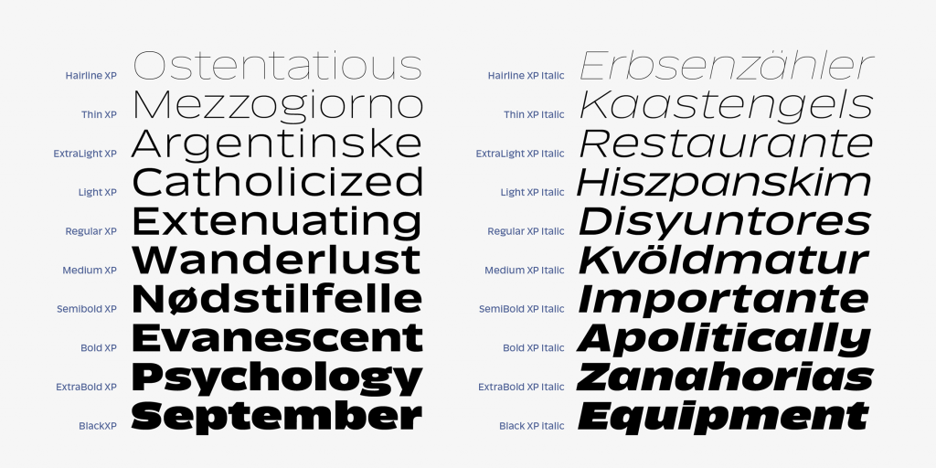
What are its distinguishing characteristics? The design process behind Ansage explored constant transformations in form, resulting in a font with 60 variables, 10 weights, and three widths, plus italics. The characters feature a large x-height, small ascenders and descenders, and open terminals that grow in expressiveness as they increase in weight. Freitez had no interest in creating a neutral font; Ansage’s closed strokes and regular forms break away from traditional rationalist letterforms. Alternate glyphs allow playful options for the lowercase “a,” “y,” and “g,” as well as capital “I,” “Q,” and “R,” ampersands and numerals. The visual distance between the Hairline and Black weights is masterful.

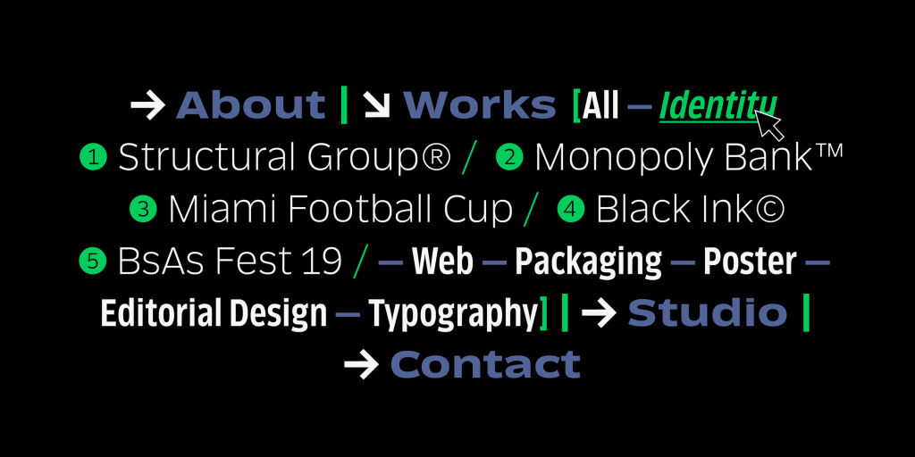
What should I use it for? Branding, posters, websites, apps, and headlines, as well as compositions where space is at a premium—Ansage sets very tight, and the condensed version is especially economical, taking up as little real estate as possible.
What other typefaces do you like to pair it with? Ansage’s many weights mix and match to provide plenty of variety within a single type family. For a pairing with a serif font, try Landa or Calicanto (also designed by Freitez). The simplicity of the characters provide a nice foil for script typefaces, too.

Bonus: License the full font package and receive a complimentary variable version of Ansage.

