


Name: Bixa Color
Designer: Mark van Wageningen
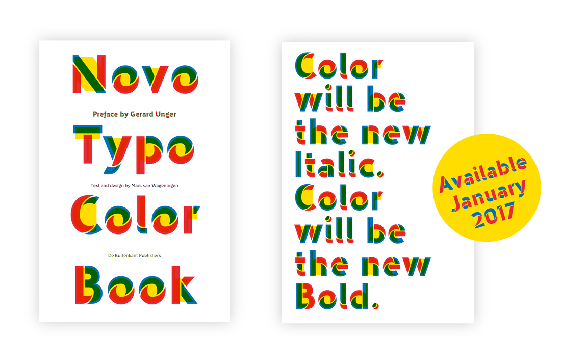
Foundry: NovoTypo
Release Date: Wood type 2015; chromatic web version released in 2016; hot metal pending January 2017
Back story: Van Wageningen first developed the chromatic typeface Bixa in 2015 for his Typewood project, a return to the exuberant wood types of the 19th century that still hold a place in graphic designers’ hearts for the vigor they bring to a printed poster or page. The Bixa typeface family, which won several awards in 2016 ( including recognition from the Type Director’s Club and Communication Arts), was originally drafted as a multicolor font for digital use—until van Wageningen’s love for letterpress won out.
In a talk at TypeCon in Seattle last August, van Wageningen said, “Wouldn’t it be interesting if I could take a typeface obviously designed on a computer and translate it into wood with all the irregularities, the textures, the rough edges, the happy mistakes and little accidents of letterpress? Perfection is boring. I like it when there is something wrong, something imperfect. Letterpress printing shows, in a way, ‘the perfection of imperfection.’”
For good measure, Typefoundry Lettergieterij Westzaan is casting a version of the typeface, to be renamed Ziza, in lead on a Monotype Typecaster for release at the end of January, intended for use in printed editorial formats requiring smaller type sizes. All bases, covered!
Why’s it called Bixa Color? The achiote (Bixa orellana) is a shrub, also known as the lipstick tree, found in the tropical region of the Americas where indigenous people used the seeds to make red body paint and lipstick. Van Wageningen liked both the sound of the word and its association with bright color.

What are its distinguishing characteristics? Bixa Color contains 12 different layers within a single font file, allowing designers to mix up various shadow, inline, color, and black options for a dazzling array of choices and over 200 possible layer combinations. The varying shapes that make up the letterforms are imaginatively thought out: pick from a menu of thin, deconstructed, striped, shadowed, dimensional (to the left or right of the central letterform), and black, to name just a few.
The typeface makes use of an OpenType standard released last March that makes color glyphs possible. Prior to that, web type rendered in a single color; i.e. characters were either black or red, never black and red. Caveat: not all browsers currently support color glyphs. Firefox is the most reliable here, though van Wageningen and Roel Nieskens of Pixelambacht, a programmer and color font consultant (who also self-identifies as a font hacker and computer nerd from hell) anticipated the situation and made sure that in the absence of browser support, the letters would still display legibly in all black. Photoshop CC supports the multicolored font format in OpenType, and InDesign fans can use layers to divide Bixa into its differently colored components.
What should I use it for? Bixa Color is a display face suitable for the splashiest pronunciations and the loudest headlines you can think of. In other words: go big or go home. Try it here, download the webfont for free, and have some fun with the type tester.
Who’s it friends with? Never try to be more fancy than Bixa. Pair it with something modest and simple, such as Sentinel or Mission Gothic.

