
Our weekly look at a favorite new typeface. Share yours with us on Twitter and Instagram @AIGAdesign with #TypeTuesday.
Name: Brando
Designers: Mike Abbink
Foundry: Bold Monday
Release Date: 2014
Back story: Brando was inspired by a design proposal for a bank logotype, of all things. From that tightly prescribed beginning it evolved into a full typeface that won a 2014 Type Director’s Club Certificate of Typographic Excellence.
It almost comes as no surprise. Mike Abbink of Bold Monday, an independent Dutch type foundry, has some serious design chops: he was formerly the design director at Apple, creative director at Wolff Olins, executive creative director at MoMA, and has spent the last 10 months at IBM as executive creative director of Brand Experience and Design. His widely used typeface, FF Kievit, began in 1995 as a design school project and was later completed in 2001 for a corporate client at San Francisco design firm Method Inc.—another project that started in one place and ended up somewhere very different.
Why’s it called Brando? Literally, because it created a brand. While he was working on the bank logo, Abbink envisioned an accompanying corporate typeface that would play an important role in branding the organization’s communications.
Then there’s that other Brando. “The name is also an homage to Marlon Brando,” says Abbink, “whose acting style favored psychological realism over grandiose theatricality, and whose characters’ brawniness often belied an underlying sensitivity. Similarly, Brando the typeface balances hard and soft elements, and its stripping away of fussy details lends the font a refined and contemporary elegance.”
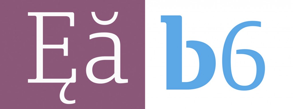
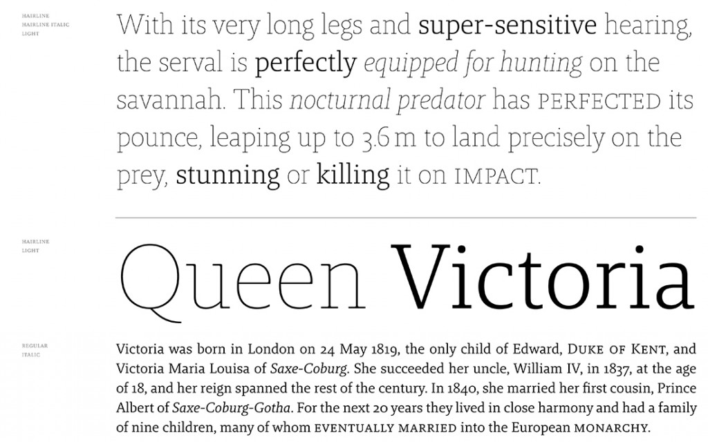
What are its distinguishing characteristics? Bold Monday’s website describes Brando as a contemporary serif with humanist proportions. It has a mix of strength and grace, thanks to a balanced contrast between mechanical and Egyptian forms. The slab serifs are more pronounced in the light styles, whose letterforms have a pleasing openness, and the heavier, more contrasty weights are muscular enough to maintain legibility even at very small sizes in text.
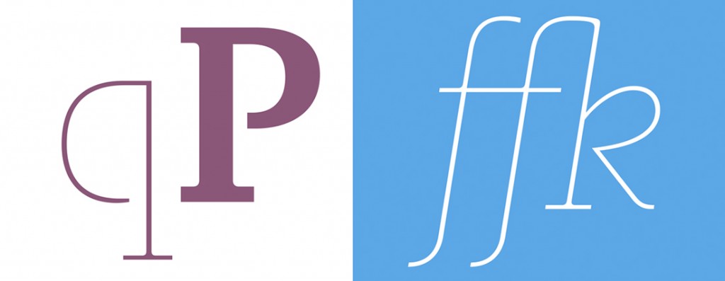
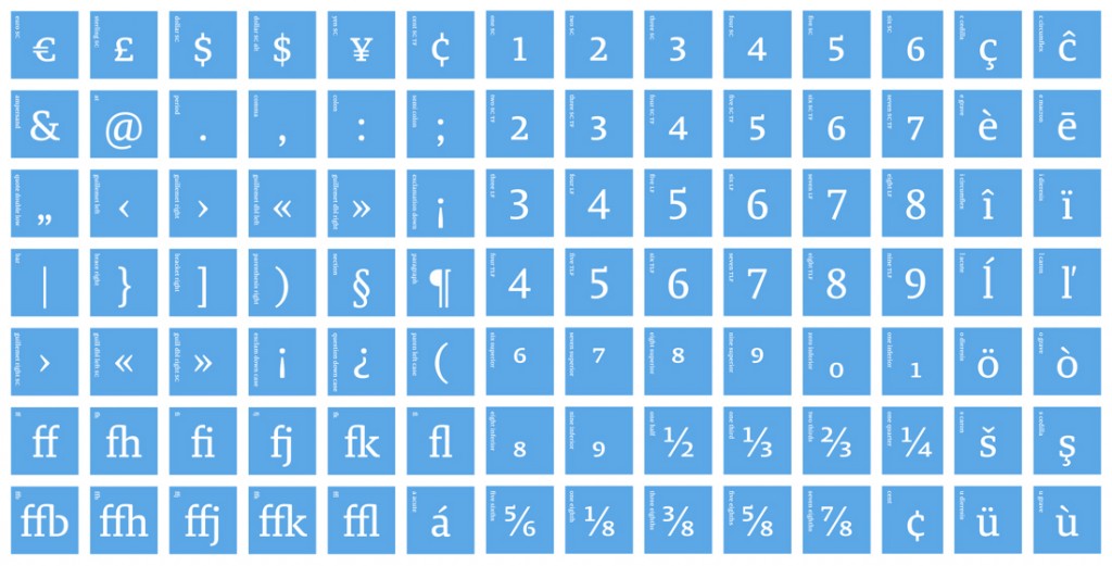
Italics hover somewhere between true italics and oblique, giving the letterforms a distinctive liveliness. Brando’s character set covers over 40 languages and includes small caps, a range of figure styles, fractions, and mathematical symbols.
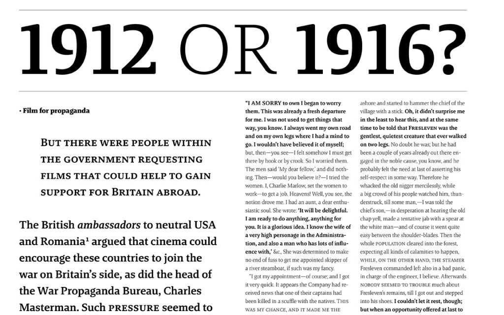
What should I use it for? Brando comes in eight weights from Hairline to Black, and works equally well as display copy or running text. Its modern forms and range of flexible options lend class to any editorial and identity design work in need of a hit of typographic elegance.
Who’s it friends with? Try Benton Sans, FF Yoga Sans, FF Zwo, Greta Sans, and Vita.

