
Our weekly look at a favorite new typeface. Share yours with us on Twitter and Instagram @AIGAdesign with #TypeTuesday.
Name: Mardell
Designer: Louise Fili
Foundry: Hamilton Wood Type and P22
Release Date: March, 2016
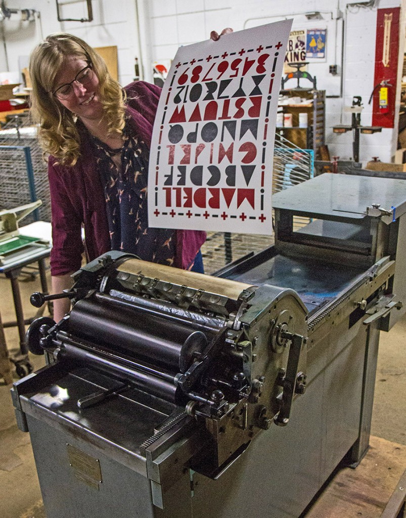
Back story: With this typeface Fili celebrates two of her favorite subjects, women and Italy. Mardell is the 40th typeface published by Hamilton and its digital partner, P22, and is offered as both a wood type and a digital font. It’s also the fourth font to be cut for the museum as part of Hamilton’s Wood Type Legacy Project, joining typefaces by Matthew Carter, Erik Spiekermann, Nick Sherman, and a pending design by Alvin Lustig, Elaine Lustig Cohen, and Craig Welsh.
Why’s it called Mardell? Female type designers, though their ranks are growing every day, are still in short supply. Fili named her typeface in tribute to veteran type cutter Mardell Doubek, who worked for decades at Hamilton. Doubek still lives in Two Rivers, Wisconsin, and participated in cutting the font named after her.
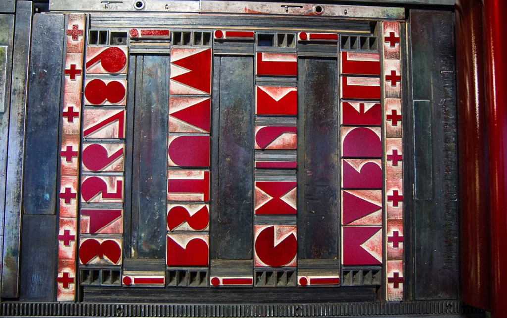
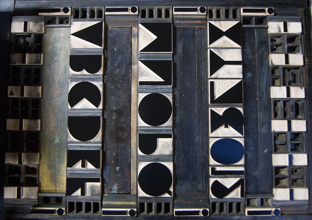
What are its distinguishing characteristics? The hefty Italian Futurist letterforms combine sharp angles and voluptuous rounded forms along with surprisingly thin strokes for characters such as the I and numeral 7. Without any open counters, Mardell’s solid geometric characters become design elements on their own.
What should I use it for? Fili says, “Anywhere you’re looking for a typographic treatment with a special flair.”
Who’s it friends with? Mardell looks great with Gotham, especially the thinner weights, and Domaine Sans Display.


