
The physical and psycho-geography of a place has a profound impact on the design it engenders. We’re not just talking about things like street furniture and signage, but graphics, too. Take The Netherlands for example: Dutch design is famed for its rigid grids, order, and slick but somehow emotionally engaged minimalism. Born in the small Dutch city of Breda, designer Luuk Janssens is supremely eloquent about this marriage of physical environment with graphic output.
“The Netherlands is a very ‘designed’ country because most of it is below sea level, and only exists because we created a system to keep the land from flooding,” he explains. “The country is therefore really structured and ordered, which extends to the way we plan our cities, our infrastructure, and even our nature reserves.
“I think living in such an environment creates the urge to structure things, to put things in place. That’s also why I have great interest in the Modernist period when it comes to design. Ordering information in a clear and systematic way was for me one of the core reasons to start studying graphic design in the first place.”
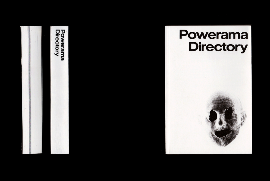

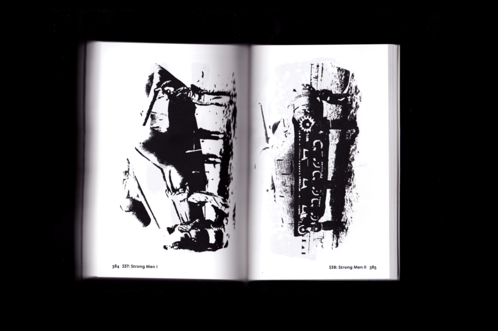
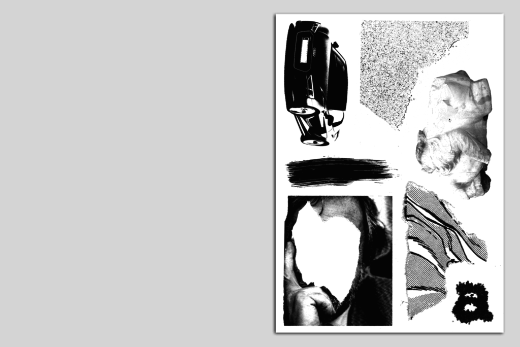
His own work takes these Modernist traits and runs with them: The Powerama Directory aims to visualize ideas around power using rigid design rules and a stark moncrohome palette; while its sister project, the Powerama series, features 36 posters displayed to echo the city and its power structures in four long rows to “create a panoramic view of power.”
Now based in Rotterdam, Janssens arrived at the city via Antwerp, then Ghent’s Saint Lucas Academy. His engagement with 3D design saw him initially study as an industrial engineer, until he realized he “couldn’t imagine spending the rest my life doing calculations in depressing offices and factories.” A passion for graphics was born out of his love of graffiti, and a green-eyed glance at friends on graphic design courses. “The things they were doing at school really attracted me, and because I was spending more time designing my thesis then actually writing it, it seemed too good to be true to study this the whole day,” he says.
He hasn’t left the precision and technicalities of engineering too far behind, though. “I still love the schematic approach of technical drawings, and all the information that’s shown as minimalistic and clear as possible,” he says. “But in a more practical way I also like to search for technical boundaries.”
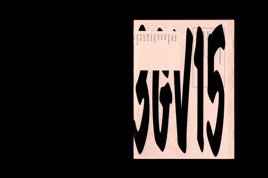
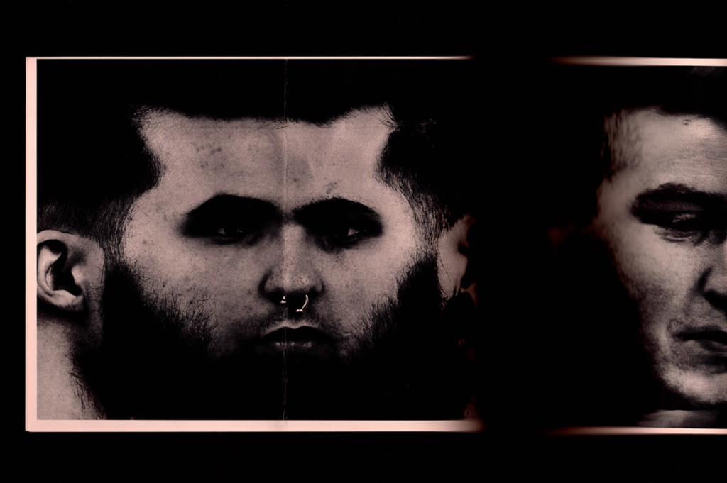
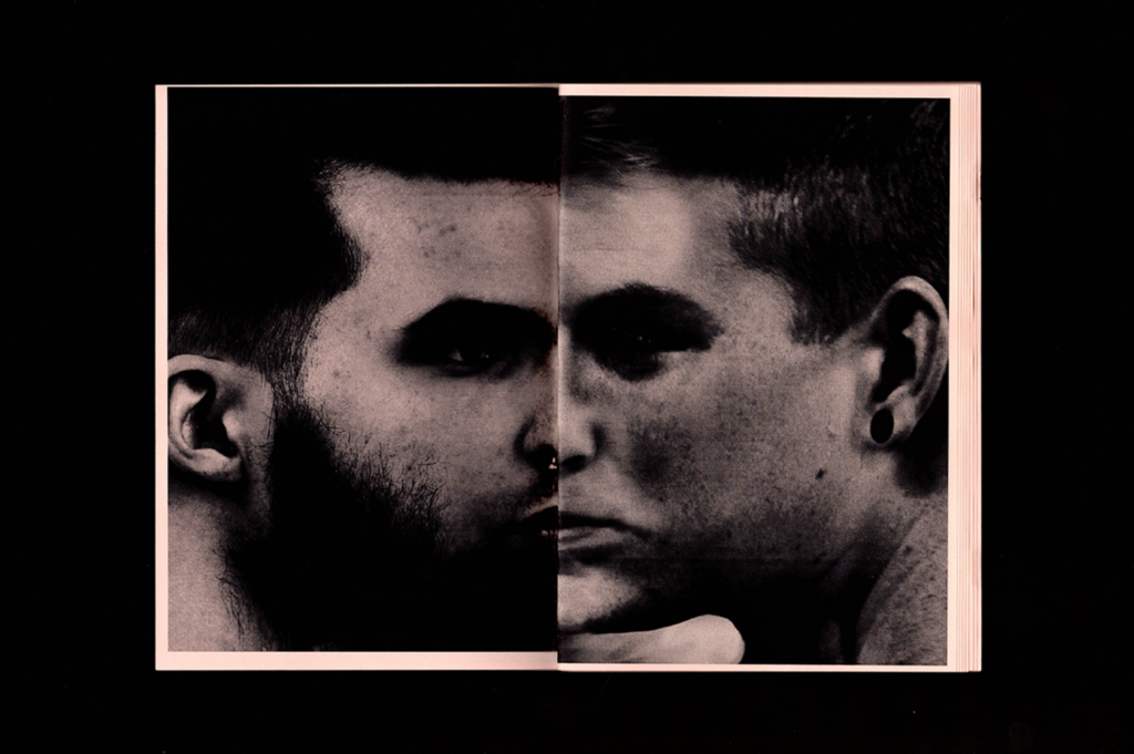
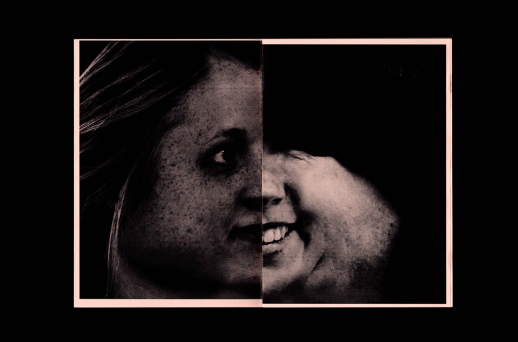
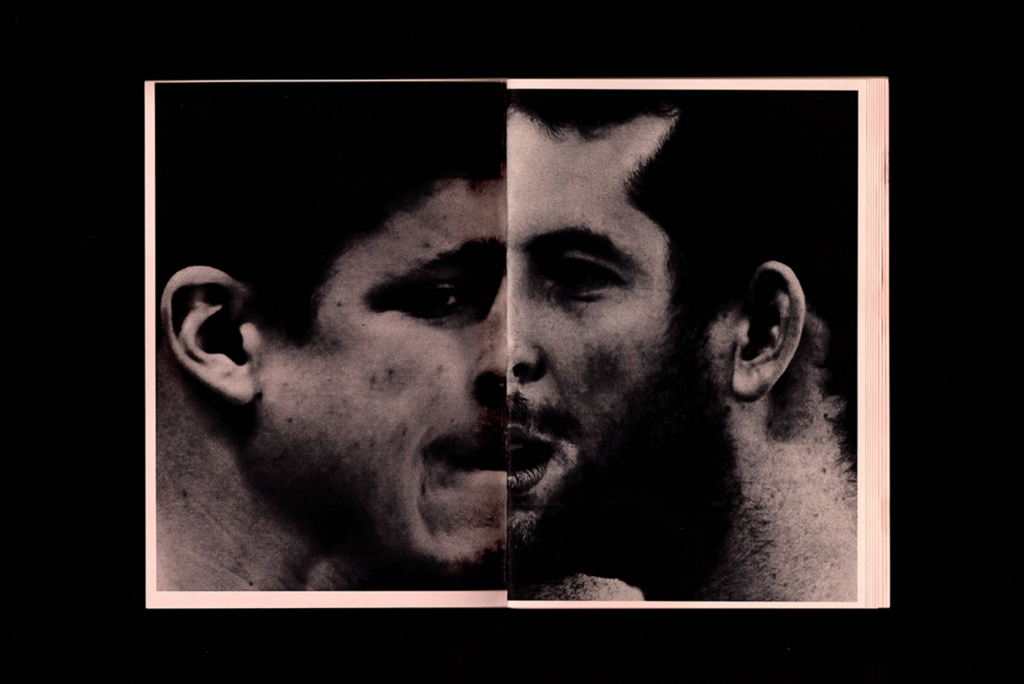
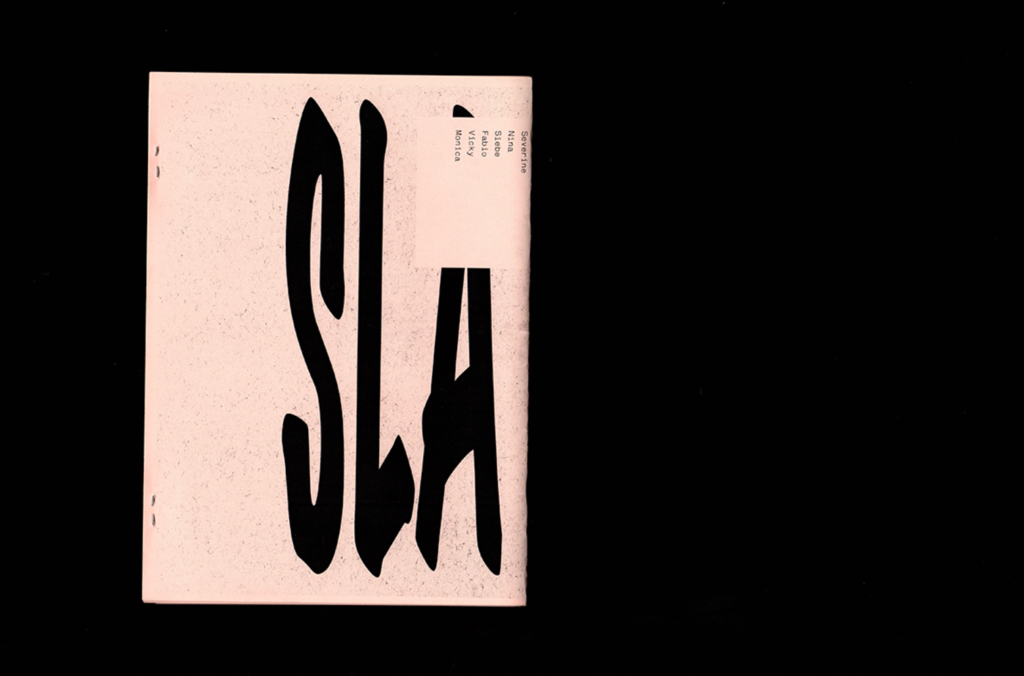
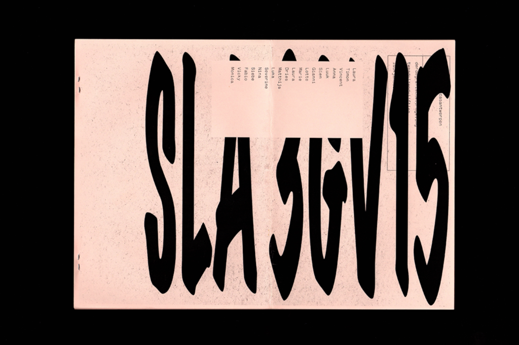
Designs for publication The Wasat were created by using an unusual approach to laser printing–“getting lines as dense as possible, and playing around with the moiré effect, which is in itself a very interesting geometrical and mathematical phenomenon.” He took a similarly off-kilter, technical tactic to making his Class of ’15 yearbook, using face mapping techniques usually used in the gaming industry to “try to make everybody look equally ugly.” Which in a roundabout way, seems like a very charming and egalitarian way of going about it.
For all his devotion to the urban environment of The Netherlands, and his country’s graphic design forebears, Janssens is reluctant to use the term Dutch Design in a contemporary context. “Nowadays I don’t think it exists and the term is more an empty alliteration used as marketing tool. They probably sell wooden shoes with Dutch Design labels on it,” he says. “I think that in the last 30 or so years a lot of things changed: globalization made ideologies and styles spread more easily, and geographical borders are non-existent on the internet. So it’s not really a Dutch thing, or a Swiss thing anymore, but it can come from anywhere around the world. It might be the Dutch design history that makes people want to study or work over here, but by bringing in their own heritage it creates a new dynamic.”

