


When satire quarterly The Baffler released its first issue in 1988, founder Thomas Frank promised erudite essays, criticism, and original art that would “blunt the cutting edge” with its tongue-in-cheek perspective.
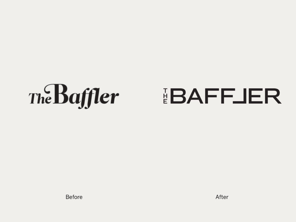
The magazine took on the tone and guise of a truth-telling fool or clown, almost like Britain’s 19th century Punch before it. Keeping in line with this idea, past identities of The Baffler have had an element of jest and a nostalgic feel to them, emphasized by ornamental typefaces for logos. Now, 28 years on and the long-standing title has had its first sans redesign, courtesy of Eddie Opara’s team at Pentagram. And although it looks sleek at a first glance, that fundamental clown still runs through all the magazine’s visuals.
“We wanted to find a more contemporary way to convey The Baffler’s sensibility,” Opara begins. This is his team’s second redesign of the magazine; they worked on a previous incarnation when the title was re-launched by Thomas Frank in 2010. The 2016 redesign coincides with an introduction of a different owner and editorial team, led by Chris Lehmann, and a move from Cambridge, Massachusetts to New York City.
For an update that’s fresh but still retains the original tone, Opara began with the logo and typefaces. “The Baffler has a reputation of being an acerbic liberal voice,” he says. “But in many ways, it is a generalist publication, really in the center of the political spectrum, targeting the left and the right alike with good, smart journalism and writing.” With this in mind, before starting the design Opara conducted an analysis with the magazine about its positioning. As an experiment, he and his team charted where people saw other journals and general interest magazines on a liberal-conservative spectrum; the results confirmed sans serifs sat on the left, and serif faces on the conservative right.
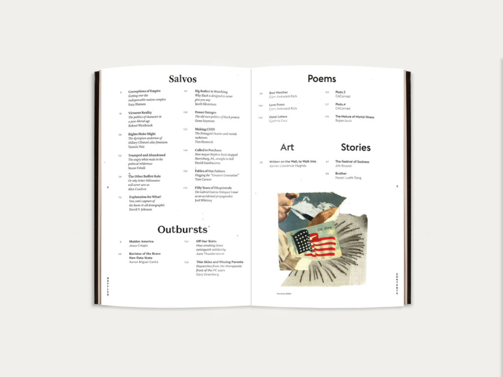
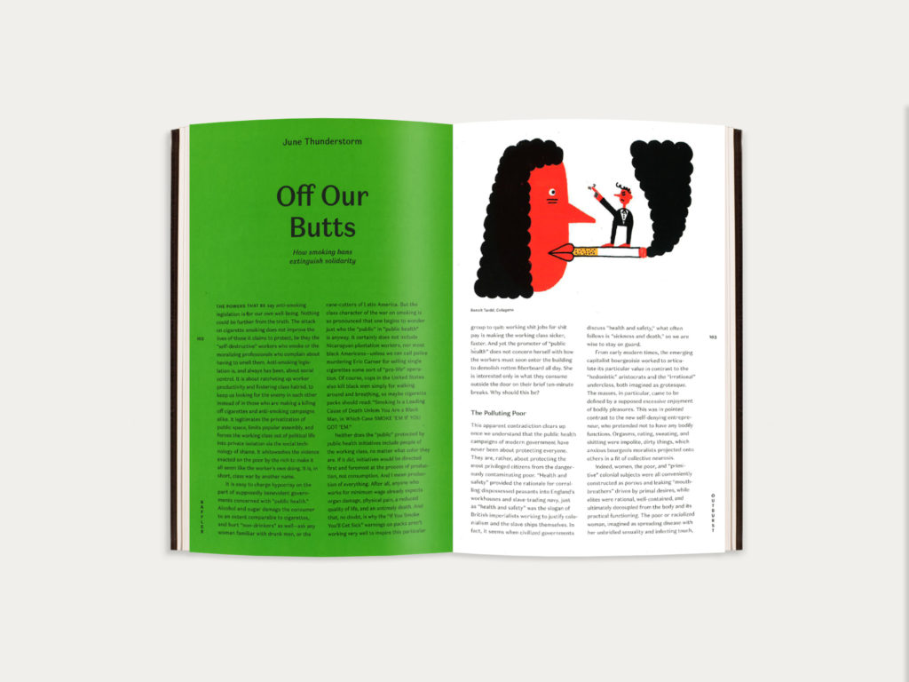
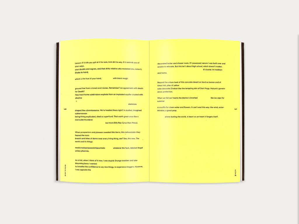
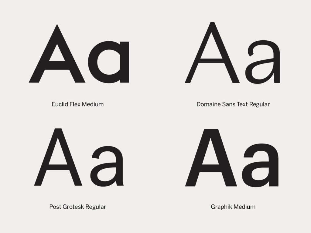
“We tried to make an identity that might successfully scramble all that and accommodate every point of view,” says Opara. That’s expressed itself partially in an eclectic choice of brand fonts: a Domaine Sans, a sturdy Graphik, a sharp Euclid, and a sly Post Grotesk, which are used in different sections to communicate whether you’re reading nonfiction reporting, opinion, or poetry. Bright colors—like polkadots on a fool’s costume—differentiate sections playfully; blue for stories, yellow for poems.
“One of our guiding principles was, we must make sure it’s baffling.”
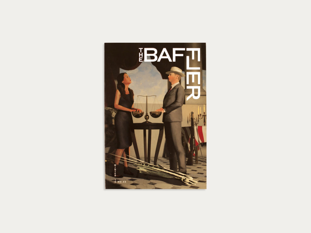
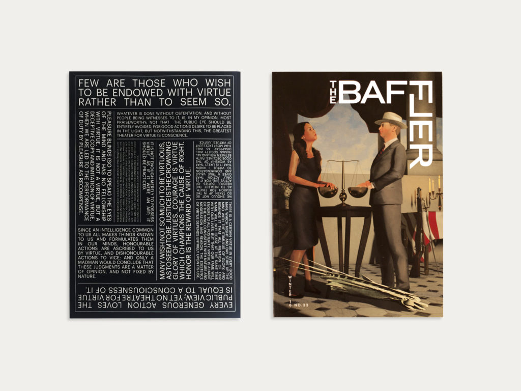
“One of the magazine’s goals is to unsettle. So we flipped the L of the logo, making a kind of jumble. The new logo can be used to frame one corner of the cover, as in the first issue of the redesign, or it might appear in a continuous patter. It’s unpredictable, it’s flexible, it’s engaging. We can’t wait to see what they do with it.”

