
Courtesy of Somewhere Else

Courtesy of Somewhere Else

Courtesy of Somewhere Else
When branding studio Somewhere Else was commissioned to transform Singapore’s oldest architecture journal into “the architect’s magazine,” there was one major rule: photographs were barred from the journal’s cover and kept small inside.
This principle was set out by The Singapore Architect’s new editor Hoo Cheong Fong, who believes that only fools think about architecture through photographs.
Courtesy of Somewhere Else
Courtesy of Somewhere Else
Courtesy of Somewhere Else
Under different editors and designers over the last five decades, this publication put out by the Singapore Institute of Architects had become too “commercial” instead of “craft-based” for the newly-appointed Fong, an architect by training, and his editorial team. “The way they presented architecture unfortunately was not through the eyes of how an architect presents architecture,” he explains.
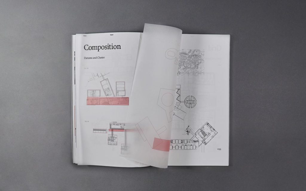
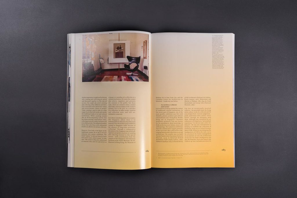
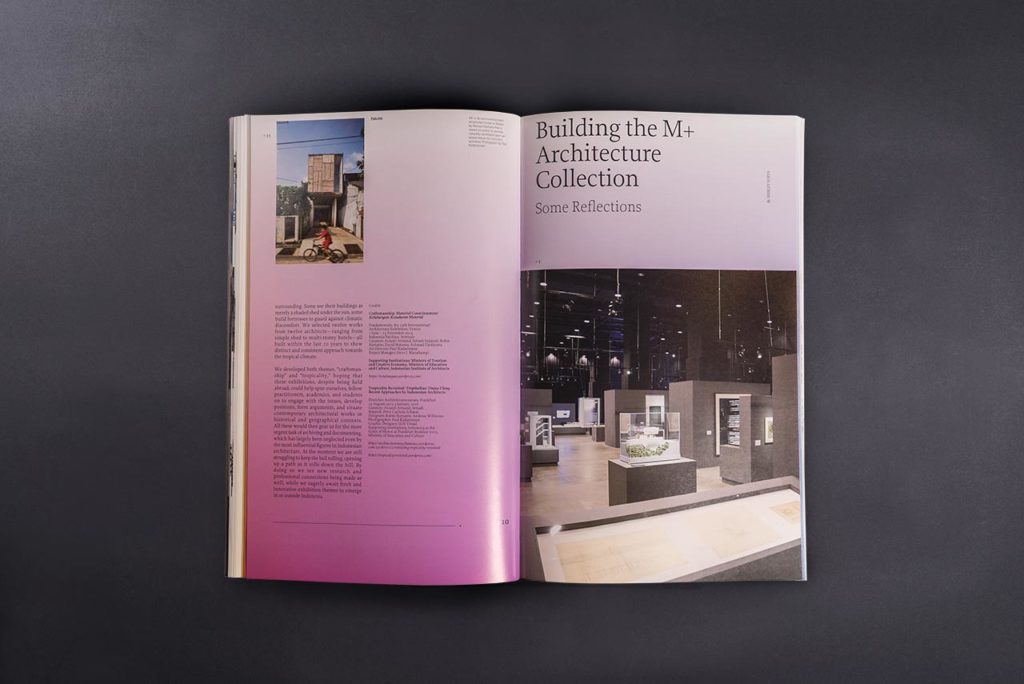
To meet Fong’s other important requirement for readability, Somewhere Else chose to use the typefaces, Proforma and Neue Haas Unica, larger than in typical magazines. In addition, each issue plays with three types of paper—wood-free, matte, and glossy—for the different sections, and also multiple layout formats to accentuate and differentiate the content. Fong compares Somewhere Else’s approach to how architecture determines people’s spatial experiences. “There are architecture spaces and ideas buried within the print media in one magazine,” he says.
Courtesy of Somewhere Else
Courtesy of Somewhere Else
Courtesy of Somewhere Else
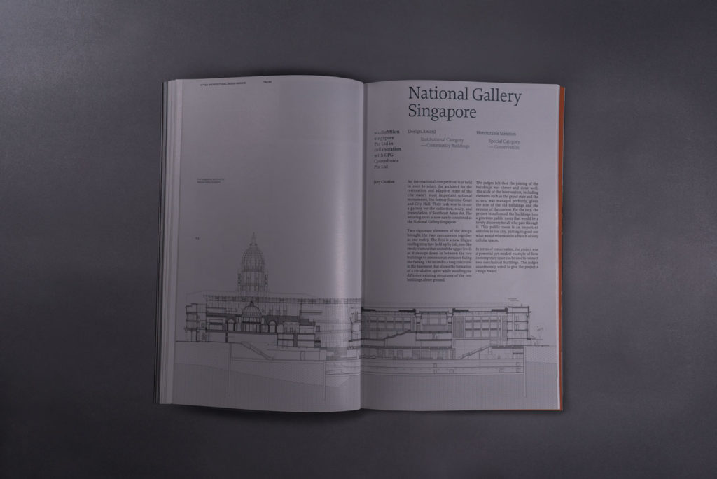
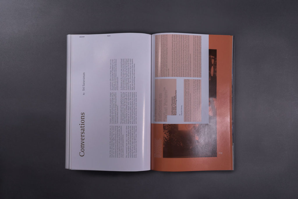
Out went the glamour of contemporary architecture magazines with their architect profiles and luscious project spreads, in came the professional language of architects: technical drawings and plans that give a more complete picture of works, critical essays, as well as a folio in alternate issues focusing on a single architecture element. To achieve this within budget, the part-time team also switched from a bi-monthly to a quarterly journal.
Managing this shift towards “heavy content” without intimidating readers became the basis for Somewhere Else’s approach, explains founder and design director Yong Ng. “We knew from the start that the editorial team wanted something more heavy for the content. But if we jam all the text in it’ll be very boring visually,” he says. Instead, they lengthened the previously A4 magazine to make room for footnotes, which unintentionally boosted the journal’s new declarative masthead above other magazines at newsstands.
Courtesy of Somewhere Else
Courtesy of Somewhere Else
Courtesy of Somewhere Else
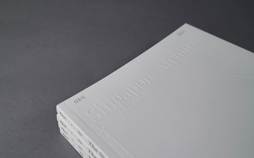
Working with these basic elements, Somewhere Else creates each issue in response to the content, particularly its cover, which always features the first letter of the theme. The inaugural issue on drawings had an all-white cover embossed with an enlarged sketch of the letter ‘D.’ In contrast, the following issue’s cover was all black with a photograph of the institute’s architectural award, which resembles the letter ‘A.’
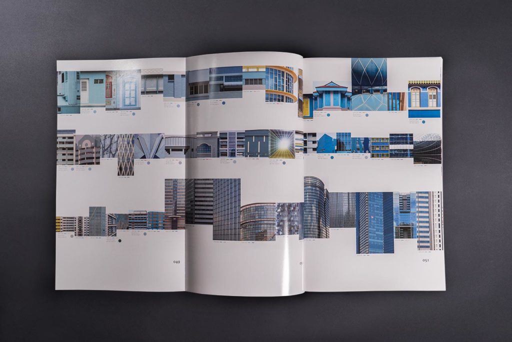
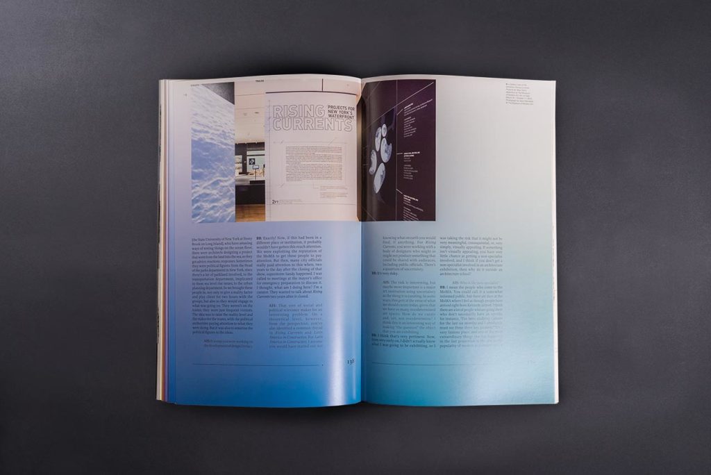
The latest issue on color uses a kitsch silver foil cover which playfully displays the color spectrum without any printing, while inside each page is printed with a gradient background that together forms the full spectrum.
“The framework is set already, but each time we interpret it again, so the design evolves with each issue,” explains Ng, who adds that the institute confidently raised the price and print run of the journal because of the redesign. “I got one comment that ‘each issue is getting cooler and cooler,’ and I think that is the intention.”

