Name Reprise
Designer Robert Holmkvist
Foundry Self-published
Release Date May 2017
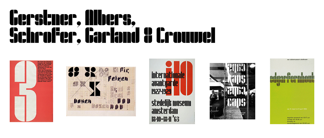
Back Story Reprise was inspired by a 1959 poster featuring a wonderful numeral 3 as a graphic device, designed by Karl Gerstner for the Swiss liberal party. In 2014, Holmkvist decided to see he if he could create a complete alphabet based on the poster’s single number. Hey, how’d it go? “I failed miserably,” Holmkvist says, “considering I was interested to see how quickly I could take a font from idea to release.” After several reassessments, reincarnations, and near releases under different names—and the passage of three years—perseverance finally paid off. The designer triumphed, and released Reprise in early 2017.
Why’s it called Reprise? Many other Modernist design icons besides Gerstner were interested in creating type from basic geometric shapes: Josef Albers, Jurriaan Schrofer, Ken Garland, and Wim Crouwel all experimented with type drawn on a grid, combining squares, triangles and circles to make up letterforms. The 2016 typeface Lustig Elements—created by Craig Walsh and Elaine Lustig Cohen from Alvin Lustig’s doodles dating back to the 1930s—is another good example. “My design is a reprise of Modernist ideas and principles,” says Holmkvist. Perfect name.
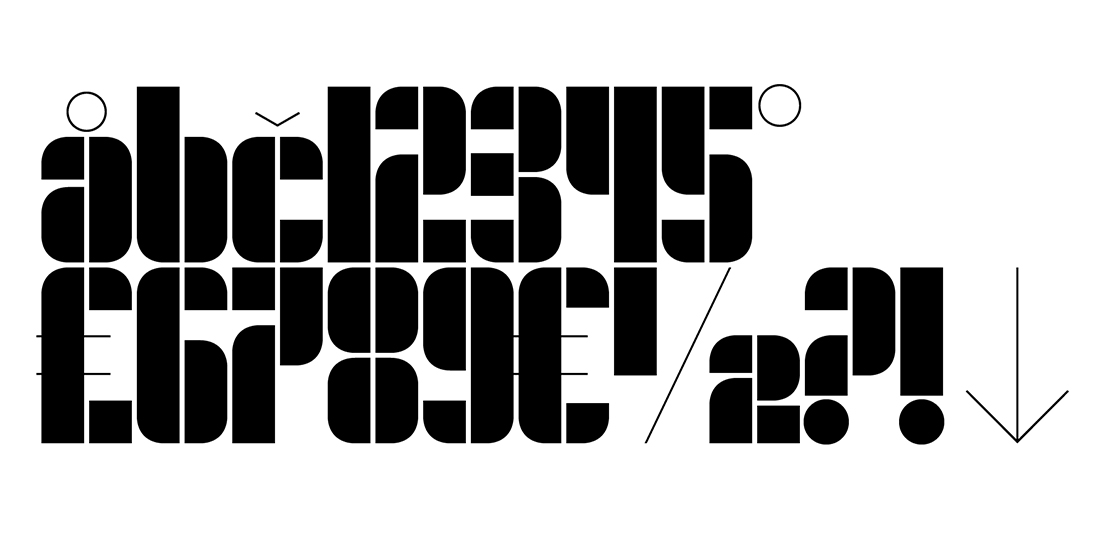
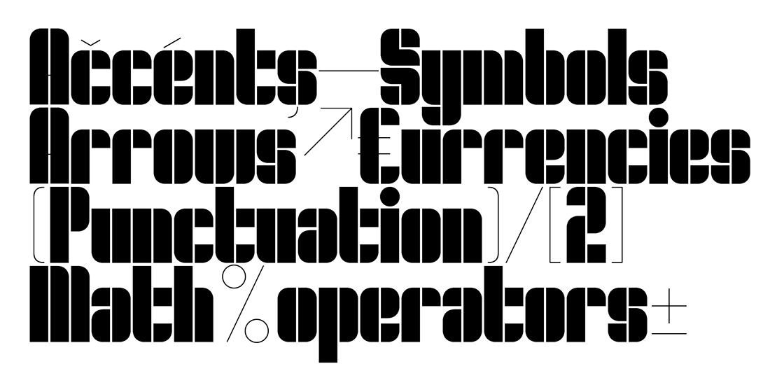
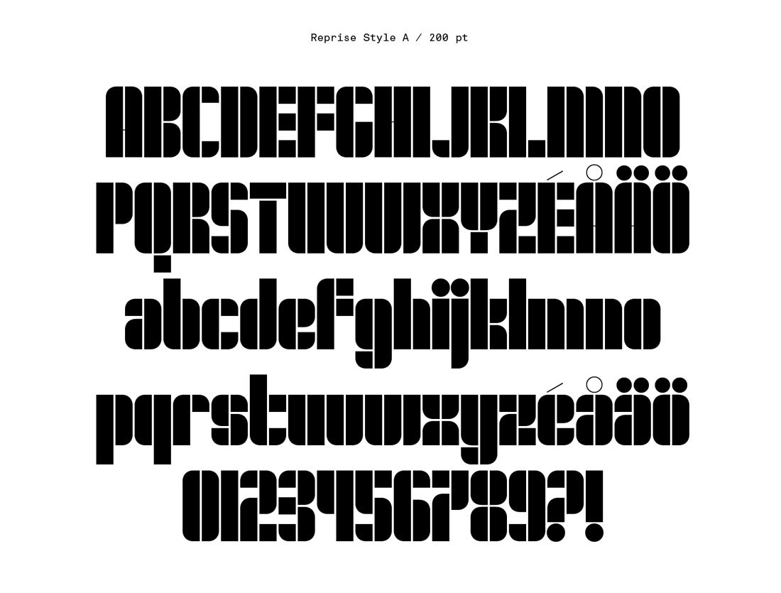
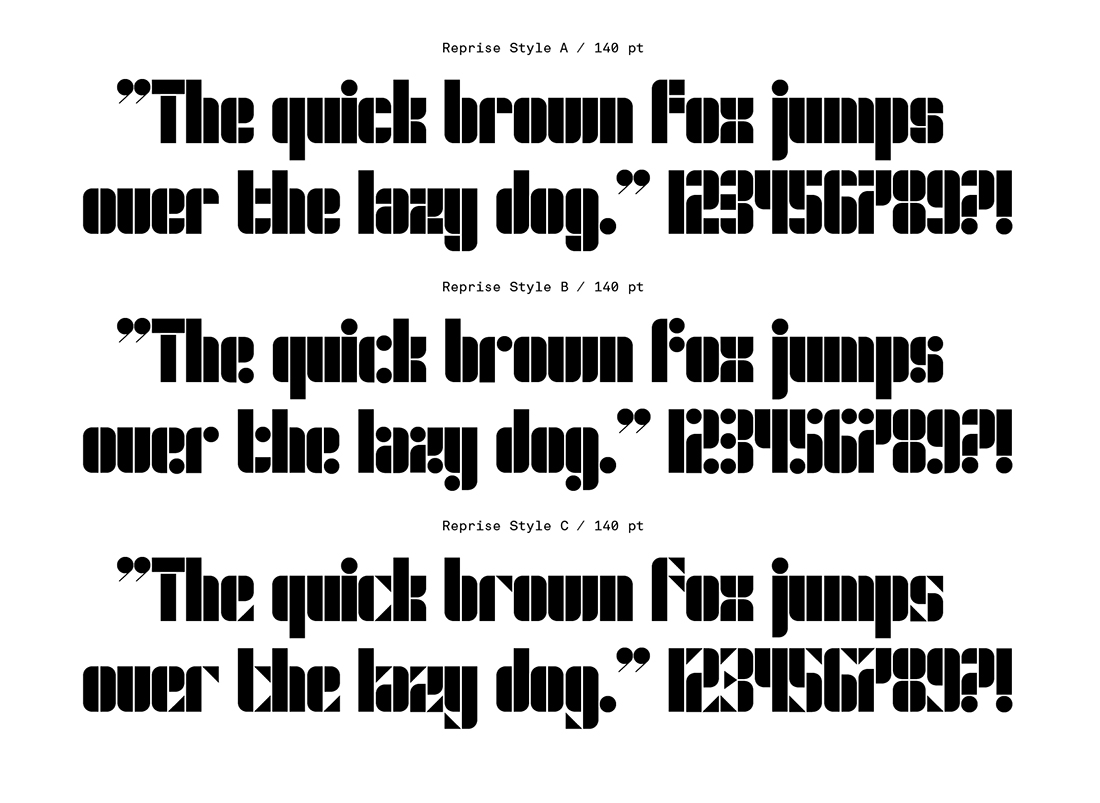
What are its distinguishing characteristics? The grid-based Reprise family features modular base pieces plus three different interchangeable styles for the terminals; elements that mix curves and straight edges, perfectly round dots, or sharp-edged triangles allow graphic designers to create varied yet coherent textures on a page using the same font. “During the process I became interested in type as image,” Holmkvist says. “Could I create a typeface that, regardless of who was typing or what was typed, looked like a piece of crafted and considered design?”
What should I use it for? Reprise is beautiful as a display font, served up in small doses for maximum impact. Holmkvist declines to specify his preferred uses, saying, “I’ll leave that to others. Reprise is conceptual to the point of being absurd; it’s really not made for body copy. However, I am interested to see it used in editorial projects, perhaps in the hands of someone like Matt Willey, or as supergraphics and/or wayfinding akin to the work graphic designer Barbara Stauffacher Solomon created for places such as Sea Ranch in Sonoma County, California.”
What other typefaces do you like to pair it with? Holmkvist says, “My gut feeling is to say something neutral—a sans-serif, a typewriter face—but same as above I’ll leave that to other designers’ capable hands.” Perhaps Pitch, from Klim Type Foundry, or Type-Together’s Ebony, will fit the bill.