
Their name says it all. Confetti, the Melbourne-based design studio founded by former schoolmates Kevin McDowell and Tom Shanahan, was named to embody the “idea of constant celebration.”
Read, then hit refresh on the homepage of their peppy tomato-red website to get a flavor of the duo’s Aussie-antics that somehow implicate George Clooney, Keanu Reeves, Jeremy Piven, Nicole Ritchie, and a cheese sandwich.

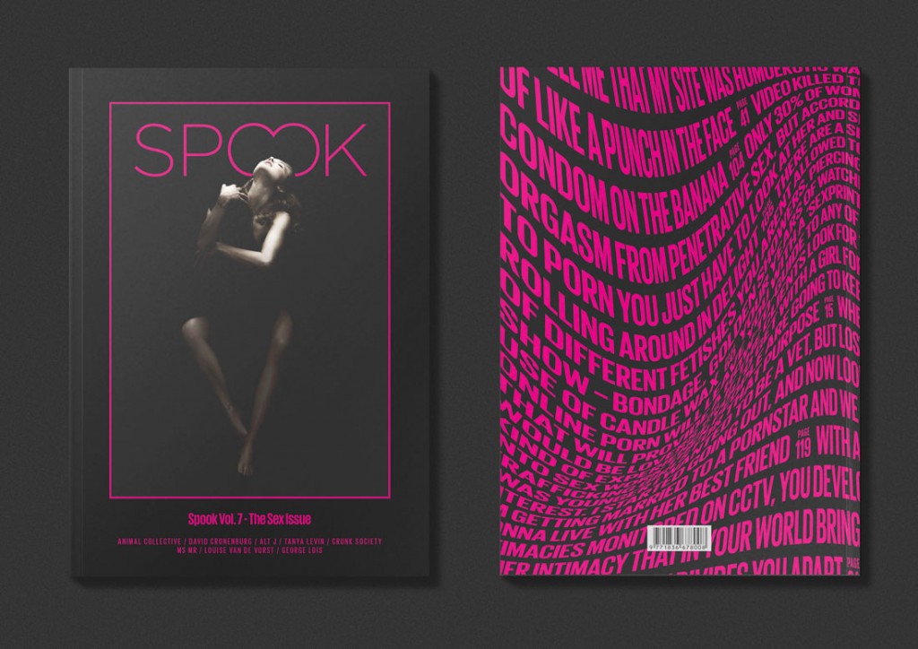
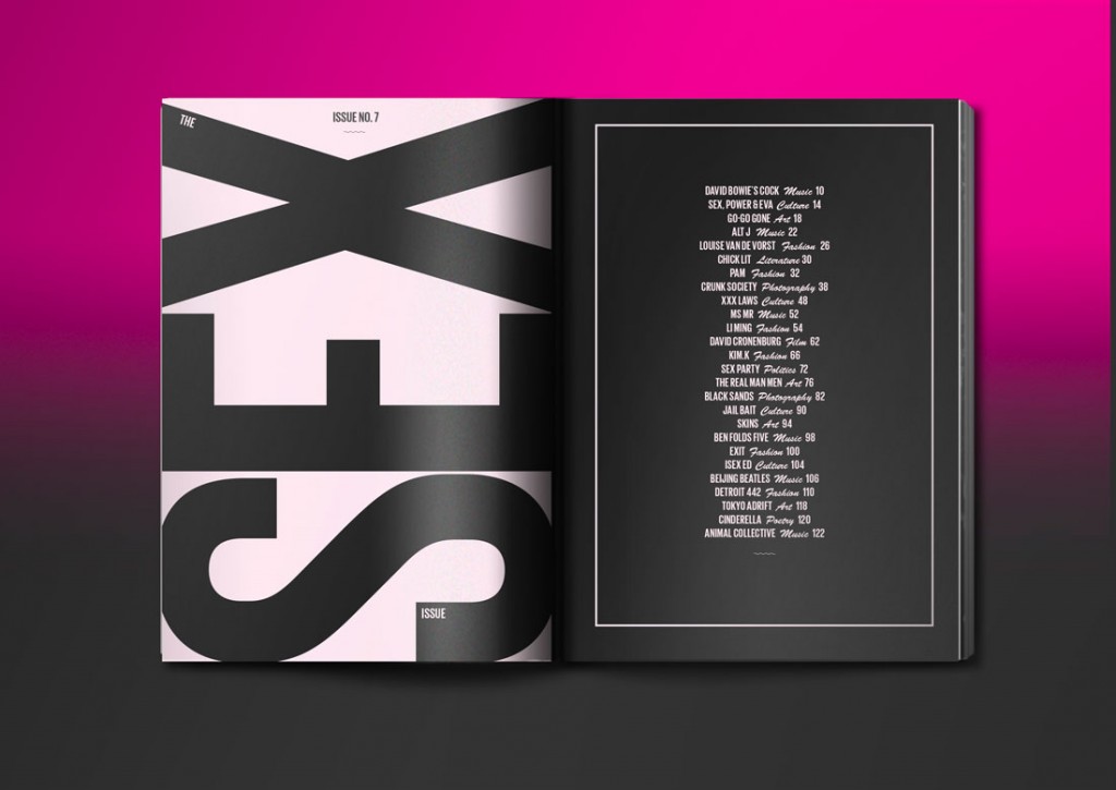
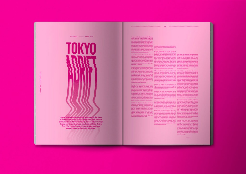
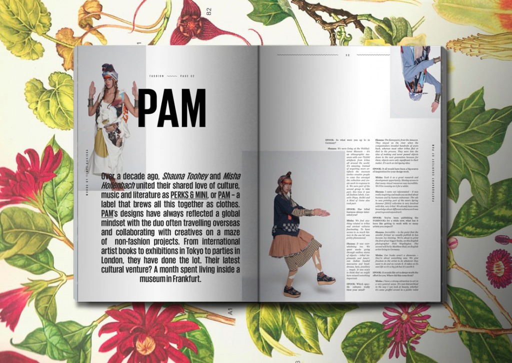
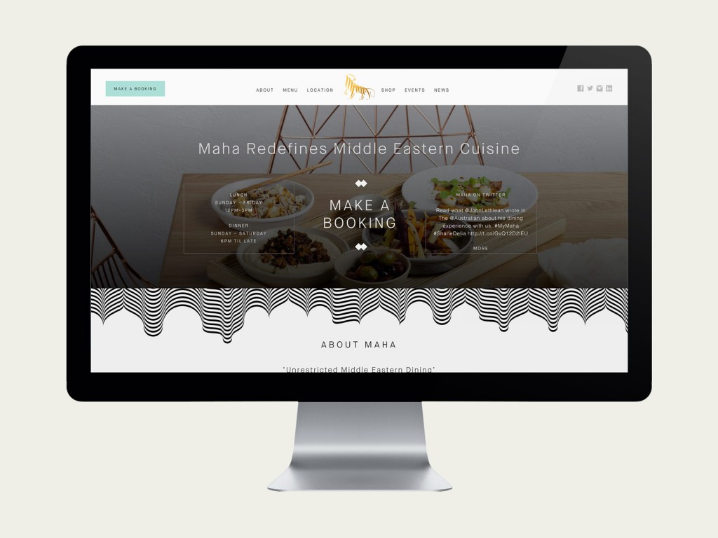
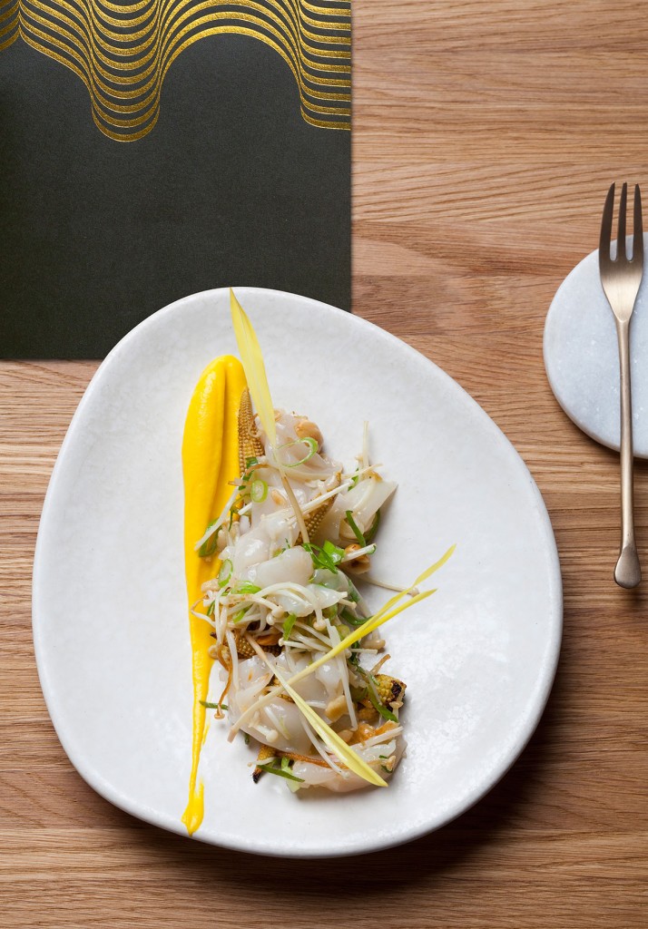
Confetti has been generating some serious raves for their branding work for Spilt Milk and Maja Restaurant, as well as for their strong editorial design for the progressive counter-culture magazine Spook.
We caught up with Shanahan, who took us on a virtual tour around the world’s most fun design studio—at least in that half of the hemisphere.
Can you describe a typical day at Confetti?
Ooooooooo. That’s a tough one. Well, today I was the first one to arrive so I took the batteries out of our developer Guido’s wireless mouse and replaced them with uncooked pasta (penne fits well), because he really loves pasta and his surname is very close to pasta (its Pasa). It didn’t go down as well as I’d hoped. I hid behind our new couch when Kev arrived which meant I caught him talking to himself in an Irish accent about war or corn (not sure). We have a revolving door of about four freelancers these days so it’s hard to say how many people are usually in the studio. There’s Kev and me, then Guido “The Penne” Pasa doing some [web] development work.

You and Kevin are co-directors of Confetti. How do you breakdown the management and creative tasks between the two of you?
Kev is the digital wizard. He designs front-end, back-end, and the space between the two that you and me, as regular humans, cannot actually comprehend. I, on the other hand, cannot even work my way around Twitter without my nephew helping me. My focus is on concept creation, print, and aesthetic. I suppose we’re both creative leads, it’s just that we apply it differently. Kev’s skills and knowledge in typography are unmatched. We both handle the business side of things as well. Anyone with their own studio knows the business side of things will take over if you let it, so we need both hands on deck for that one.
How did you come up with the fab orange-and-gold studio identity?
We just thought it was a good color combo that we don’t see that much (outside of Imperial China). It’s funny that you say orange. Most people do. We have always seen it as red. Maybe color perception is different in the southern hemisphere.
I remember during the letterpress stage, we were trying to colour match to the RGB red/orange on our website (ff3600). We’d run a test print and hold it next to our phones and be like, “Hmmmm, needs more POP.” Then after about three hours of testing and color mixing, we finally settled on a red that was really actually quite close to the one we use on screen. Then we laid down the most intense gold foil we could get our hands on. The legends at Taylor’d Press in Richmond were very patient with us that day.

In a recent interview, you advised designers to “get in deep” when it comes to new challenges. What has been the most challenging (or scary) project you’ve done so far?
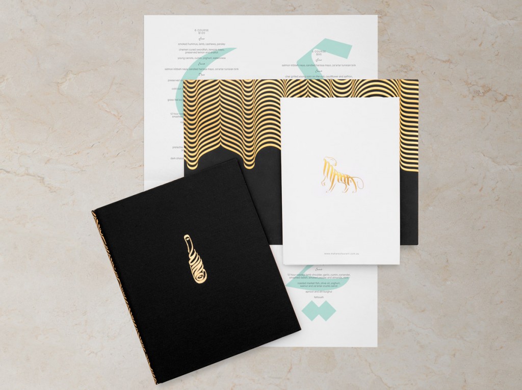
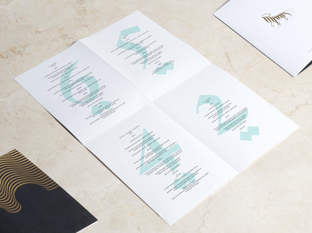
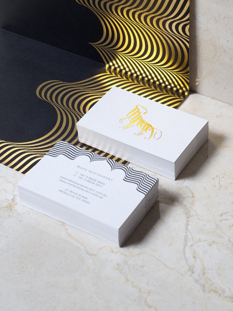
Maybe the rebrand for Maha Restaurant. We were way out of our depth, trying to mimic 5,000-year-old calligraphy found in the Qu’ran for a high-flying celebrity chef who specializes in a cuisine I had eaten maybe four times in my life, in an industry we’d never really worked in.
Since you opened the studio in 2012, it appears that you’ve rubbed elbows with your fair share of celebrities. But is there an artist or designer, living or dead, who you’d still like to meet? What would you ask him/her?
I’d ask Kandinsky how he would hang Yellow, Red, Blue 1925, or if its orientation is open to interpretation because we have a big print of it in the studio and I hung it upside down (an accident at first). You can see a funky cat on the right smoking a red pipe and singing to that sad old dog wearing a hat on his head and a worm on his back. I like that about expressionism and abstract art. I might see a hairy squid writing on a digital typewriter made of mice where you’d see a mask wearing a mask blowing kisses at an endless green field of mustaches. I’m not sure if that’s the point but it’s fun—like watching clouds.

