“Coming together for food is a lovely moment in time,” says Hato Press’ Ken Kirton, a graphic designer and Risograph-print entrepreneur whose approach to design is similar to his cooking philosophy. For their Central Saint Martins graduation project, Kirton and Hato co-founder Jackson Lam created a dinner event where guests had to learn a recipe from around the world from an actual person— cookbooks and the internet were banned. The pair relished the idea of food as a medium to get to know people and to learn.
After finishing University, Kirton and Lam continued to be resourceful: they set up Risograph printers in their bedrooms as the press was small and cheap, and provided a means for them to fund themselves as they set up their own practice. Their love for the simplicity and vibrant colors of Risograph grew, and now Hato is both a design studio and press that boasts an impressive, visually smart client list including Urban Outfitters, The Serpentine Gallery, YCN, and the V&A. Although they’re now focusing on digital apps and designs for London’s leading galleries, food is a topic still very much on the Hato table.
“We’ve just been working on a book with children at The Wellington School in Kent called The Cookbook of Possibilities,” Ken tells me over the phone as we discuss how food and print are the perfect mediums for sharing and education. For the cookbook, Hato and the students created a sourdough recipe that they then used to shape and bake letters. When the sourdough rises in the oven, the typography grows fat and bulges outwards: the morphing shape of the dough helps Hato to teach kids how to change the characteristics of typefaces.
Cooking and typography is a recipe Hato know well. For their Cooking with Scorsese cookbook, which they designed at the studio and printed in-house, they created a typeface inspired in part by old Italian cookbooks and in part by the MGM logo (the references are evoked subtly by vocal stresses on the ‘e’ and a reflected form on the ‘k’). They named the typography The Fourth Lion after the iconic growling Leo. The thin, bright yellow booklet brings together a series of screenshots of cooking tips and recipes from films. “From Ang Lee, we learned how to take out the stone of an avocado with a knife, and there’s also a great recipe from Tortilla Soup,” Ken tells me.
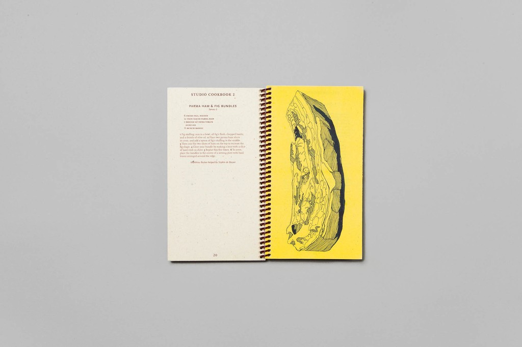
But a love of food isn’t just a topic of interest for Hato, it’s a philosophy. “Everyday we have studio lunches together. One person cooks and then all of the printers and designers come together for an hour to eat and talk.” Kirton’s communal lunch speciality is Japanese food, especially sushi and miso soup (he has a fond memory of eating Bento boxes as a kid); if there was ever going to be a Hato Restaurant (which there might one day be), he’d serve Japanese cuisine. Favorite lunch meals are printed in a Studio Cookbook series, where dishes like Parma ham and fig bundles are illustrated and Risograph printed in sharp yellow and deep blue. These bold colors and flavors have become Hato staples.
The studio and press’ foodie future is looking bright. Kirton tells me they’ve organized a Wes Anderson-themed feast at The Hoxton hotel in London in September, and they’re also planning a Cooking with Scorsese Ramen pop-up at the Art Book Fair at MoMA PS1 in New York. Hato is inspired by how design can educate and inform, and they have a particular taste for tangy yellows, soy-based inks, and gastronomic gatherings.

