
You can tell a lot about a neighborhood through its letterforms—it’s often signs and storefronts that subtly give an area its own unique flavor. Some styles are echoes from the past, like recreations of ornate Victorian lettering; others reflect current trends such as the more corporate, globally minded popularity of minimalist sans serifs.
The variation in lettering hints at how letterforms change with shifting cultural attitudes: the carefully constructed manners and social mores of the 1800s were reflected in fonts with excessive ornamentation and flourishes; which were soon replaced with more minimal forms after WWI, underscoring the new more minimal austerity.
Signage often offers clues to the provenance of the food you’re about to order, just as a great label on a wine bottle can somehow make it seem all the more special. Here, we take you to four classic London fast food joints, each with a sign over its door that that tells a significant story about design and letterform history over the past 150 years.

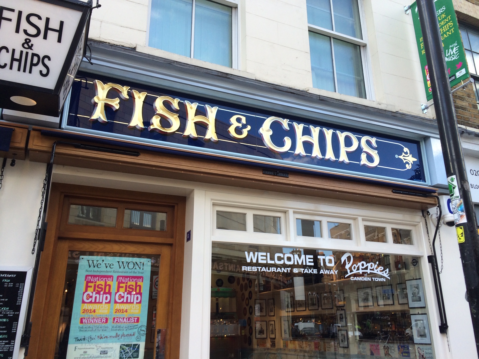
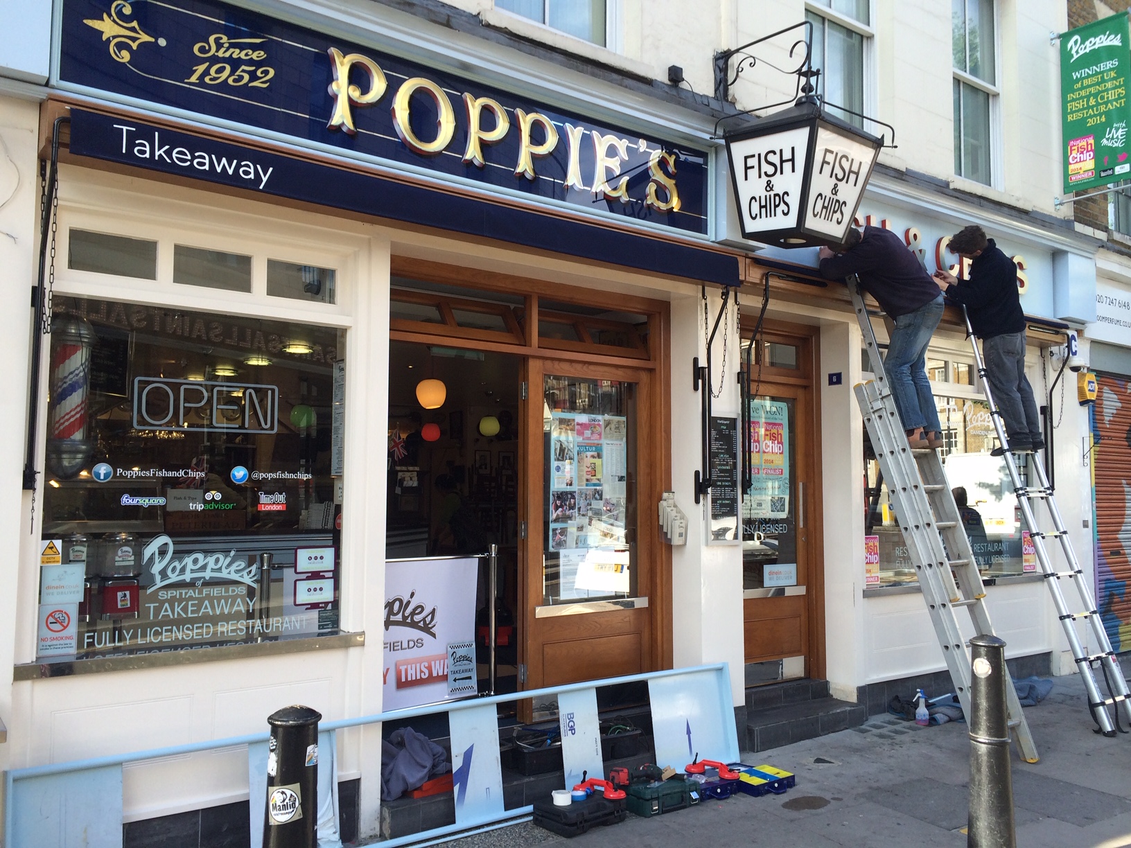
A mouthful of Victoriana: Poppies fish and chips, Spitalfields, East London
This type of signage was hugely popular in the middle of Queen Victoria’s reign, at the same time that the first fish and chip shops appeared. It’s made from pressed copper and glass with gilded letters in a style called Tuscan—also known as fishtail—which is a serendipitous nod to the menu.
“The Tuscan letter takes it name from the most ancient and archaic of architectural ideals, and to me resembles an organic form,” says Ash Bishop of Brilliant Signs, creator of the Poppies sign.
“These are like unfinished Roman serif letters. When you paint a Roman letter with a pointed brush you get Tuscan first, because the two down strokes are not yet connected with a third, horizontal stroke. The style is quick and effective, and always makes me think that it was the first real casual lettering with the perfect balance of speed and style.”

Although Tuscan letterforms had been around for centuries, they were embraced with the Victorian fashion for highly ornamental, decorative styles; from architecture and home furnishings to the typefaces they used.
“This Victorian fascination for overdone decoration and classical forms meant that the place of the Tuscan letter in the typography stylebook was cemented and the style flourished throughout the world,” says Bishop.


Flared letters, fried chicken: Throughout London
Walking around East London you’ll spot an almost universal fried chicken font, as well as hilarious monikers like Perfect Fried Chicken (PFC, natch.)
What these signs all have in common, apart from the color schemes, are the flare-shaped letters which sit somewhere between a sans serif and a serif. “I call them lazy-arsed serifs,” says signwriter Mike Meyer. “Signwriters could use a big brush to paint the letters and just put a quick flick at the end of the stroke, instead of switching to a smaller brush to create the fine serif details.” Although most of these signs are now produced from plastic or vinyl, they retain the memory of the signwriter’s brush.
This imitation game seems to be a uniquely fried chicken phenomenon—no other cuisine seems to have the same level of impersonators. This suggests that there’s something more to it than mere brand appropriation, and that these signs have come to represent an idea. The KFC franchise launched in the 1950s and, by association, I suggest its flare-serif letterforms have absorbed references from mid-century American consumerism such as opportunity, life, liberty, and the pursuit of happiness. Like the curvaceous Coca Cola script, the letterforms themselves have come to symbolize so much more than food or drink.

A taste of Art Nouveau: F. Cooke pie and mash Broadway Market, East London
F. Cooke first opened its doors in 1900, and the cafe transports you back to a London at the turn of a century. Back then, the new Art Nouveau style saw people embrace nature and craft as central to commercial visual language, using flowing letterforms that often featured organic motifs and plant-like curves. Sadly, the shop closed earlier this month.
“Pie, mash, and eels is known as the Londoner’s Meal. Cheap, nutritious and filling, a dish of pie, mash and eels was the Victorian equivalent of today’s pizza or fried chicken, only better for you,” says Melanie McGrath, author of Pie and Mash down the Roman Road: 100 years of love and life in one East End market.
“At the height of their popularity between the fin de siècle and WW1, there were more than 150 pie and mash shops in London serving the capital’s working class population—from factory workers, seamstresses, and costermongers, to Billingsgate [an east London fish market] porters and stevedores.”
The slightly psychedelic feel to the letters seems fitting for a meal that is served with liquor—a bright green sauce made from eel water, parsley, and spices that dates back to the earliest eel street sellers.
While graphic design fashions have changed, this sign remained constant for more than a century, hinting that the food being served up by each generation of the Cooke family is an original recipe from the past.

A slice of NYC: Voodoo Ray’s, Dalston, East London
Dalston has been radically transformed in recent years and the bright neon Voodoo Ray’s sign has brought the bright lights of New York to this part of east London. These glowing geometric letters, reminiscent of the signage of Manhattan’s Radio City Music Hall, want to tell punters that they won’t just be eating pizza, but biting into a slice of NYC itself.
“By-the-slice dining and the style of pizza that Voodoo Ray’s are famous for are both very New York, so the city definitely played a part in the inspiration for both the branding and the signage” says Liz Bisoux, creative director of Studio Partyline, which created the Voodoo Ray’s branding. “We were inspired by the visual culture of both fast food and NYC itself, mixing 80s donut drive-ins with the big theatre signs like ABC Studios or Harlem’s Apollo Theatre.”
She adds, “When the Voodoo Ray’s sign went up [it opened in 2012] there weren’t really any lights or signage in this part of East London so we really wanted it to shine out down the street, calling hungry people to this great late night spot. Now the whole street has joined in on the neon action.”

