


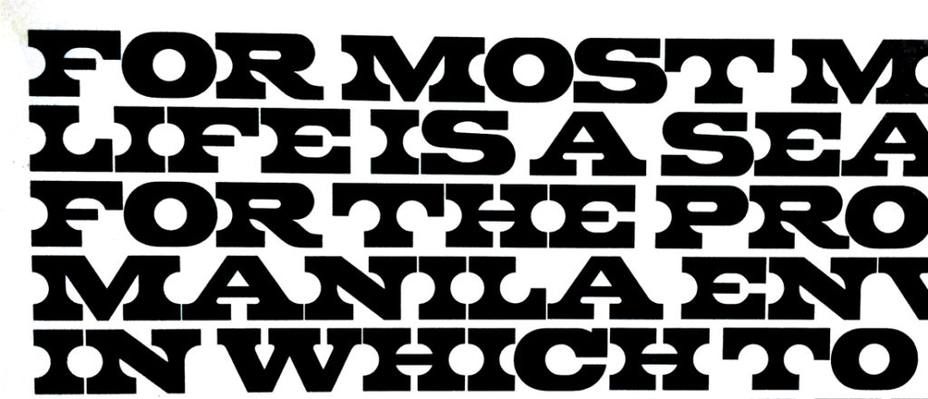
Sometimes 2D forms (like typefaces) take on unexpected lives of their own—an increased presence, a grandeur even—when reimagined as 3D objects. This is no secret to Michael Prisco and Helen Sywalski, 2016 graduates of the Cooper Union’s School of Art, who received the prestigious Rhoda Lubalin Fellowship for seniors who demonstrate excellence in graphic design. Their project Type High: Experiments in Dimensional Design and Typography, explores typography as a sculptural art form that plays with positive and negative space, a reference to the physical origins of typesetting as wooden or lead letterforms. We spoke with Prisco and Sywalski about the show, including how they built the four-foot-tall letters—A, B, and C—that visitors can walk through, around, and even into.
Take us through your design process—how did you get from flat, printed letterforms to large-scale sculptures?
Helen Sywalski: We started by poring over type specimens in the Herb Lubalin Center, since this was a research-based fellowship that uses the collection as an entry point.
Michael Prisco: We weren’t interested in alphabets that were dimensional or extruded. We were looking for interesting forms and counterforms.
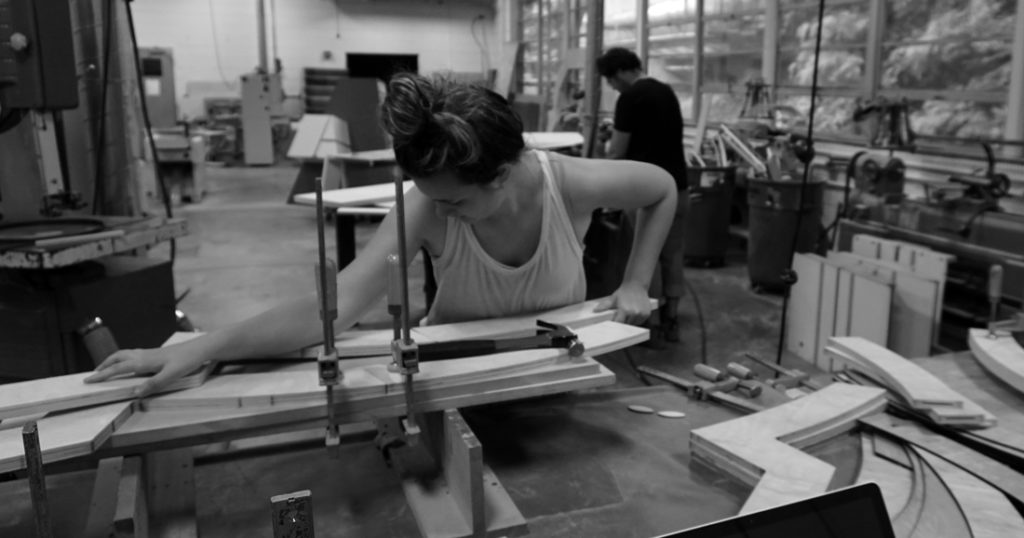
Sywalski: Next, we executed a series of classic type studies of positive/negative space and started to abstract them. To build the sculptural letters, we made both computer and hand-drawn sketches, and Michael did a few digital 3D renderings. We made some adjustments to the proportions as we worked, almost like adjusting optical sizes for a print typeface.
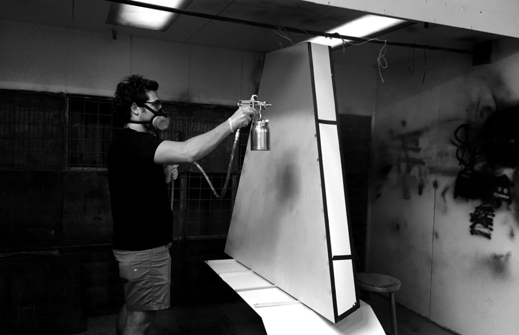
Prisco: My dad is an industrial designer and furniture designer, and we fabricated the letters at his studio in North Carolina. All the forms disassemble so we could pack them into a van and drive them up to New York when we were done.

What typefaces are the letterforms based upon?
Prisco: For the A, each side is different. One is a sans serif (ITC Franklin Gothic), and the other is a slab serif that we designed.
Sywalski: The B is inspired by a William H. Page chromatic wooden typeface. C is based on Giorgio; its negative spaces are really strong geometrics. It was fascinating to imagine Giorgio in 3D, since it was drawn to look dimensional in print. I wanted people to stand inside the letterform sculpture and spatially feel the thicks and thins of its serifs and counterform.
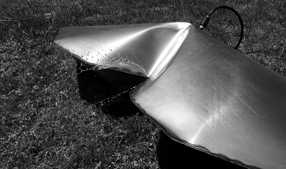
How did you make the B out of metal?
Prisco: It’s hydroformed!
Sywalski: You weld two flat shapes together, drill a hole for a spout, and hook it up to a pressure washer. It slowly fills with water and expands. Eventually the water breaks the seam and that’s how you know you’re done. It’s slightly unpredictable in terms of where you end up with your 3D shape; you can’t control it.
Prisco: We made a representation of a chromatic layer out of a different material, in this case plywood, like a little drop shadow for the metal form. I love to see people interacting with the B. It’s very tempting to rap it with your knuckles because you know it will make that great, really satisfying hollow sound.
Do you think you might do something like this again?
Sywalski: Absolutely. This was such an amazing experience.
Prisco: Oh yeah, we’re trying to figure out where these things could live.

