
For the uninitiated, hardcore was a subgenre of punk that has since become most famed for its more political movements (that’s political with a small “p”), including many fans’ adoption of a lifestyle that embraced gender equality (to an extent), veganism, and a tee-total “straight edge” policy that meant no booze, no drugs, and sometimes even no sex.
Many posit that said tee-totalism was born of the “x” marked on the hands of many young fans who wanted to go to shows but were too young to drink, so staff knew not to serve them. But that didn’t stop them from a joyfully outlandish embrace of the music, and often some very, very wild moshpits, bruises, and general lunacy.
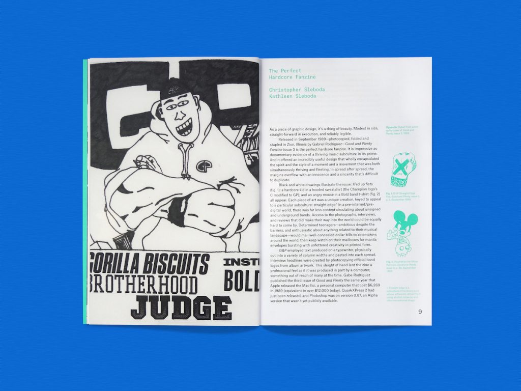
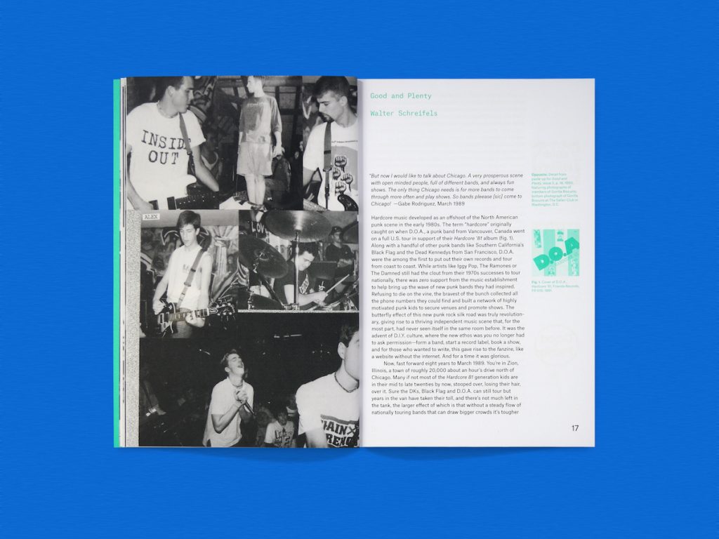
The hardcore movement and the bands that exemplified it has been documented in many a zine, and a new book celebrates one in particular, Good and Plenty, published as a “labor of love and fandom” by Zion, Illinois’ Gabe Rodriguez. Zooming in on its seven issues produced between 1989 and 1992, Hardcore Fanzine: Good and Plenty is a beautiful and fascinating little tome produced with contributions from graphic designers and design educators Ian Lynam, Nate Pyper, Briar Levit, Ali Qadeer, Gabriel Melcher, and Kristian Henson.
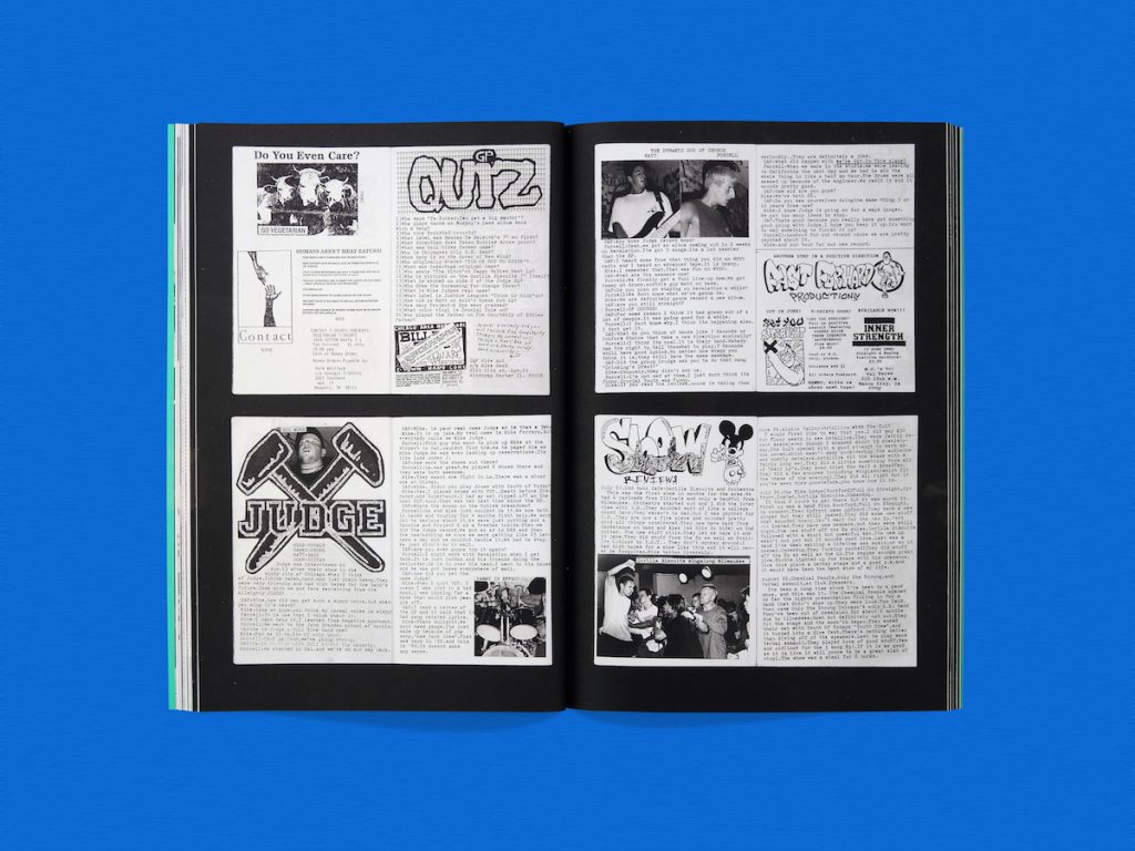

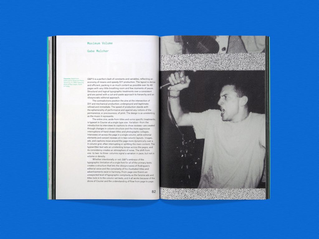
Published by Draw Down Books, the book examines the zine with a focus on its graphic design and typography, meaning we get a snapshot of a pre-internet era in which zines were still made by rudimentary photoduplication. Written by Christopher and Kathleen Sleboda, Hardcore Fanzine positions zines as central to creating alternative social spaces, just as they do today, but with a perhaps greater sense of urgency in a time where “community” was firmly a physical thing (in printed pages or gigs, rather than message apps or social media). It also examines how such zines have made an indelible mark on designers in both their approach and their output.
Good and Plenty has a personal significance to the pair: Christopher started reading it in high school, having discovered it through a friend who, like him, was getting into skateboarding, punk rock, and hardcore. Not long after, he started his own zine, which proved to be the first of many, and began acquiring a collection of hundreds of others covering similar themes. Being part of the hardcore scene at the time meant that he was continually designing album covers, posters, catalogs, logos, and making band videos, and he went on to pay for his design education using the money he made from distribution, including an MFA at Yale. San Francisco-born Kathleen’s roots are more in riot grrrl, punk, rockabilly, and psychobilly, but she too was making flyers and posters, and collecting zines from an early age. “Making zines basically was about applying and acquiring skills [in graphics, photography, layout and so on] even if you don’t realize it at the time,” says Christopher.
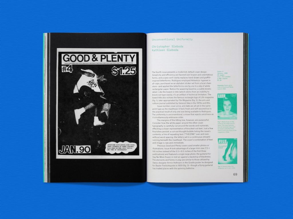

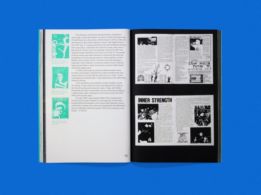
When the writers contacted Rodriguez about the book, it turned out he still had all of the original paste-ups he used for Good and Plenty, and shipped them over the cut-and-paste layouts. “We had only previously seen the published zines, which were always printed in high contrast black and white; the mock-ups featured original photographic prints,” says Kathleen. “It was a thrill to see all the production details up close: the impressions of the typewriter Gabe used, the columns of text still carefully taped into the spreads. As we considered [Rodriguez’] archive, we realized that G&P was an excellent case study. The issues evolved, transitioning from cut and paste productions to offset printed issues.”
That transition neatly exemplified both the personal nature of zine production and the time’s technological transformations, such as the advent of desktop publishing, and “the way subculture knowledge was produced and transmitted in the pre-internet era,” she adds. “G&P documented an exciting period in hardcore history, and we felt that the social themes in the issues were of ongoing interest.”

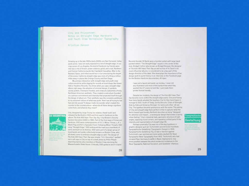
While stylistically and production-wise hardcore scene zines have a fair bit of overlap with their punk forebears—and of course, were produced with the same purpose of documenting the bands and areas at the heart of the genres—where they differ can be seen by zooming in on the typography. The 1930 typeface City (designed by Jorge Trump and first used in hardcore on 1982 album The Kids Will Have Their Say by Society System Decontrol) and Princetown (released in 1981 by British designer Dick Jones for Letraset) were prominent in straight edge album design and by bands for their logos, as Kristian Henson’s essay in the book, “Vernacular Typography,” points out. The “adoption of minimal design” subverted a “firmly Northeast American aesthetic,” Henson writes, adding that hardcore fans “were creating a subculture laid out by a serious commitment and intensity that projected itself through the design of album art. Their aesthetic was the complete antithesis to my assumed notions of what was punk.”
“The adoption of minimal design subverted a “firmly Northeast American aesthetic”
What Henson means by that antithesis is the adoption by a small community of straight edge kids in New England of Varsity jackets instead of leather jackets, and Nike hi-tops instead of chunky black boots—which soon spread to hardcore communities nationwide. “It’s hard to explain how crazy this was,” says Henson. He adds that the conflation of punk and everyday suburban culture “managed to really aggravate the scene” as it moved to New York’s Lower East Side.
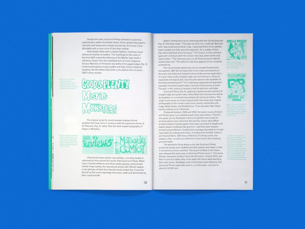
The impact of the zines that emerged from that scene is hard to underestimate, and one of the book’s contributors, Ian Lynam, notes that the resurgence of “scanner glitches/stretched typography” are “visual hand-me-downs” from 1980s skateboard zines like Bend and Swank, which acted as visual precursors to the likes of Freestylin‘ and Raygun magazines, as well as showcased a resurgence in what he terms “British aesthetics” in early ’90s zines’ use of its 1950s typefaces. This can be traced to contemporary work such as that of Zak Kyes for the Architectural Association, and Mark Owens’ pieces for Dot Dot Dot in the 2000s, according to Lynam.

Among the highlights in the book are spreads from issue six, which focused on addressing sexism in hardcore and punk straight edge. Rodriguez invited a number of his friends who are women to write about their experiences for that issue, “and the results are a fascinating record of teenage gender relations in the late 1990s,” says Kathleen. “There was a real effort to raise consciousness about consent, rape culture, and patriarchy.” This was just one instance in which, as mentioned above, the hardcore scene was about more than the music: it was community building, and frequently with equality and social values at the fore.
Many of the writers featured in the book are also design educators, and Lynam credits zines as superb tools for teaching type, image-making, editorial design, and learning about prepress, thanks especially to their fundamentally anachronistic, experimental format. “They are an example of the postmodern notion of “the designer as author,” when you literally write the content, make the images, make the typefaces, do the design synthesizing all of the stuff that you have generated, and then print them yourself,” he says. “[Learning from zines] also helps connect students to historical forms of subculture and makes them feel as if what they are doing, making, and living, is an extension of history and invites them into the continuum of graphic design and DIY culture.”
“Every designer may not be a zine-maker, but every zine-maker is a designer.”
The book’s general premise borrows from the Marcel Duchamp quote “…while all artists are not chess players, all chess players are artists” and skewing it into the assertion that “every designer may not be a zine-maker, but every zine-maker is a designer.” This means that the very act of producing such a piece of print and putting it together is inherently about considering the relationship between image and text. “We wanted to honor vernacular design—‘design in the wild,’” says Kathleen. “If the art world can have room in the canon for art brut and art made outside of the academic tradition, we believe that graphic design can recognize design traditions that arise outside the academy as well.”

