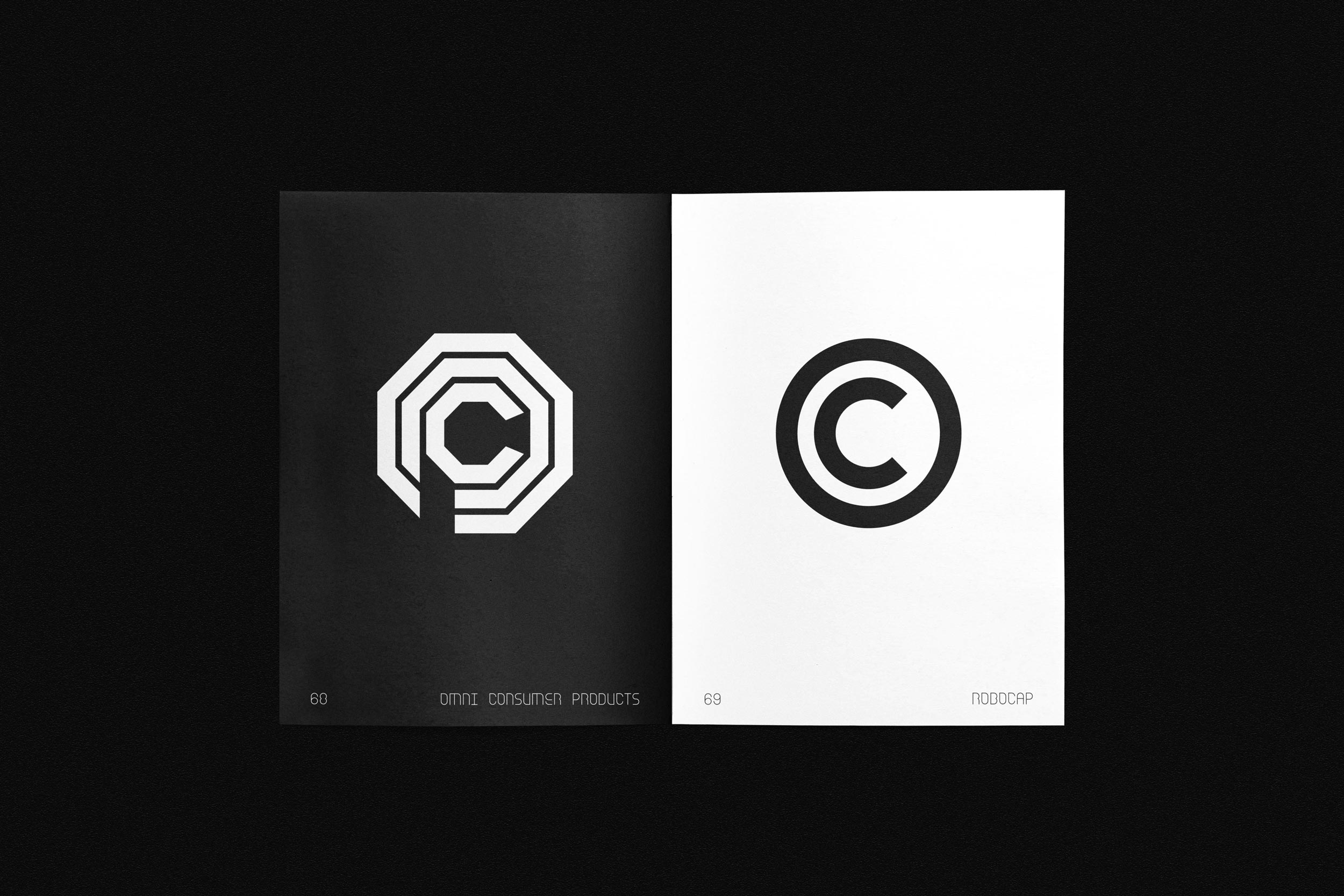
Name: Robocap
Designers: Nikolos Killian and Tanner Woodbury
Design Studio: Forth + Back
Release Date: Spring 2020
Back Story: What happens when 10-year-old kids watch films that are probably inappropriate (too scary/mature themes/graphic violence/language/nudity, the whole nine yards)? Well, what do you know… the kids live through it. Some even grow up to be designers, and those lingering memories of things seen and felt at the movies get woven into an interesting typeface. Killian and Woodbury were fourth-graders when they first watched director Paul Verhoeven’s 1987 classic RoboCop, and the film’s otherworldly themes and visions of dystopian futures stuck with them long enough to find their way into the design team’s East L.A. practice.
“We’re not sure if it was our general affection for the film or the RoboCop action figure we keep around the studio, but somehow it all began to creep into our consciousness,” says Woodbury. “We became fascinated by the idea that iconic narratives remembered from childhood could influence and form the foundation for typographic exploration.”


Why’s it called Robocap? You know why.
What are its distinguishing characteristics? RoboCop’s human past haunts him, lingering as remnants of morality and conscience. This apparent character flaw, which causes him harm throughout the film, ultimately proves to be his greatest advantage at defeating his adversaries. Oh, you meant the typeface?
Robocop’s aforementioned traits are reflected in the font’s jittery rhythm of curves and oddly shaped counters contrasted with ramrod straight strokes. The type family comes in four weights, inspired by the four directives programmed into RoboCop (serve the public trust; protect the innocent; uphold the law; any attempt to arrest a senior officer of OCP results in shutdown). An insidious set of alternate characters breaks down and collapses the forms of their respective glyphs. Robocap evokes monospaced typefaces such as OCR-A and OCR-B—those classic retro-tech fonts we’ve come to associate with visions of the future—but with odd little peaks and breaks throughout the letterforms.
“We unintentionally deleted a point along one of the character’s paths and became surprisingly enamored by the resulting form,” Woodbury says. “At the beginning of each film, RoboCop was presented as a pristine metallic specimen of the future, yet he would inevitably end up beaten down and damaged by his endless pursuit to uphold the law. All of the resulting imperfections made him look more authentic—or at least much cooler.” The designers clearly kept this in mind as they hammered out Robocap’s letterforms.
What should I use it for? Any creative situation calling for an authoritative yet endearingly human typeface. Designed to be used primarily as a display font, Robocap lends an aura of hi-tech precision and a no-nonsense toughness.
What other typefaces do you like to pair it with? Directives 1-4 mix and match nicely together. Robocap annihilates everything else! Kidding aside, Futura evokes similar visions of space and machine-based environments (it was, after all, the first typeface on the moon), as does Eurostile, used in so many sci-fi movies it’s become almost a kind of shorthand for evoking the future. Or try Bank Gothic, Eurostile’s 1930 precursor designed by Morris Fuller Benton.