Type designers have a bit of a reputation for being meticulous, which makes sense considering the nuances of creating letterforms that are equal parts beautiful and functional. But for some type nuts, there’s more to it than aesthetics and usability. In the mid-1950s, it was posited by academics Aaron Edwards and Charles Harrington in their labs at Indiana State University and the University of Vermont, respectively, that there’s a highly scientific basis underpinning lettering—the notion that printed letters are made up of molecules. Their argument spurred a decades-long Molecular Typography movement that looked to explore and express that letters in print all have chemical and physical components in that they’re formed of actual particles.
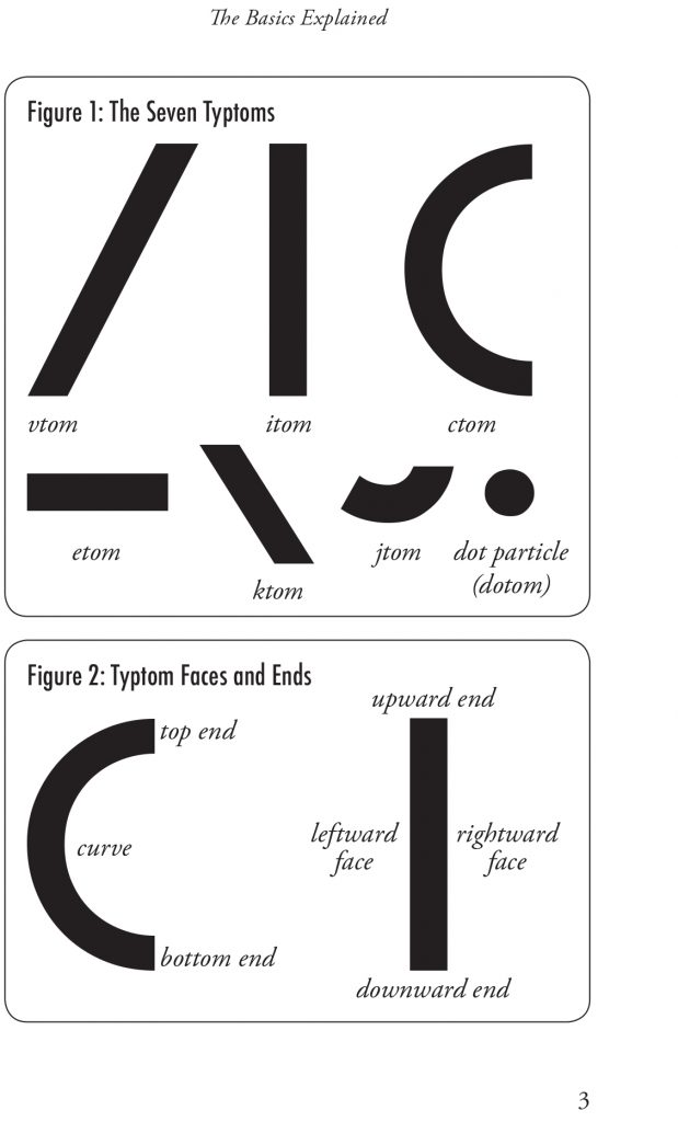
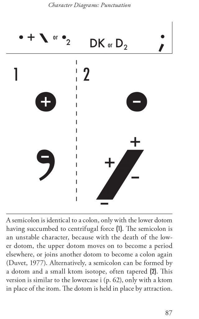
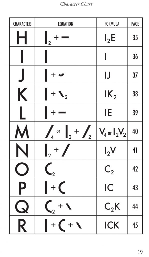
It was a small but significant movement, and one that united the science and design communities. Around 40 years after the research into Molecular Typography began, the 1992 book Understanding Molecular Typography was published by H.F. Henderson to draw together the work in the field into a concise publication that, at the time, was considered hugely influential. The book is both a primer in laying out the basic principles of Molecular Typography and a field guide of sorts, using detailed but clear diagrams to show how molecules form letters, numbers, and punctuation marks.
“The metaphorical implications of the work might be the most important after all.”
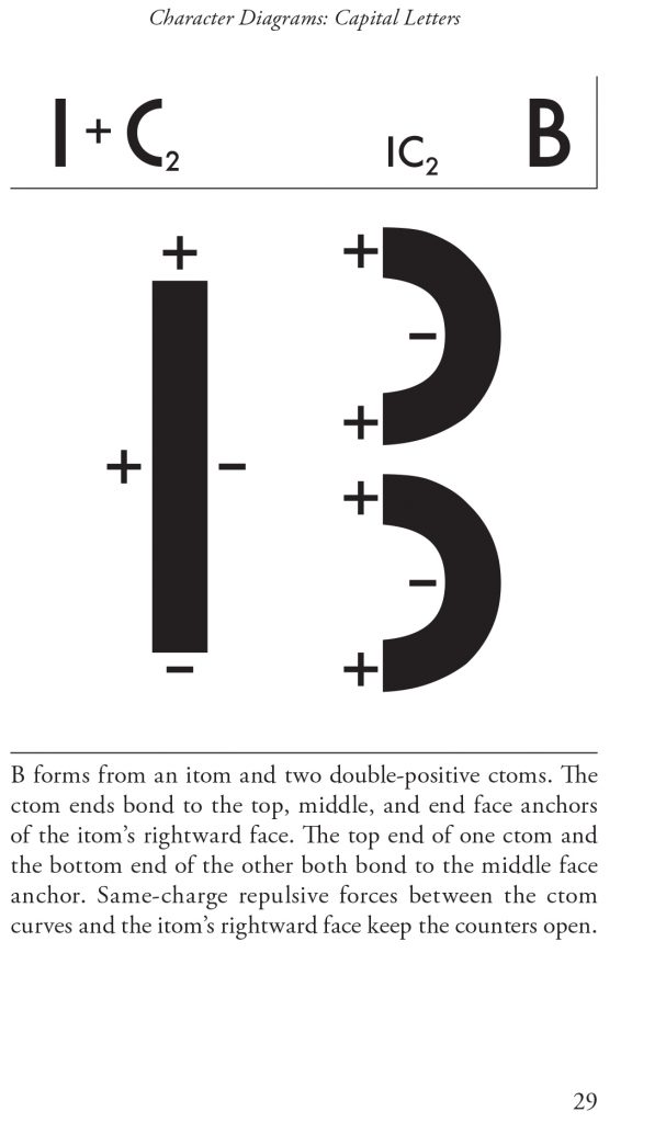
The core concept of Molecular Typography is that type, when in the form of ink on paper—like all matter—is made up of molecules. As such, it has chemical and physical foundations, which inherently means that when we make letterforms, we make physical structures that are formed of more than meets the eye.
However, almost concurrently with the book’s publication, Molecular Type fell out of favor—until, perhaps, now. Toward the end of last year, Ugly Duckling press republished the book with a new introduction by artist, writer, and bookbinder Woody Leslie. The publishers suggest that the decline of the movement was in part due to the fact that “improvements in digital type technology obviated some of the need to understand the chemical basis of print,” since screen-band letters naturally lack the chemical characteristics of their print counterparts. Even now, the idea of Molecular Typography feels radical—but also very relevant, since it inherently demonstrates the unethical side of print at a time when climate crisis issues are more pressing than ever. As the publisher points out, understanding the molecular makeup of ink and paper, and the letterforms that result, draws attention to the fact that even typography is a physical entity with environmental implications.
“Peculiar as it may be, molecular typography is… a science worthy of being brought back to mainstream attention, if for no other reason than demonstrating humanity’s frequent scientific misconceptions throughout history,” writes the publisher.

It took me a while to get my head around the concept of Molecular Typography, until Leslie points out in his introduction that there are “no metaphors here,” as I’d mistakenly assumed on reading the book’s title. Printed letters, he writes, “are in fact really molecules.” He implies that the science behind Molecular Typography eventually waned because it “was largely dismissed by corporations and governments averse to further regulations [on printing].” The hope, with the book’s republication, is that increasing activism around climate change on both a personal and (at least outwardly facing) business level has paved the way for Molecular Typography to make a comeback—at least in the design community.


To me, a comeback seems unlikely. It’s not an easy concept to grapple with, and even Leslie admits that his interest in reprinting the book is mostly about making it available to a wider audience “out of a respect and awe for its creator’s determination.” Despite the clarity of the book itself, and its links to contemporary climate crisis, it seems to me that few would likely be willing to see Molecular Typography as the key to understanding printed letters. But fully understanding the concept may also be besides the point. “In the long run, it turns out that the metaphorical implications of the work might be the most important after all,” says Leslie, hinting at the fact that the reissue might be most beneficial in reminding people that printed objects have an environmental impact.
Plus, there’s something poetic about the assertion of Henderson that “letters are in fact living organisms.” As Leslie puts it, “For those of us who are writers, printers, typographers, and poets, letters are already living organisms, and we don’t need science to prove it. But thinking about letters in this context brings new insight and inspiration to our work.”