

In 2013, Google co-founder Sergey Brin helped fund the world’s first synthetic hamburger. He asserted that meat grown in a lab would reduce the environmental impact of livestock production and resolve the ethical implications of factory farming. Whether or not the burger was worth its $330,000 price tag, the fact that it could one day be on the menu marks a new era in which technology can completely reengineer what we eat; call it Food 2.0.
Today, dozens of venture-backed startups are developing prepackaged meals in liquid or powder form, also known as Complete Food systems, which promise enough nutrition to theoretically eliminate the need for “real” food, making it more of a recreational pastime than a necessity. Sure, meal replacement products have been on the market for decades, but these aren’t your mother’s diet shakes, and one of the key difference lies in the branding.
Where the Slimfasts and Ensures of yesterday were sold specifically as weight-loss products, today’s liquid lunches target the savvy, modern early adapter who’s tired of wasting time and money on daily meal preparation, or who’s interested in living a more sustainable lifestyle.


Brands with space-age names like Soylent, Huel, and MANA tap into our collective imagination of a cleaner, smarter future that now feels as reachable as a tall glass of their finely engineered products. Seriously, if Buckminster Fuller’s Dymaxion House had ever been mass-produced, he would have stocked the refrigerator with bottles of Soylent. In fact, these Complete Food companies share the same Utopian optimism for technology that was present in the designs of many postwar Modernists, Fuller included; and the belief that we can make the world a better place through pragmatic, functional design is clear in the mission statements and streamlined packaging of many Food 2.0 brands.
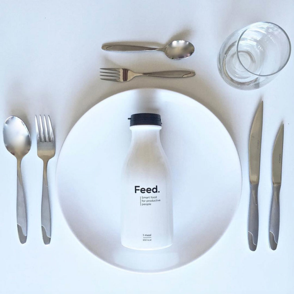
With so many food tech companies currently developing liquid meal replacements, there’s bound to be some overlap in the branding from company to company. However, I’ve found it curious just how uniformly similar the aesthetic is for this particular market: each product line consists of minimalist, stark plastic pouches filled with powder, accompanied by sans serif fonts of the Swiss variety, wrapped around clear or white bottles and mixing receptacles free of any ornamentation beyond the basic nutritional facts and logotype.


Using 20th-century design principles to brand a future food poses an interesting dilemma. While Modernism metaphorically supports the spirit of a company that seeks to create a radical break from convention, Modernism itself is an idea of the past, and can create a homogenized aesthetic, devoid of local character—and even worse, is at times, *gasp* boring. I’m reminded of that old Seinfeld bit how in movies about the future everyone is dressed the same. “Somehow they decided, ‘This is going to be our outfit. One-piece silver jumpsuit, V-stripe, and boots. That’s it.’”
Is this the packaging equivalent of the one-piece silver jumpsuit? Has Modernism become a stand-in for the future?
I spoke with a few of the designers from Soylent and Huel to learn more about their design process for developing the right aesthetic for their brands, and why they think there’s so much visual similarity among Complete Food systems today.
Huel (Human + Fuel) founder Julian Hearn says, “We wanted a modern but timeless identity system that needed to represent the brand’s ethos to help simplify life. We felt that too often food packaging is overly colorful and busy, so instead of shouting louder we took the opposite approach, less is more.” The Huel team worked with designer Salih Kucukaga to develop their packaging, who’s visual references ranged from “Epcot logos, to religious iconography in Pisa, to the Latvian god of the harvest Jumis. But eventually they were whittled down to the Swiss style, and a few specific brands such Rapha and Blue Bottle Coffee.”


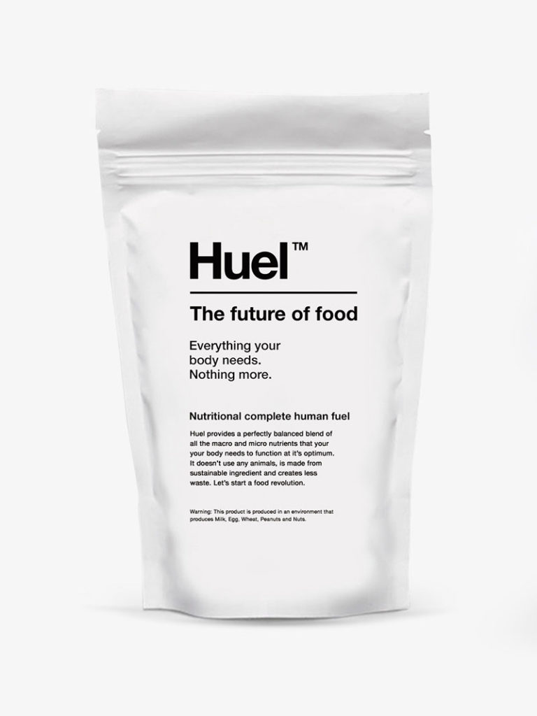
I asked Hearn why he thinks capital-M Minimalist Modern has become the go-to aesthetic for Complete Food systems. He says it’s all about getting back to basics. “As a population we have made food so delicious that we crave it, get addicted to it, and over consume it. The fact that Complete Food goes against the norm in terms of focusing on the primary purpose of food, e.g. nutrition rather than exclusively taste, has attracted similar founders. I believe the common goal is to strip away the unnecessary additives, flavors, packaging, and preparation. The result is the minimalist aesthetic you see in many of the brands in this space.”
For Soylent, the design team, helmed by Ryder Ripps of OkFocus, was inspired by the work of Helmut Schmid, IV Bags, and NASA space equipment labels. John Zelek, senior creative at Soylent says, “We also looked at other ubiquitous staple foods in their simple forms, like milk and bread, and imagined what those things could look like in the future. Ryder and his team at OkFocus are really great at staying ahead of the curve with design—specifically internet and technology-inspired design. That meshed well with what we were trying to do with Soylent. Each iteration of the Powder has a version number and changelog, like software.”


Zelek says of the brand’s modern design aesthetic, “I think that this clean minimal style (as opposed to the sort of heritage, farm-to-table earthy look) can be exciting. It also embraces the fact that this is precisely engineered food. We aren’t trying to fool anyone into thinking we pulled these bottles out of the earth.”
When asked about the visual similarities in many Food 2.0 brands, Ripps explains, “Imitation is a farce of the truth. Like if you screenshot an image over and over again, each JPEG compression pass will degrade the image till it’s unrecognizable. Trend riders do this in many industries, putting something with purity and meaning into their machine, pushing the ‘on button,’ and with each pass the thing gets more and more distorted. While nothing arrives from thin air, greatness only arrives from passionate clear intent where there is need.”
Ripps also confirmed that Soylent’s packaging is definitely not Modernist. “I think of it as functionalist. Modernism has become so corny, Design Within Reach killed it.”

