
Typography is often described in musical terms: we speak about its rhythm, pacing, and the relationships between positive and negative space. That may be because the technicalities and mathematics of type design and music are very similar: When we learn to read, after all, we “sound out” letters in order to form words. Typography is imbued with its own sense of semiotics—we likely “hear” (at least internally) certain forms in different ways depending on the slopes, curvatures, connectivity, and spacing of letters. In simple terms, a script might “sound” gentle and flowing, like a piece of swanky restaurant background classical music; a jagged, erratically spaced display font, on the other hand, is shouty, wild, veering into white noise.
Acid House, Acid Colors
It’s little surprise, then, that so many designers working with typography also have an ear for music or sound, and recently we’ve seen a flurry of projects that unite the two; both in explicit ways—such as designers who mostly work with traditional processes now releasing records—and more abstract ones, such as exploring the meaning of the spaces between lettering and how that relates to the human voice. A designer firmly fitting into the first of those categories is Anthony Burrill. Known for his bold, striking letterpress pieces, his process is for the most part defiantly analog, but his past is colorfully electronic. In the late ’80s (at the height of the legendary Hacienda club) as a student in Manchester, he and some friends ran the short-lived rave in Oldham called Heck Ta Sea in a “stinky events room,” with Burrill designing the flyers. Its debut outing was a wild success that peaked with everyone going “absolutely mental” and a “binbag of money” for the organizers, according to Burrill (not bad considering its £2 entry fee). Its success was its downfall, however, with a policeman showing up at one of the organizer’s mom’s house, and soon putting an end to all that.
His process is for the most part defiantly analog, but his past is colorfully electronic.
“I think it’s probably a similar part of the brain that links into music and visuals, as well as type,” Burrill says. “Thinking about the structure of music—especially electronic music—and how that’s built up from little pieces that all fit together, there’s something puzzle-like with the whole thing.” His own fascination with those layers and puzzle pieces is obvious from his letterpress printing works, and he points out that the alignment of rudimentary technology and future-facing experimentation can be traced directly back to the likes of Kraftwerk.
“It’s the machine and man together,” he says. “Working with a machine, but keeping a soul within it.” Bjork is a musician who puts this beautifully: “I find it so amazing when people tell me that electric music has not got soul, and they blame the computers… if there’s no soul in the music that’s because nobody put it there.” The same, of course, can be said for computer generated design: it’s up to the creator to add the magic.


Design and music, likewise, are about communication and intention. The tools used for both can be dull in the hands of one person, and utterly thrilling in those of another. Burrill was keenly aware of this when he ventured into his first formal music production in 2018, with the release of The Future is Now, a collaboration with DJ/producer Andrew Claristidge (of Acid Washed) that sits at the intersection of Chicago house and the east Sussex countryside. There are two tracks on the record: one, according to Burrill, is the archetypal “club banger,” while the other is a slightly more languid, lysergic lower tempo version. Both pay homage to those archetypal ’80s and ’90s club tracks that play with vocal samples (like this).
“Taking those methods and skills and applying it to a different medium unleashes a different part of your creative mind.”
“The idea was to make an acid record but not just a slavish recreation, something a little bit different,” says Burrill. “A lot of my role was jigging about in the background saying ‘that sounds brilliant, turn it up.’ It was almost like art direction in a way, setting a vibe and giving a brief. With any creative process, you have a rough idea of what you want and then while you’re working on it, it develops organically. Taking those methods and skills and applying it to a different medium unleashes a different part of your creative mind.”
Burrill, of course, designed the sleeve; with each of the limited-edition releases bearing a slightly different cover. “I like the idea of variety and seeing patterns in repetition,” he says. The titular phrase The Future is Now directly informed the simple geometric letterpress typeface; and the bright but pared back color palette, naturally, hints at the acid house vibes.
Branding with Sound
The relationship between sound and design can also be exploited as a canny move to promote a new typeface. When Fontsmith launched its FS Benjamin typeface, it collaborated with the agency DixonBaxi on a campaign entitled “Sounds of London,” releasing a record along with the font that used field recordings of London’s sounds and conversational snippets. Working with Zelig Sound, the team created a limited-edition vinyl record; its A side presents a melange of conversation, looped noises, and sound design that together creates an “immersive soundscape that captures the essence of city life.” The B side, according to Fontsmith, is just “10 minutes of raw field recordings.” For DixonBaxi, it was a chance to truly express what London is—as with any city, a vital component of what makes London London is its sound.
“The great thing about sound is that it adds narrative, emotion, and rhythm, which design alone can’t capture,” says Dixon. “Sound is incredibly emotive.”
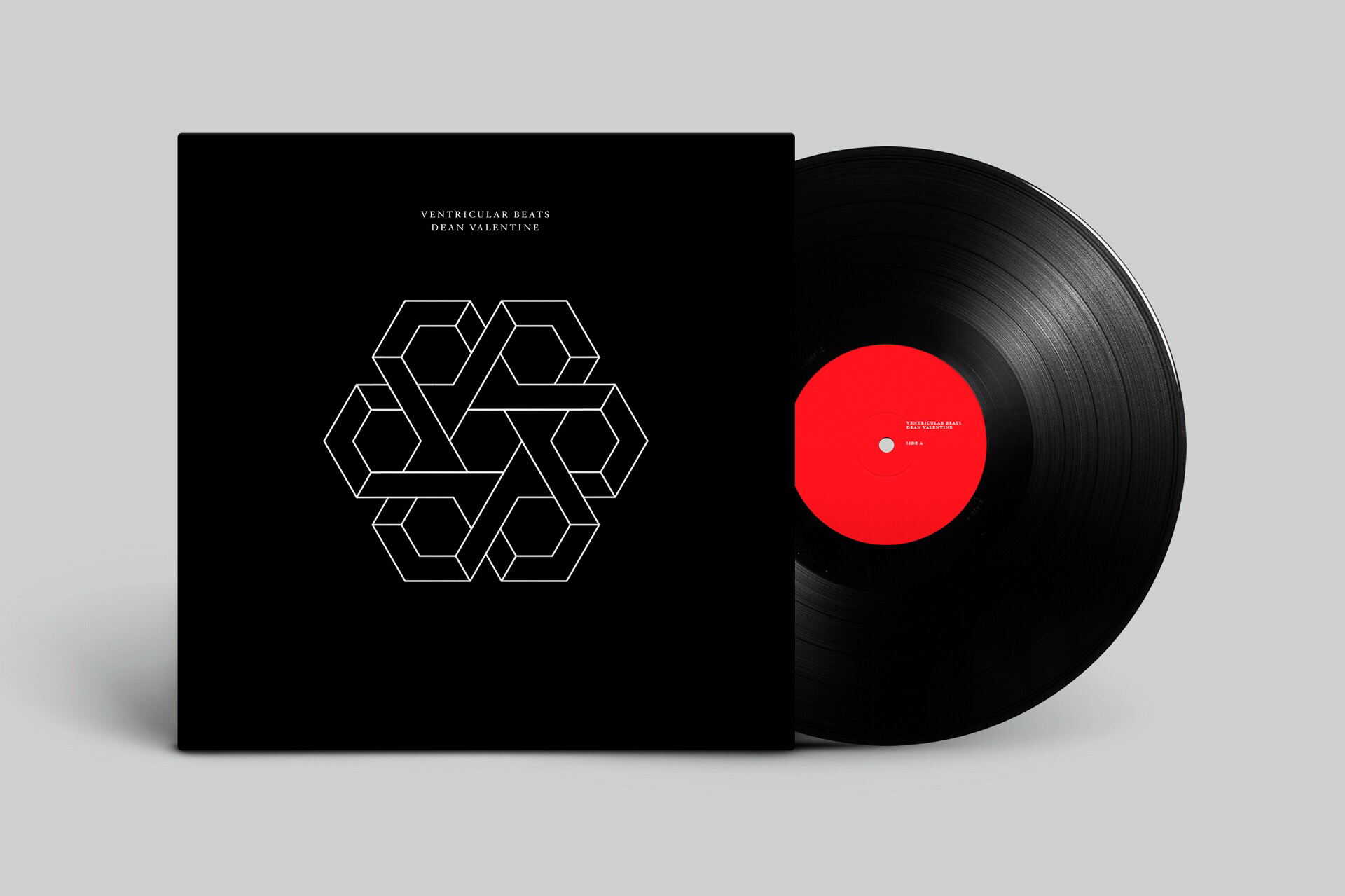
This isn’t the agency’s only adventure on wax. In summer 2018, the studio launched its first album, Ventricular Beats. Composed by Dean Valentine, and co-produced by DixonBaxi cofounder Simon Dixon, the record was inspired by DixonBaxi’s first feature film Tiger Raid, and is billed as a “haunting and bold foray into foreboding electronica on a grand scale.”


Today, much of DixonBaxi’s work is with television clients, and Dixon says that the link between sound and visual is the critical underpinning to making such projects successful. “We do a lot of brand experience, developing design systems that work across every platform, and that’s often driven by emotion or design theory which is driven by sound,” he says. “The more you understand the audible aspect of the design experience the better they interplay.” One example is the agency’s work with the Premier League: the team not only created a visual experience, but an anthem. “The great thing about sound is that it adds narrative, emotion, and rhythm, which design alone can’t capture,” says Dixon. “Sound is incredibly emotive.”
Making it Personal
Dixon is right of course: it’s a cliche for a reason that a particular song, or even voice, can trigger something utterly visceral in us. (Just the menacing first few notes of Nirvana’s Aneurysm, for instance, take me back to the sheer devastation of my blotchy faced 16-year old self, post first heartbreak.) This highly personal, emotional, and place-connected resonance of sound is something Ran Zheng honed in on in her Look/Hear project, which she describes as “a system of aural and visual signals” in which typographic forms are generated, with the aim to trigger associations with certain people and certain environments in the viewer.


The designer describes architecture as “frozen music” and type as “frozen sound.” She designed a visual system based on sound data from five places: a park, a street, a cafe, a subway, and an office. She then placed the letters from the words “look” and “hear” onto a 2D grid, then used 3D software to place them in a 3D space. Each letter was repeated into nine layers, and she then input the different 3D letter shapes into the grid. When the sounds played, this would modify the size and forms of the letters in realtime, and visualize the emotional differences between, say, the tranquility of a park and the fist-clenching horror of a rush-hour subway.
What this ultimately boils down to is a sense that just as we each interpret visual communication on a personal level, to an extent, we interpret sound individually, too. When we break down an image or a sound to its most basic components, they become abstract—meaningless, even—but together, as a cohesive whole created ultimately to tell us something, they become signifiers of a certain space, a certain time—happiness, sadness, weddings, funerals.
Abstracting Shapes
Digital artist Fabien Zocco took this idea to its ultimate conclusion in his 2012 installation Aleph Relative. The piece used a net-connected program that captured messages such as emails and Google searches (again, these could be either banal or incredibly meaningful) and projected them continuously in their encoded form, leaving nothing but indecipherable symbols that are then recited by a vocal synthesizer to create equally incoherent noise.
Zocco’s project is vaguely menacing, though it’s not as out-and-out terrifying as Palimpsest, the collaboration between Japanese Fluxus veteran artist Yasunao Tone and musician Florian Hecker. The record attempts to find the “hidden meanings” in an anthology of 8th century Man’yōshū prints of Japanese poems. Tone scanned the characters into a computer, then played back the audible verses. The result is a barrage of noise and static, yet with a certain sense of rhythm that hints at the text’s original format somehow. Hecker magnified each piece of data from the scanned ink and fibers by 10,000; then divided the sound into two “voices,” placing one into each stereo channel. It’s not one for the faint of heart.
The notion of interrogating the abstract resonances of written text is one familiar to Austrian graphic designer Astrid Seme, who works across graphic design and sound, incorporating both seamlessly into much of her practice. For her, working with typography—and the implication that these letterforms are created to be spoken—means design and sound are inextricably linked. Her interest in combining the two in her work stems from a love of minimalist composers such as Karlheinz Stockhausen, who used graphical notation over traditional musical scores. “Where artists or composers established their own notation through the use of forms, today it stands alone as a visual work of art,” says Seme.
The designer played the flute as a child (“though I wouldn’t say that was crucial in my interest in sound,” she says), and feels that her design background and lack of formal musical training gives her a curious and open stance when it comes to working with sound. Underpinning all of her work is the connection between graphic letterforms and vocalized sound. “If you take a very simple glyph in a typeface, you don’t see as a blank space—it has a certain length in speech,” says Seme. “It’s ephemeral, so you don’t notice it while you’re speaking. For me, it’s a super interesting connection.”
“Where artists or composers established their own notation through the use of forms, today it stands alone as a visual work of art”
Seme cites an example a project of hers that revolves around the words “Wien Mitte” (a rail and U-Bahn station in Vienna); she asked a speaker to consider the blank space between the two words, then she then “zoomed in” on that space, “like you’d zoom into a photo in Photoshop.” She explains: “I was interested in how you hear this blank space in speech. It was stretched; in the end, the longest one was 30 minutes, but in the beginning there was nothing.” The result is a sound work just shy of six minutes that begins by sounding like a YouTube pronunciation tool and veers rapidly into a disquieting piece that’s somewhere between noise art and utter terror.
Her explorations are similar to those of Dutch type designer Just Van Rossum; who acknowledges that the parallels between the sounds we “hear” when we read letters are highly subjective (consider dyslexia, for instance, in which a neurological processing difference makes it harder to decode a word into separate sounds than those without the condition.) Van Rossum has undertaken a number of examinations into the process of taking letters and transforming them into sound waves. These examinations look at the potential for a letter to “sound” different when typed in, say, Gotham compared to Garamond. When the letter shapes become sound waves, their change in shape and dimension naturally alters the pitch and volume.
His work is by no means unusual. Sonotype is a long-running collaborative project by Amy Papaelias and Jaanika Peerna that began in 2005 and uses sonogram interpretations of letters to create experimental typefaces that “make visible the differences and similarities of spoken and written language.” Similarly, in 2014 Norwegian designer Håkon Stensholt and programmer Paulo Barcelos created the tool Sound Meets Type, which allowed users to create new 3D typefaces from sound (a song, a voice, a piece of foley) which can then be modified to alter its weight, color, or elasticity. Stensholt describes sound as a “form-giver”—a simple phrase that neatly encapsulates the notion of both design and sound-generation.
Strange Poetics
Seme’s work draws on a number of traditions: the graphical notation of 20th century composers, of course; the formal and structural experimentation in Laurence Sterne’s Tristram Shandy; as well as Modernist works that combine poetry, sound, and typography, such as Kurt Schwitters’ 1927 experiments with a phonetic alphabet, which were largely inspired by Jan Tschichold’s Die neue Typographie. That Dadaist standpoint was crucial in Seme’s work with an ornithologist for Urbirds Singing The Sonata, a piece that uses birdsong to create a work that becomes a haunting and, at times, rather funny melange of the natural and the nonsensical.

That theme is one that was often employed by the Dadaist poets, who played with “visual features which do not apparently align with linguistic meaning,” as visual communication lecturer Dr. Barbara Brownie puts it in her essay Semiotics of Typography. She points to the “defiance of words” as being used by the likes of Dadaist poet Francis Picabia, who created poetry that used typographic symbols as graphic forms to destabilize meaning: when the visual and verbal don’t match up, the reader is more keenly aware of “both their identity and incongruity.”
Teenage Dreams
Like many other designers, Simon Dixon of DixonBaxi got into the industry by designing record covers and rave flyers. “My first design studio was in the back of a record shop, so we’d trade design work for space,” he says. “I’ve a natural affinity to that. “When I started, the scene was very much a big overlap between graphic design and music.” For him, the reasons that so many design and type aficionados are also music and sound nuts are manifold: “It works on several levels. There’s a technical aspect to making music and design—using a series of elements to build a narrative—but both are very intuitive and emotive. Communication is very personal: design is not pure art, but there’s an artistic sensibility, and there are similarities with how you’d do that audibly.
“Finding the right note or sequence or a field recording is like a designer trying to find the right typeface or color. Artistic people care about details and telling stories or developing a narrative—taking loose elements and turning them into something cohesive.”

So many designers we speak to (not least for our Design + Music strand) point toward a love of music as their first taste of design and its power. So many people we interview discuss drawing band logos or record label identities in their school books before they had ever even hear the phrase “graphic design.” For Burrill, the constructivist typeface on Kraftwerk’s iconic Man Machine cover, designed by Karl Klefisch (the back cover design is a straight copy of an El Lissitzky work, fact fans), proved incredibly inspiring: “It’s so stylized–they’ve all got that slicked back hair… they could be a design studio as much as a music group,” he says.

Peruvian-born designer Jonathan Castro attributes black metal and punk graphics as his initiation into what graphic design is, and describes his love of music as “the inspiration for my whole life.” Today, his work is directly informed by experimental music: “When I started making graphic design I wanted the same sort of freedom you have in experimental music,” he says.
“Finding the right note or sequence or a field recording is like a designer trying to find the right typeface or color”
Castro also makes his own music. Meanwhile, Irish producer Iglooghost (a.k.a. Seamus Malliagh) creates an entire visual world and series of character designs around his sounds. This is nothing new, of course: graphic designer Niklaus Troxler founded the Willisau Jazz Festival in the ’70s, and ever since has been behind the event’s iconic annual posters. The characteristics of jazz—its “sense of improvisation, individualism, sound, and rhythm”—directly inform his design work.
“As a fledging designer you’re probably in your bedroom surrounded by posters and listening to tapes and records, so you create your own little environment,” says Burrill. “Basically I’m doing the same thing in the studio now. [Design can often be] just an extension of constantly playing music, and that music informing the work you do. You want to be in a band, you’re on the edges of all that stuff but you can still be involved somehow—even if its just making flyers and posters—just wanting to be part of the culture, and have your own little bit of it.”

