


It’s taken me a long time to realize that the push-up bust line is not the natural shape of a woman. Fashion advertising has certainly made it seem the most “sexy” during my lifetime, but over the years tastes have changed relentlessly. In the late 18th century, for example, the ruffled bustle exaggerated the preference for protruding backsides. Decades later, after the liberation from the corset, a streamlined and athletic body draped in loose camisoles was essential to 1920s flapper-girl style. What role, if any, has graphic design and packaging played in shaping our notion of the ideal female form?
Now a new exhibition, Undressed: A Brief History of Underwear at the Victoria and Albert museum (V&A) examines not only how our bodies have been shaped by underwear and the effect that’s had on our perceptions of gender and sexuality, but through graphic design of years past we see how packaging and advertising was historically a lot more honest about the way knickers, corsets, and bras contorted the body into a way that was not the “norm,” but simply fashionable. The show draws attention to how the graphic design language of underwear packaging has drastically changed: the idea that a consumer uses underwear to sculpt their body into the shape that it should be—tucked in and pushed up—has been a prevalent message of marketing (who could forget Victoria Secret’s ridiculous “The Perfect Body’’ campaign in 2014?)

Looking through the V&A show, you can see how the trajectory from early underwear advertising to the present is a progression from lots of explanatory text to more visual design. An advertisement for “The New Keelapso Bustle” in 1887 is incredibly text-heavy and direct about how the fold-in bustle functions—“it COLLAPSES ENTIRELY when the wearer sits down” it reads, and the typography above the woman in the folding underwear enacts the product as it slinks across the page with ease. Advertising from this period celebrated functionality and mechanics with meticulous description.
An advertisement for the Stescroc corset from the same period is similarly direct about how the product changed the shape of the natural body. In it, a woman compares her hour-glass waist with that of the classical woman in art. The fact that the illustrated model looks at a sculpture that’s sat on her dressing table, where a mirror might usually be, is telling: one woman is “mirrored” by the other, the advert is saying that the corseted women is also “sculpted” but by her undergarment. The illustration makes no secret out of the fashioning of the body. Compare it with something like the Victoria Secret advert and you can see the dramatic shift over the 100 years: according to “The Perfect Body” campaign, the best body is one that’s pushed up and padded.

In the 1930s, text still featured dominantly in underwear advertising, describing exactly how a garment is hooked and laced, how it would work against a woman’s natural shapes—making underwear’s artifice obvious. A suggestive, V-shaped illustration advertising Charnaux’s 1934 Corselette is instructional, but also demonstrates the increasing tendency towards visual spectacle. Hans Schlenger’s 1936 advertising poster for Charnaux shows a shift in marketing, too: here, the corset echoes a woman’s body instead of sculpting it as the Stescroc promised.

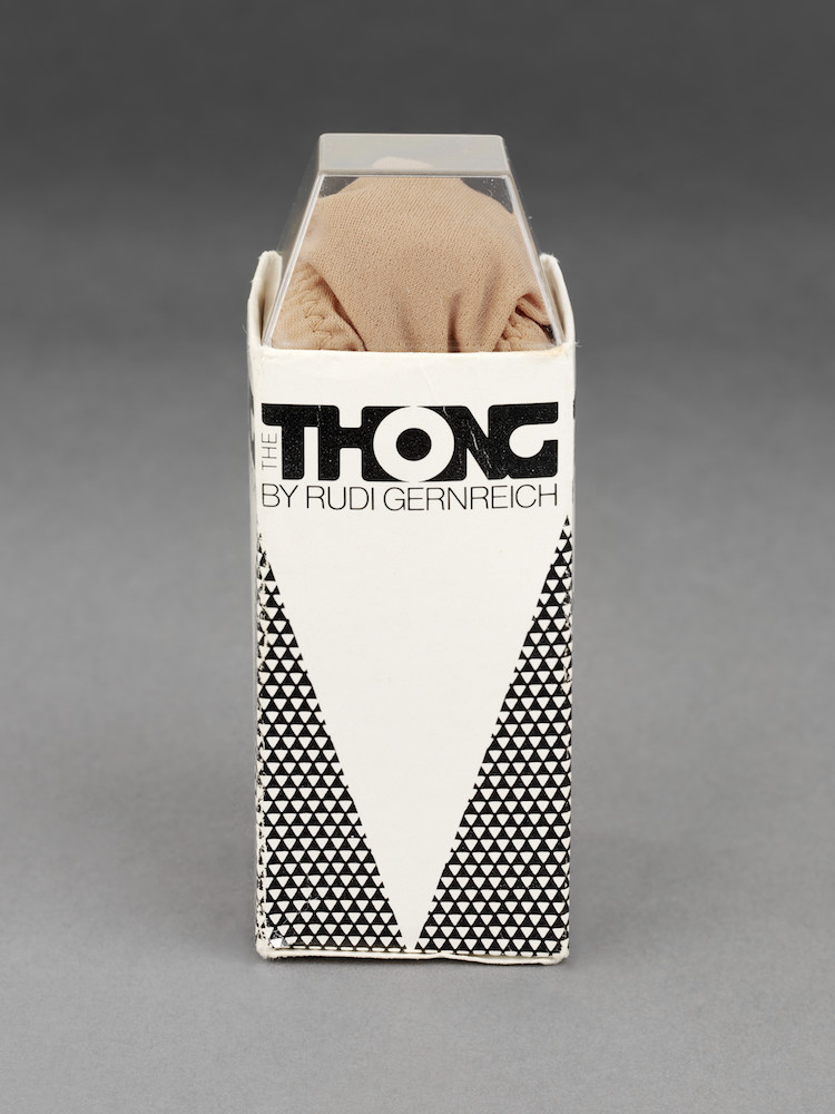
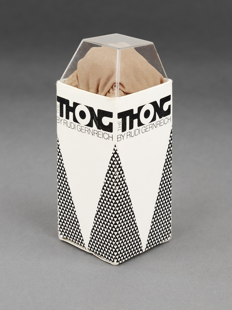
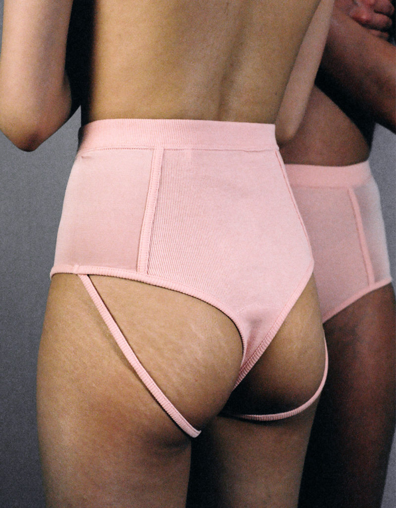
By the 1950s, text is scarcer, as in the Little X pantie adverts for one of the first underwear lines for young women. It’s during this period that slogans like “dream figure,” “the ‘natural’ look,” and “natural charm” also start to emerge, suggesting—and this is the important, subtle distinction—that underwear isn’t shaping the body into a fashionable ideal but is fashioning it into the shape that it should be. In the 1960s, Rudi Gernreich launched his soft, minimal, sheer No Bra Bra to combat the belief that the structured, uplift bra was the norm: both his bra and thong design encouraged natural shapes not an aesthetic ideal. The Rudi Gernreich thong packaging—pointed and erect, releasing the pants from its tip—visually articulated the liberation and directness about the body that the designer was inspiring.
Today there is another backlash, with companies and designers questioning the stereotypes of sexy and the notion of the “normal” body shape. This shift inevitably plays out in the marketing of these brands, which are now generally focusing on lifestyle, sensuality, and the self over “pleasing your man” through attaining the “right” curves. A recent article for Protein highlighted the rise of minimal and androgynous underwear designers—it’s a trend the V&A grounds in Calvin Klein’s pioneering range from the 90s, and which has regained popularity after the release of Acne’s unisex briefs.
New companies like Marieyat, Thinx, and The Nude Label are devising campaigns that feature un-photoshopped models of different sizes with stretch marks visible across thighs and bums. Though not text-heavy like the corset campaigns of the 1900s, it’s a return to an aesthetic of directness and visibility. These adverts appeal to lifestyle instead of catering to male gaze.

Minimal advertising and packaging is also finding its way into the mainstream; think of Uniqlo’s functional space-age packaging for soft bras and pants, or the simple cardboard boxes that &OtherStories lingerie comes in. These packages state size, material, color—it’s an aesthetic of functionality that encourages the buyer to imagine the product fitting their own personal shape instead of squeezing it into the unattainable shape of the model that’s being sold to them. It might be a trend, but it’s a healthier one.
I get soft bras from COS and nude-colored underwear from Muji and Uniqlo. This is partly due to campaigns like those by Marieyat, and the promise of comfort and self-confidence that simple packaging implies. It’s a lifestyle we buy into, just like girls growing up in the 50s must have bought into Gernreich’s packaging and campaigns that promoted a lifestyle of sexual freedom.

