
Name: Acid Grotesk
Designer: Folch Studio
Foundry: Folch Studio
Backstory: Last year, we wrote about Acid House Barcelona, a new alternative education program started by Spanish agency Folch that’s aiming to turn design education on its head. The space is dedicated to educating students on the realities of working in the design world, but it doubles as studio space for Folch and a general hangout and cafe for the city’s creative set. Folch describes Acid House as a “design innovation center,” but it turns out that even forward-thinking innovation centers aren’t free from the constraints of traditional branding.
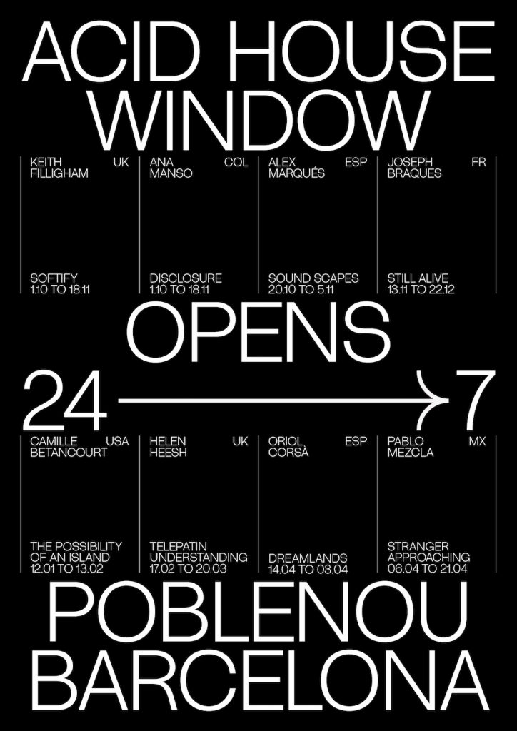
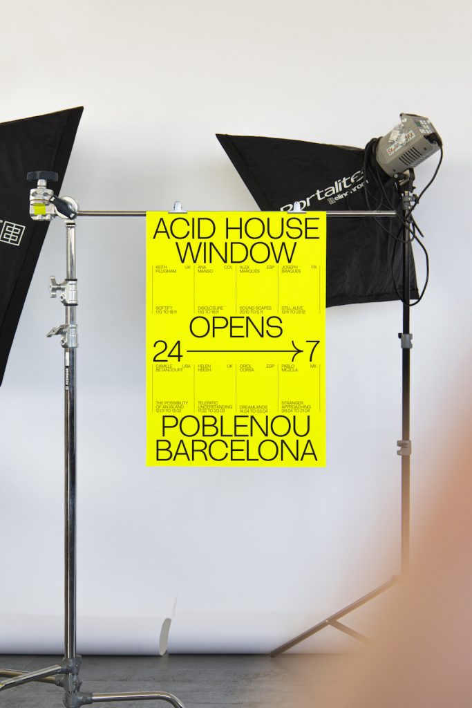
With the opening of Acid House, Folch rolled out a comprehensive brand identity that centers around Acid Grotesk, a clean sans serif that’s used across all of the center’s communications. “As the voice of the initiative, the typeface needed to work for any space, website, poster, or book, consistent and identifiable,” explains Folch’s design team. “We needed a transversal identity. Something adaptable yet ultimately recognizable.”
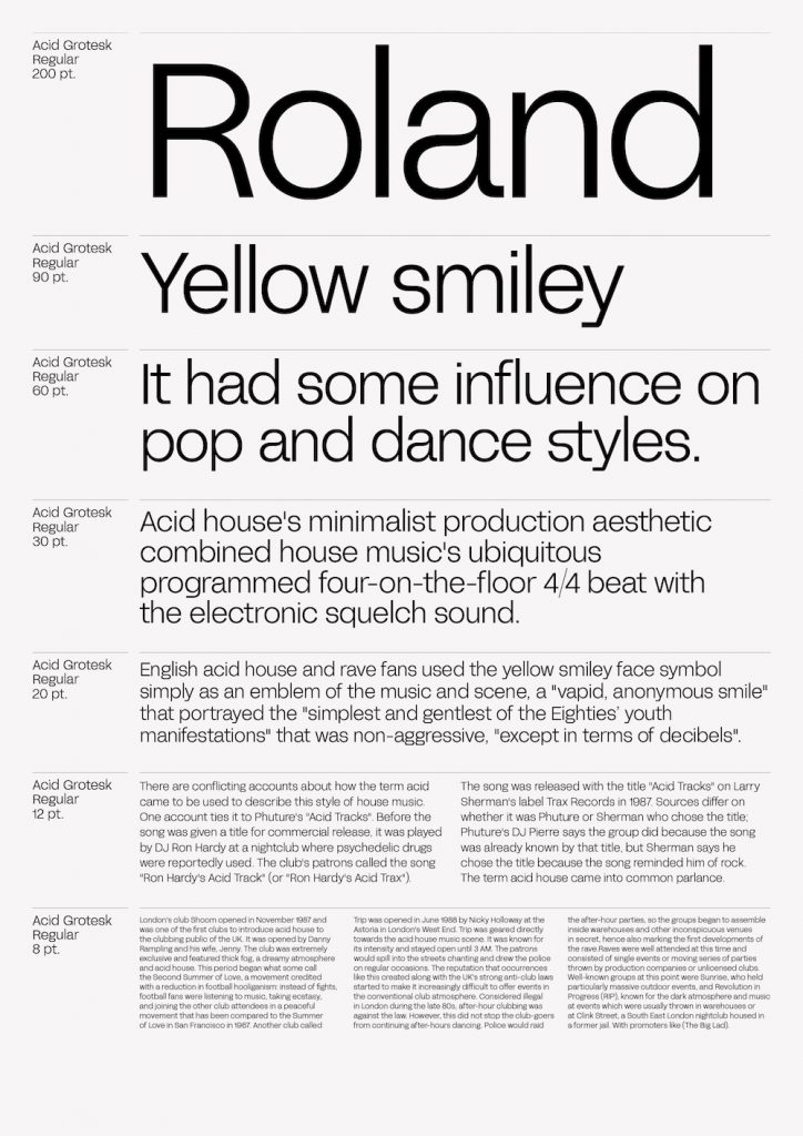
The design team started by asking itself: What will this typeface be used for? Acid Grotesk lives on business cards, event posters, the website, and as an illuminated neon sign above the building’s front door. With the sheer variety of use cases in mind, Folch had to keep the typeface relatively restrained despite its intentional nod to the more psychedelic roots of the Acid House musical genre. “Stemming from the Acid House concept, it would have been easy to fall into a psychedelic typographic display with complex characteristics, transferring the transgressive and playful spirit of the brand,” they explain. “But we also required a functional typeface capable of working in displays, headlines, and in texts.”
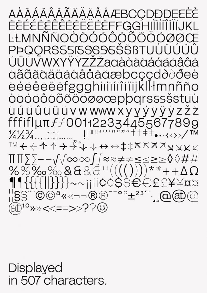
Why’s it called Acid Grotesk? Beyond the obvious (it’s the typeface for Acid House), Acid Grotesk is named after the musical genre of house music born in the 1980s. The designers explain the grotesk: “We wanted it to maintain the raw appearance and much of the visual character that the first sans serif had, but also to take inspiration from the more refined forms of neo-grotesks.”
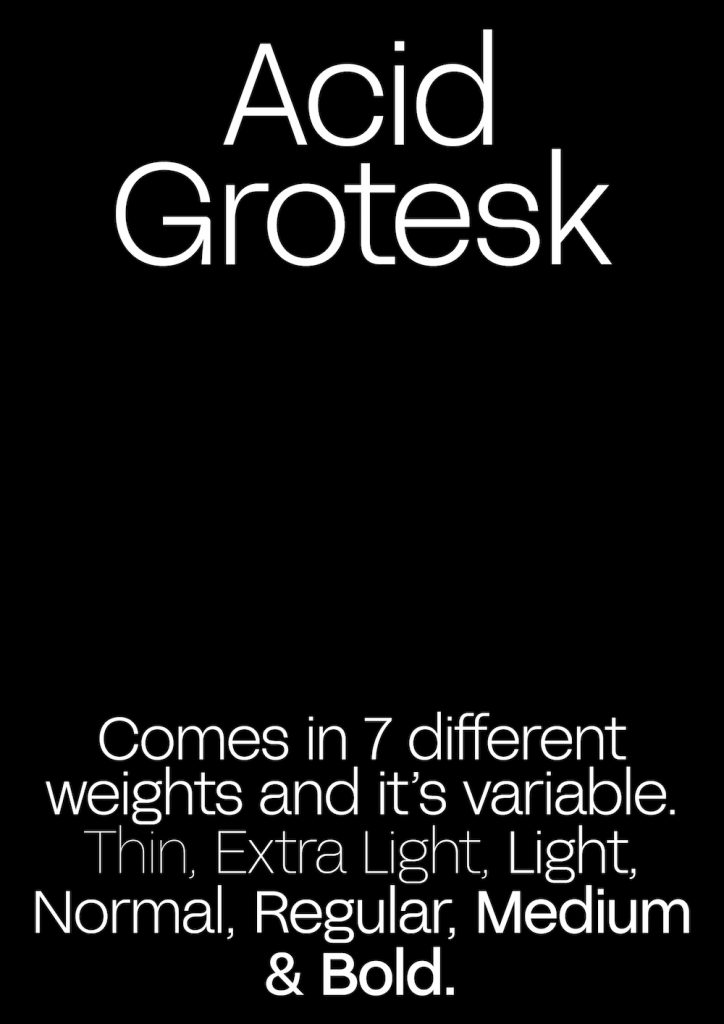
What are its defining characteristics? The typeface is designed to bridge the worlds of utility and trendiness. It is exceedingly functional, with smooth curves and rounded vertices, but there’s a hint of playfulness to Acid Grotesk thanks to its big, open counters and unorthodox alternate characters. “With a sans-serif in mind, we took a classic, neutral personality and developed something more dynamic, potent, and unique from this basis,” they explain. “The idea was to be able to modulate the voice according to our audience, adapting it to a wide variety of contexts.” To give the typeface breadth, Folch added a series of alternative characters like an exaggerated, almost snake-like bowl for the “s,” and a big, round smiley face glyph. “Both the open and semi-open ‘s’ and the ‘y’ with the inverted tail were born from an individual exploration of these characters,” the designers explain. “We looked for ways to re-interpret them without losing the function or spirit, for cohesion with the rest of the alphabet at the same time as communicating something a little bit extra.”

What should I use it for? Acid Grotesk is designed to live in both the digital and physical worlds. “We knew it would be used for the Acid House website as well as for all the signage for the new space, designed to host many different activities,” the designers say. “Its shapes and counter forms allow it to adapt to smaller and larger applications while the alternative characters give each message its own individual spin—a nod to the diversity of activities on offer.”
What should you pair it with? Acid Grotesk is custom and proprietary for now, but the designers still have some suggestions for how it should be deployed: “We would love to see it paired with some sort of light italic condensed, something with very angular shapes to create an interesting contrast.”

