


Calling all Paul Rand, Massimo Vignelli, and Max Huber lovers—Hey Studio is bringing its 21st-century take on international-style Modernism to the local Barcelona design scene (and well beyond). The work by the four-person design team gives a friendly nod to the past, while articulating a fresh, clearly defined point of view. The playful concepts and lively color palette in Hey’s packaging, publishing, branding, and illustration projects strike a perfect balance with the severity of the grid system.
Founded in 2007 by Verònica Fuerte and Ricardo Jorge, and joined later by Mikel Romero and Eva Vesikansa, the studio gained visibility early on with illustrations for Monocle, and later for clients like Apple, Wall Street Journal, and Penguin/Random House. “About 50 percent of our best client work started as personal projects,” says Fuerte. “That way we can inject our best energy and ideas into the presentations and have the most fun at the same time.”
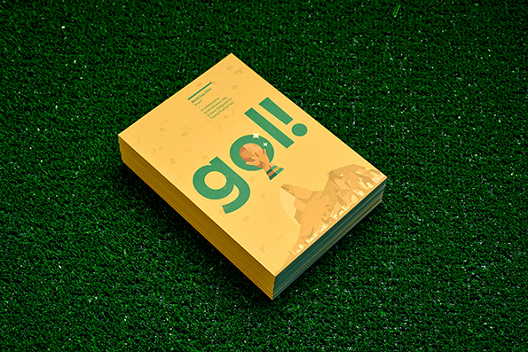
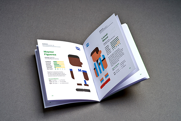


This philosophy is apparent in Gol!, a recent book with illustrations of players from every nation competing in the World Cup. The project started on Hey’s Instagram feed, which features Jorge’s daily illustration of pop-culture icons. After discussing the idea to focus on soccer players for a World Cup exhibition with Dave Sedgwick of Studio DBD, the next step was pitching it to the client and hitting print.
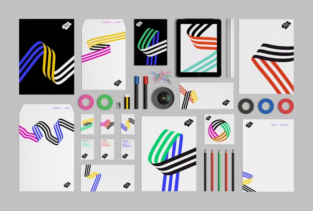
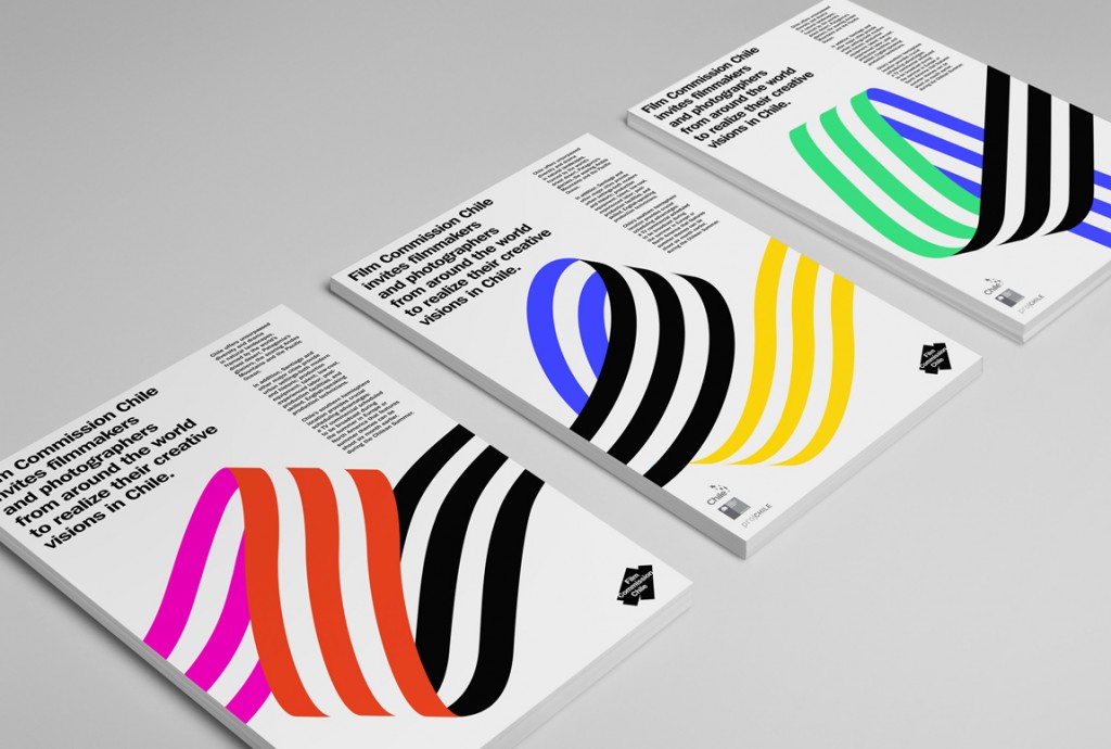
The visual identity Hey created for Film Commission Chile was inspired by that most basic film production item: a roll of gaffer’s tape. The fluid lines echo reels of celluloid film, and variations in the overall color palette are actually a nod to the diverse landscapes found across Chile. The system allows for plenty of interchangeable parts, while maintaining a distinct graphic identity across the whole.
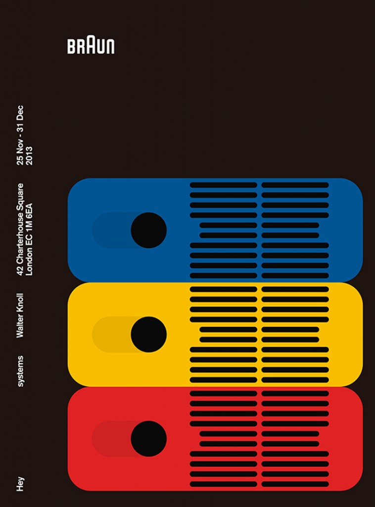
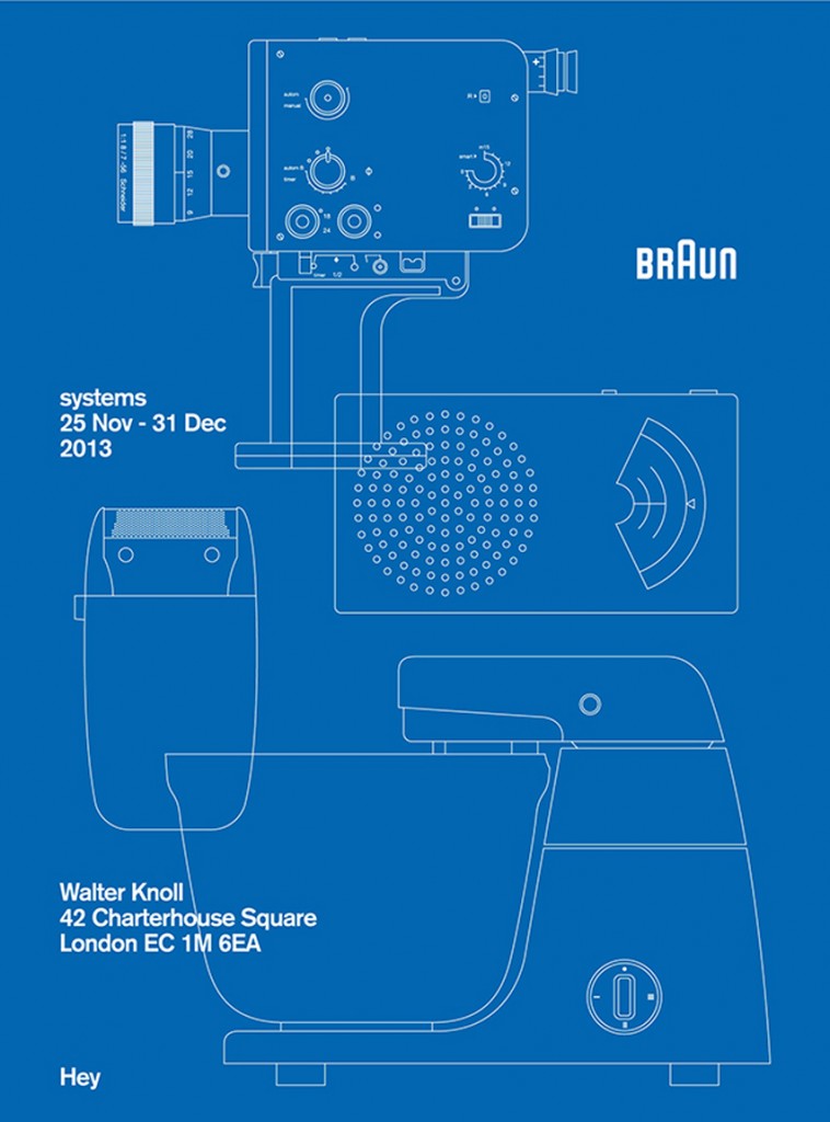
At first glance, Braun, whose midcentury industrial design is legendary for its Modernist purity, might seem like an intimidating subject for a small design group to tackle. But—perhaps not surprisingly—the project proved a great fit for Hey, who created a series of posters to accompany a 2013 exhibition of ’60s Braun products at the Walter Knoll showroom in London. The posters paid homage to Braun’s pared-down products and also showed off the bright colors, minimal gridded compositions, and clear design thinking that distinguish Hey’s very best work.

