
Do you love the mid-century modern brush script often found in vintage fashion ads? Then you’re in luck: type designers Jesse Ragan (Brooklyn) and Ben Kiel (St. Louis) have collaborated on Cortado Script, a font that’ll whisk your text across the page with the breezy confidence of a ’50s swing coat in Harper’s Bazaar.
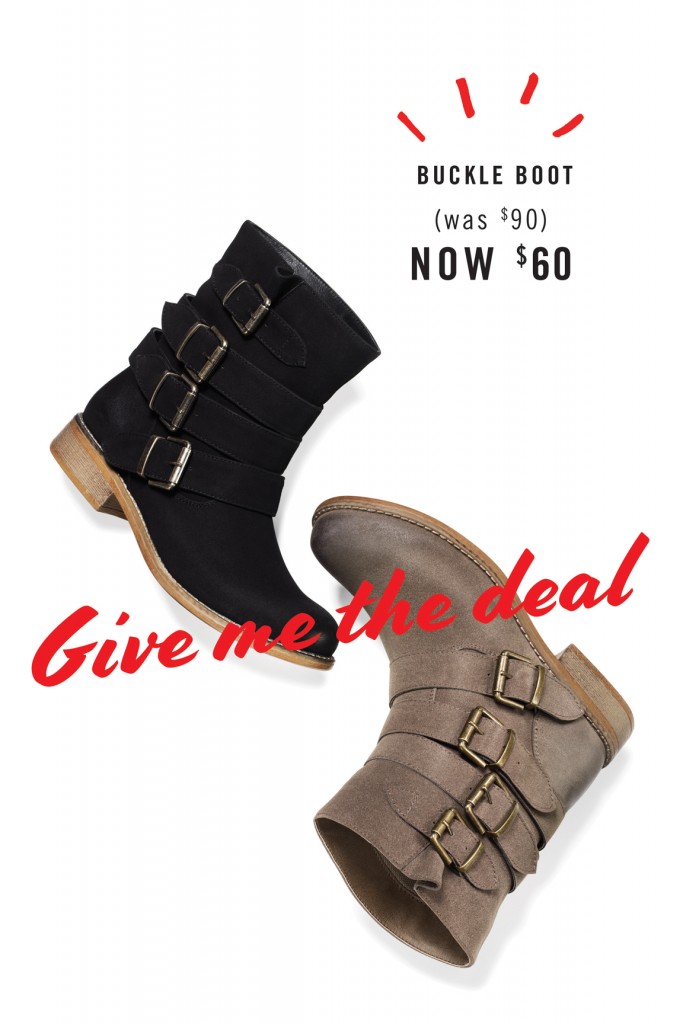
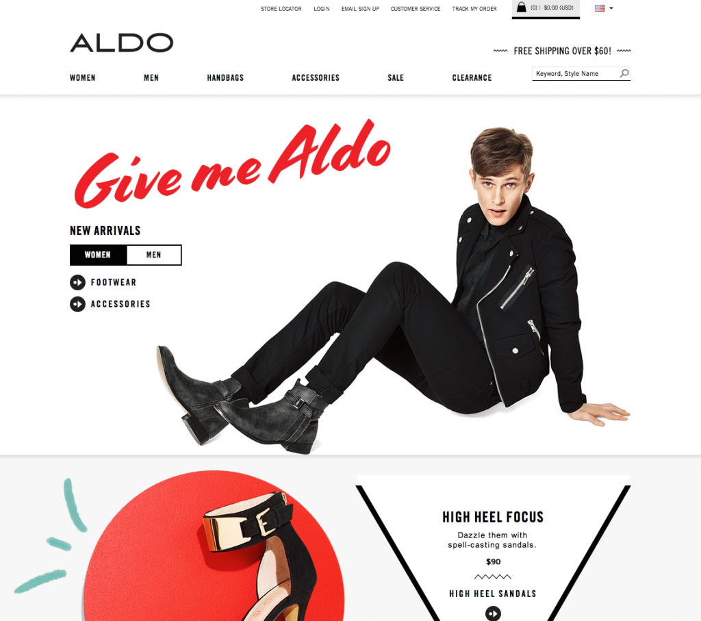
Based on the freestyle, pointed-brush lettering of Swedish illustrator Cecilia Carlstedt—whose work has lent an energetic insouciance to advertisements for H&M, among other clients—Cortado Script was originally commissioned by shoe company Aldo for their “Give Me Aldo” campaign. “Cecilia’s original lettering has a lot of characteristics that would be considered ‘wrong’ by a classically trained commercial lettering artist,” says Ragan. “But since those peculiarities are central to the charm of her work, we decided to celebrate them, rather than iron them out. Maintaining that kind of unconventional personality is one of my favorite challenges in designing a typeface.”

Kiel adds, “After seeing Aldo use Cortado for a season, Jesse and I both saw things that we wanted to change in the design. The benefit of hindsight allowed us to take a pause and spend a good amount of time refining the design further. We rethought the best way for the font to function, and then re-drafted, re-coded, and re-kerned the font for a retail release. The end product is something that we’re even more proud of.”
The thereby thoroughly overhauled and streamlined Cortado Script is available for desktop, web, and print at cortadoscript.com, where you can also use the handy, interactive “try it” feature and watch letters dance and change as you type. Another plus: Cortado Script is modestly priced, starting at $50 for desktop and $25 for web.
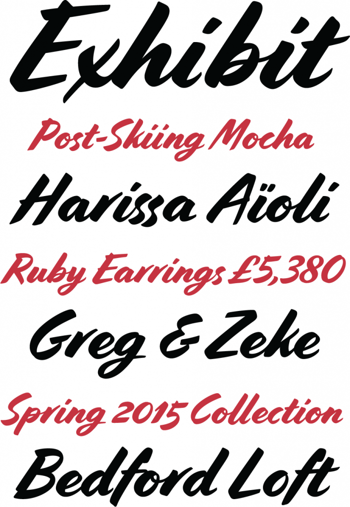
If you’re wondering what gives Cortado Script a truly hand-drawn quality, it’s 1,100 glyphs—an impressive number of varying connectors, ligatures, and characters, which this OpenType “smart” font swaps in either automatically or manually. To lighten the monotony of a completely connected cursive, Cortado Script varies the connection breaks between letters based on the context. For example, as you type the last three letters of the word “amber,” the “b” first connects to the “e,” but then breaks from it when the “r” appears. It’s those kinds of breaks that are a signature of Carlstedt’s style.
And it’s that same choppy texture that inspired the typeface’s name: café cortado is Spanish for “cut coffee”—espresso cut with steamed milk. And, just like a jolt of caffeine with a smooth hint of sweetness, Cortado Script could be the heart-racing solution to your next layout.

