


Amsterdam’s Mainstudio is known for its clean, conceptual, typographic designs for the architecture, art, and fashion industries. Founder Edwin van Gelder and his studio first garnered attention for their strikingly explosive yet systematic editorial design for architecture magazine Mark, even if their work is now more recognized for its restrained, emphatic, and blissfully exacting aesthetic.
Despite the amalgamation of shapes and colors that permeate his work, Gelder’s approach can be boiled down to a simple, flawless formula: the right typeface + the right grid = the right design. So how does he define “right?”
“Mostly I define a project by a system in which typography plays a significant role,” Gelder explains with characteristic precision. “To set up a system’s ‘rules,’ I play a ‘game’ within its boundaries, which I also create. Without boundaries, there will be no logic.” It’s a sophisticated and calculated process in step with Amsterdam’s great Wim Crouwel, who also championed the importance of the grid.
Like the lines of a soccer field, the grid contains what Crouwel determined could be a “fine” game, but only if a designer played it right.

As well as working on Mark, Gelder has designed numerous architecture publications and posters, and has even applied his staple sense of rigidity to an issue of Berlin’s avant-garde interview magazine mono.kultur (the James Nachtwey issue). His two most recent projects very clearly illuminate the Mainstudio approach, and also show how Gelder modernizes and explores the possibilities of grid-based design in a way that’s suited to the 21st century.
A recent identity for fashion designer Anne de Grijff uses the parameters of a tight system to create a logo that can shape-shift and easily adapt depending on where it’s being used. Specifically, Gelder designed a system that could be tailored uniquely to different customers.
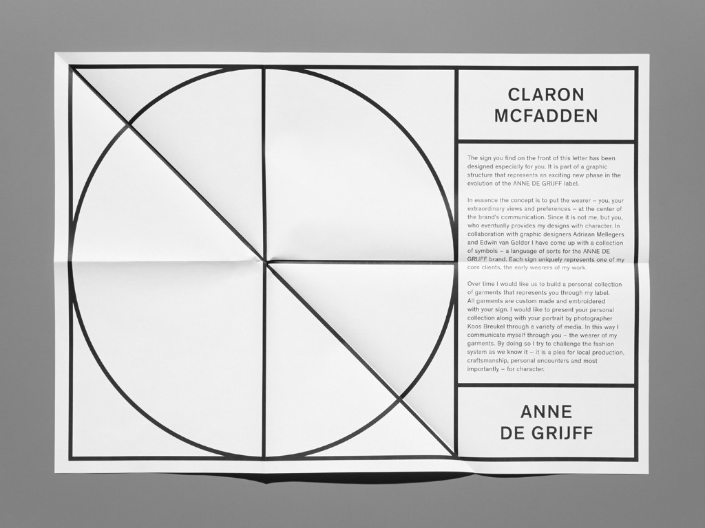
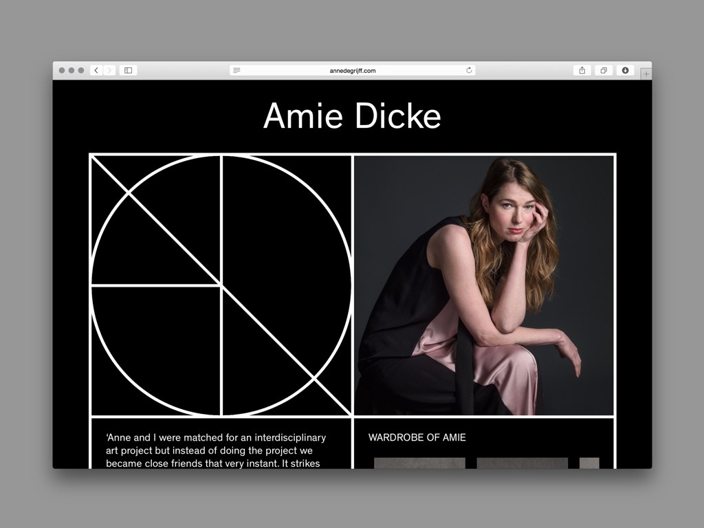
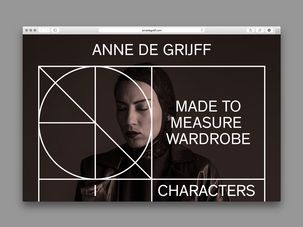
His clear, modular grid consists of four overlapping elements (a square, a circle, a cross, and a plus sign), shapes that derived from the strict seams of Grijff’s collection. These lines can be deconstructed and rearranged into thousands of different compositions and shapes, which is well-suited to Grijff’s approach as a fashion designer; her clients get their own personal collections tweaked ever so slightly to suit their specific style, and so Gelder’s logo can be tailored to make a personal “symbol” that uniquely represents each client. No two logos are ever the same, and what looks like a very systematic and rigid identity is actually very fluid and individualistic.
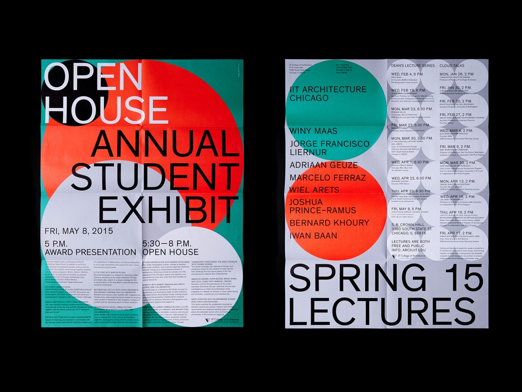
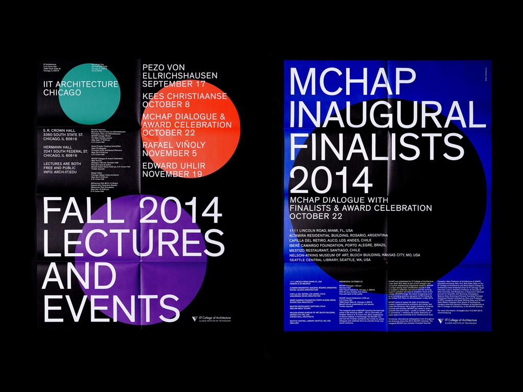
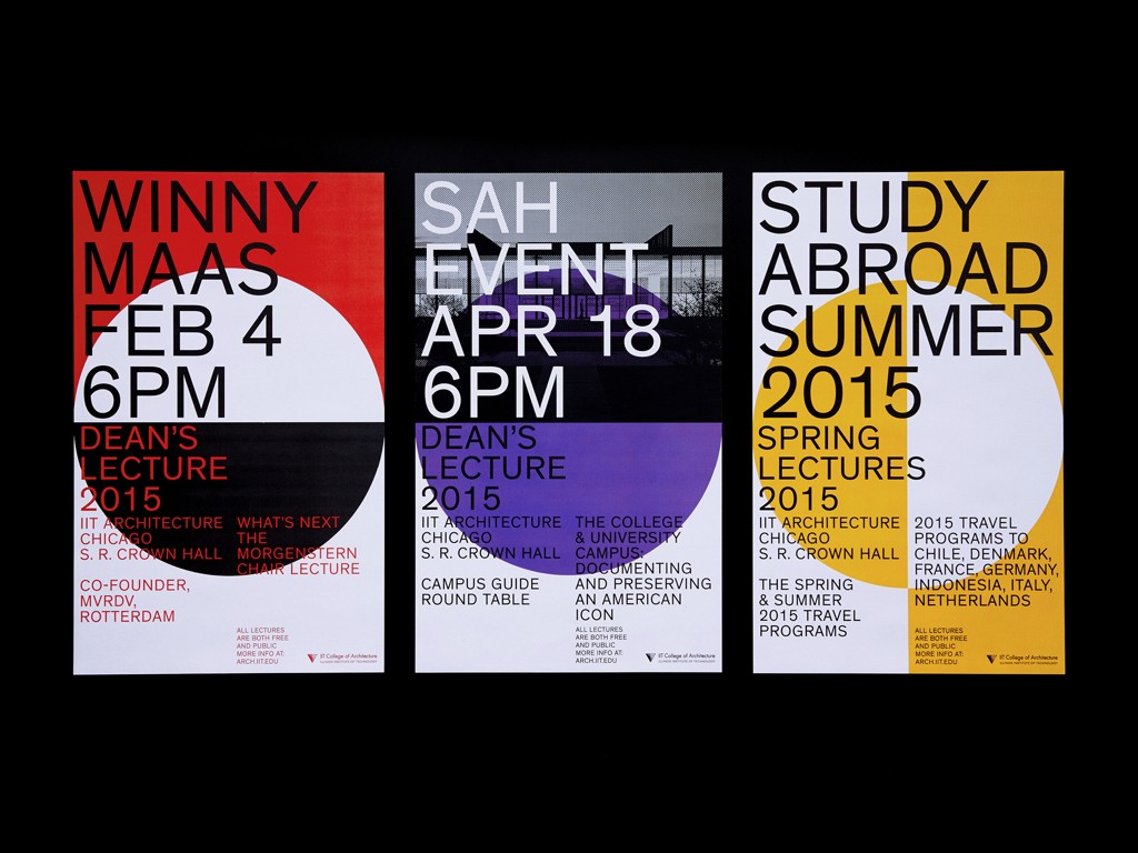
For Gelder, a typeface should always “work” without being forced to, so he chooses his fonts “intuitively.” A seamless combination of typeface and design is particularly evident in his IIT Architecture posters. The color palette and shapes are deliciously evocative of Swiss style, but the design is sharply updated because of the use of Theinhart, a classic Grotesque face designed by Francois Rappo (Optimo). The font family is organized in a wide range of weights and suits the grids of the posters, especially because of the characters’ openness and square shape. The fit is important aesthetically, but it also works on a conceptual level, elevating the design so that it’s obviously of the now.
Gelder’s uses the systems that came before him and the typefaces of today, a combination he believes can mediate the timeless and the timely. This is of core importance to the output and ideas behind Mainstudio. As Gelder explains:
I look to the past for design, while for typefaces I look to the present. Design has a history, and it should be known when creating the future.

