
I arrive to Estudio Herrera late, searching around the side of the building for the bright red door that would indicate I was in the right place. The regular entrance is closed due to construction, and when Maricris Herrera comes down to let me in she waves a hand at the orange cone-studded mess in annoyance before leading us up a narrow stairway. In the spare and light-filled offices she shares with architect Frida Escobedo, we pass the workspace of the two designers she calls her “dream team,” and continue all the way to the top floor, to a room that opens up to a tiled terrace brimming with potted plants. On the wall opposite, a floor-to-ceiling bookshelf lines up the spines of artist monograph after artist monograph: Gustav Metzger, James Lee Byars, Isamu Noguchi, Marcel Duchamp, Andy Warhol, John Baldessari.


Before landing in Mexico City the weekend before, almost everyone who I asked about designers in the city referred me to Herrera. Along with her small team, she’s worked with many prestigious cultural institutions in Mexico, and for that matter the world; her work includes exhibition, book, catalog, and identity design for places like Museo Jumex, Museo Tamayo, the Guggenheim, the Broad, and Columbia University. At Jumex, she worked on the graphics team that helped launch the contemporary art institution in 2013, and over the course of a little over two years designed upwards of 20 books around the museum’s collection and exhibitions. She works with commercial publishers as well, and several of her books have been honored in AIGA’s 50 Books/50 Covers competition. While her studio does digital and identity work, too, one look at her website indicates what her book-laden offices solidifies: book design is at the center of her design practice.


But unlike many designers who came into a graphic design career by way of print, Herrera took a circuitous path to the profession. After growing up in Ciudad Juárez, in the Mexican state of Chihuahua, she studied to become an architect, then spent two years in the small city of León working for an architecture firm in town. She had a quick stint in visual merchandising and retail design in Guadalajara, Mexico, then landed in Mexico City a decade ago, where she started working as a freelance graphic designer. While she loathed the slow pace of architectural projects, it’s clear in talking to her that she never left the field behind entirely. “Making books is my comeback in architecture,” she says.
“I love plans and dimensions,” she says. “When you’re working on an architecture project, you need to think in four dimensions,” with the fourth dimension being time. While much of graphic design deals in two dimensions, the physicality of book design not only adds a third, for Herrera it brings her back to four. “Books are forever—they’re an archive. The research [in these books], that’s now a part of culture.”

For an architect, books also provide a familiar materiality—they have substance, weight; they require spatial thinking, have to be physically constructed. In another sense, Herrera describes graphic design as a way of bringing structure to the text of the book as well. She uses words like “pillar” and “infrastructure” to describe elements of her book design, and looking at her work you can see it: her design is like a blueprint for the text. It feels solid and precise, ordering the contents and providing support to the narrative. It reminds me of the way Paul Soulellis, another architect-turned-designer, describes the book as a “container” for content. “I still think like an architect,” Herrera says. “[With architecture], I would say ‘Okay you have the bathroom, and then to the bedroom,’ and map out a plan of the house based on its contents. The first place for me in the book is also the content, not the design.”


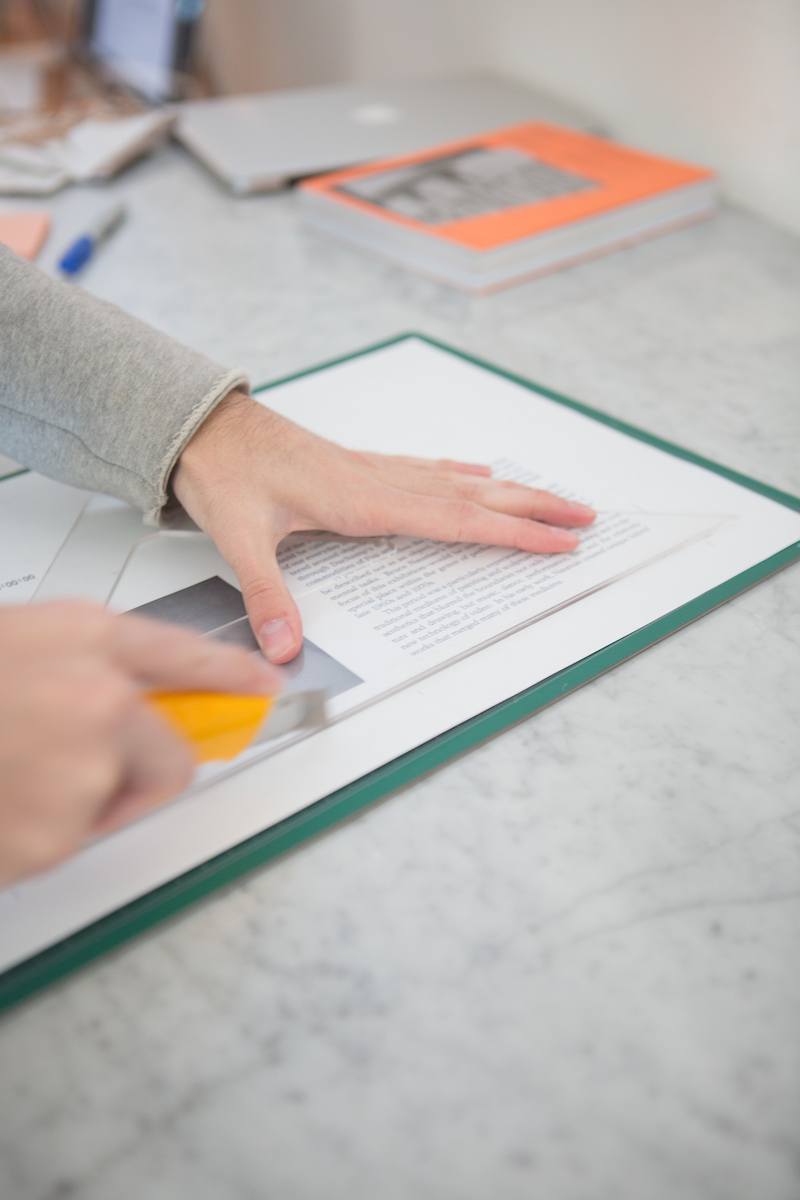
It’s easy to see traces of Herrera’s sense of order and organization in her compact office, which is tidy and considered without the glossy, sterile feel of other minimal design offices. Downstairs from where we’re sitting, her two designers alternate between the screen and more hands-on, prototyping work. Stacks of books and sprawling plants give the quiet studio a homey feel.
When I ask Herrera if she emulated any designers to teach herself graphic design after architecture school, she tells me she mostly learned from reading. “My references were in books because we practically lived in a biblioteca; my father read a lot books so they were everywhere in the house.” In high school, her English teacher, rather than teach her grammar and vocabulary, gave Herrera a book about Van Gogh. The book was written in Spanish, but Herrera was supposed to come back at the end of the semester with a book report written in English. Though she didn’t find it a very effective way of learning the language, it did open up an interest in art books.

Estudio Herrera’s work isn’t exclusively books, and it’s not exclusively for cultural institutions—the studio also works with several Mexican fashion designers, which provides a steady source of income. But working for Museo Jumex early on in her career set Herrera up well to work with art museums and galleries on both long and short-term projects. She’s currently working with the Eli and Edythe Broad Art Museum at Michigan State University, to launch its new identity and website, and with the CAPC museum in Bordeaux, France. Estudio Herrera also designed the graphics for the recently opened exhibition of Frida Escobedo’s work at Columbia’s GSAAP school. Though she and Escobedo are friends and the architecture studio, only slightly larger than Herrera’s team, works just across the hall, Herrera says that they only get opportunities to pair up infrequently, usually with exhibition designs or graphics for certain architectural projects.
But even when Herrera designs an entire identity for a museum, she usually ends up designing a few books for its exhibitions as well. She describes designing straight exhibition catalogs as “super boring; they’re just for sales,” and designs hers with the care and inventiveness of an artist book. For an exhibition called Superpowers of Ten, a performance work based on the famed Eames film Powers of Ten, Herrera designed a book that functioned more like a folder; when you open it up, there are two separate books—one in Spanish and one in English—tucked inside the jacket flaps. The catalog for Receipt of a Magical Agent, the CCS Bard Graduate Thesis Exhibition, includes an original piece of fiction from the writer Carmen Maria Machado, inside a soft yellow gradient cover with stitch binding.

Herrera is also currently in the third year of a book project for Alejandro Jodorowsky, the brilliant and notoriously kooky director of films like Holy Mountain and El Topo. Jodorowsky’s style is ultra-intense, surreal, visually dizzying, and “psychomagical” (to use one of his own terms). It feels to me like an intimidating project, not least because, per Herrera, Jodorowsky isn’t super concerned with sticking to the publishing timeline. How does a designer do justice to an artistic vision of someone as distinct as Jodorowsky, without compromising her own style?
For Herrera, it’s not an issue; the design is a vehicle for the book’s content, not for her or the artist’s personal style. “Every artist is different, and every exhibition is different, but a text is a text,” she says. “Culture and art are already super rich. I don’t need to contextualize them more as a designer. The focus is the content; the work of the art is in the exhibition.”
Even so, Herrera’s books are works of art in their own right. Even the exhibition catalogs are built to last, as the packed shelves in her studio give testament to. “My approach at Jumex and now at other places is to try to have a catalog that lives forever, not just for the exhibition.”


