“‘Look at me! I’m an event!’” says art director Anna Kulachëk, mimicking what she believes one of her posters might say if it could talk.
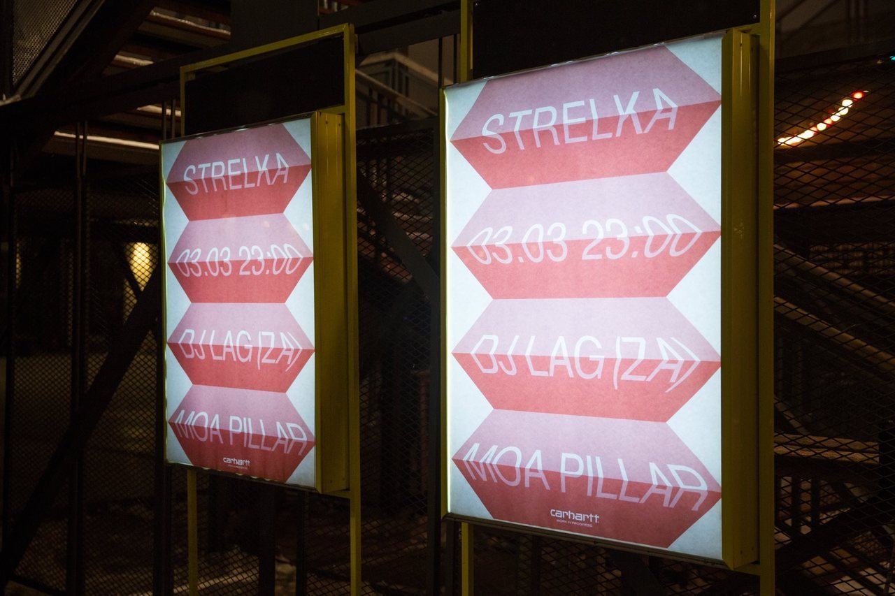
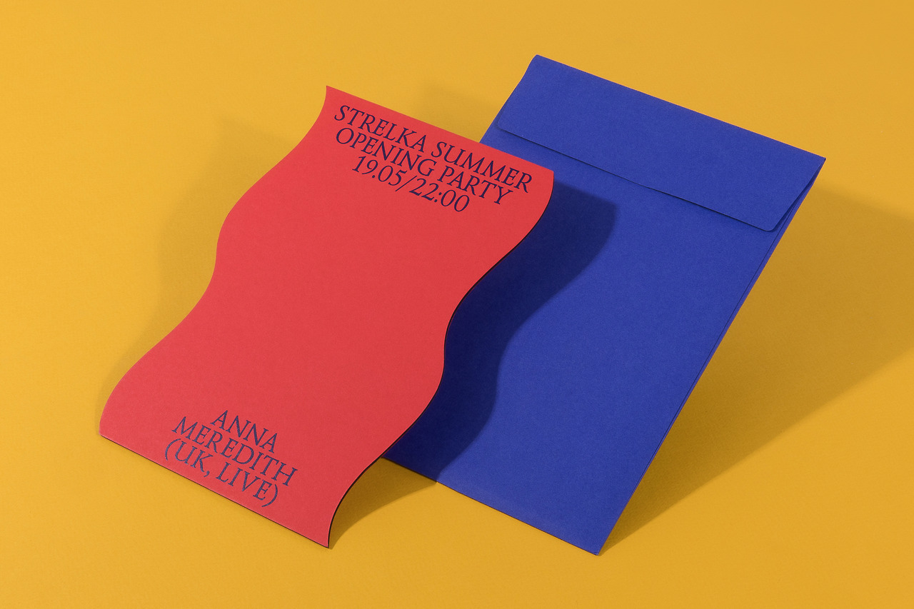
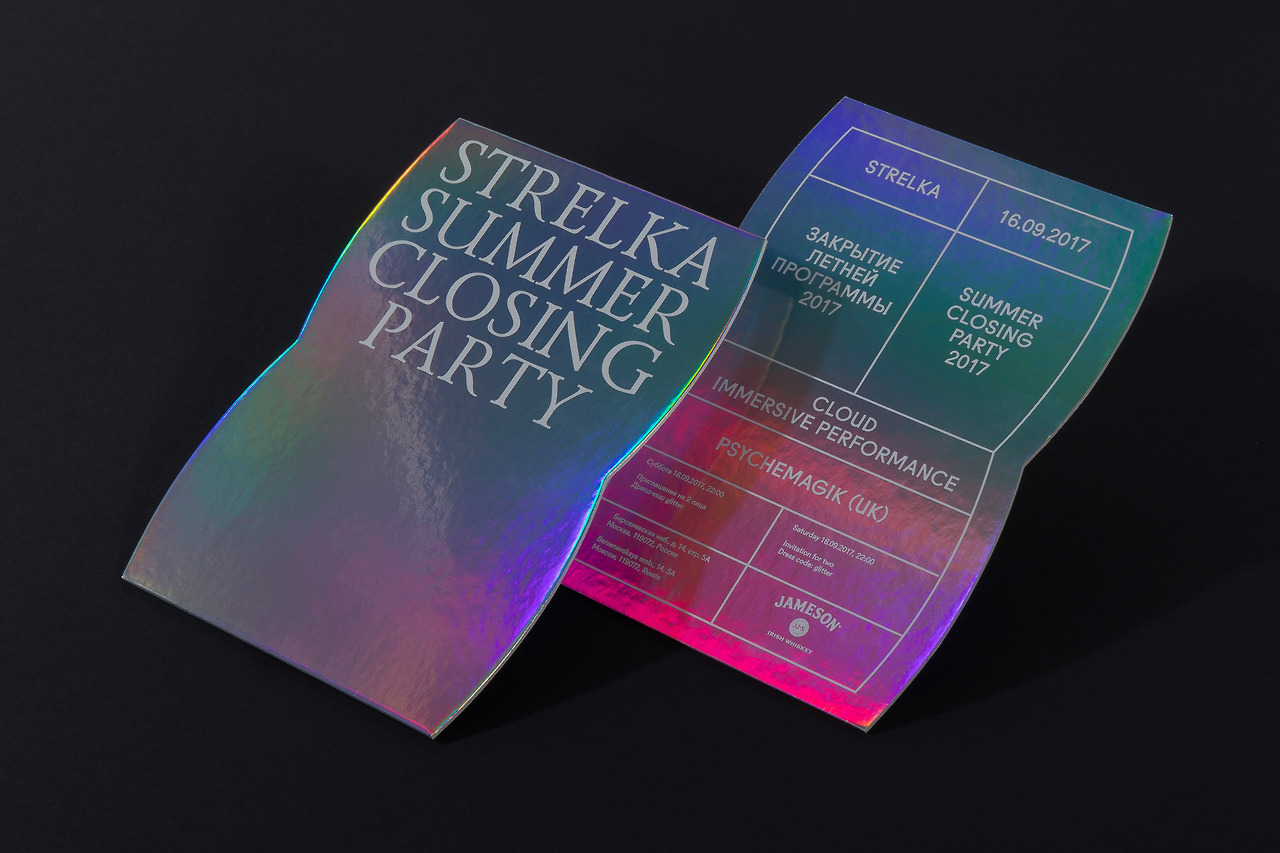
These vibrant prints, which often couple a simple typeface with primary colors and basic shapes, are undoubtedly loud and eye-catching. Every week for nearly five years now, Kulachëk has used her simple recipe to churn out numerous designs for Moscow’s Strelka Institute for Media, Architecture and Design. These posters have been celebrated in numerous design exhibitions and are instantly recognizable as belonging to the Strelka when they rapidly disperse across social media as designers worldwide swoon.
OK-RM designed the basic identity for Strelka in 2012, which draws from the metaphor of public space by using a clearly defined grid. Kulachëk, originally from Donetsk in Ukraine and now based between Moscow and New York, was brought in-house during May of 2013 because OK-RM’s basic identity alone was not enough for all the various media required. There are so many events that take place at the institution every day—from art openings to parties, lectures to movie screenings—that there needs to be someone in charge of designing fresh visuals that respond to individual programming. “Strelka didn’t know how to do it when I started,” says Kulachëk. “And neither did I! But I simply began and then we figured it out along the way.”
She joined right as beginning of summer, the busiest time of year. “For me, it was a really tough period,” Kulachëk remembers. “I had to design so many posters and other media, and all of the time: each required its own identity that I had to come up with from scratch.”
To address the quick turn-around required as art director, Kulachëk began to devise a loose system of her own for one-off posters. She often takes elements from OK-RM’s identity—maybe its lines and gridded components, or its Fugue typeface—and couples these with basic shapes and bold primary colors. “Our biggest issue is still always time. I never have enough,” she says. “That’s why all of my posters are simple. They’re easy to print. Easy to notice. Always: Name, Strelka, Time. Really direct.”
Kulachëk will often use one of two typefaces for event posters to make information even more clear: her fonts of choice are the aforementioned Fugue, or Helvetica. “I’ve never been a big fan of discovering strange, new typefaces. In my work, typography is about its pairing with color and composition. It’s about proportion.”
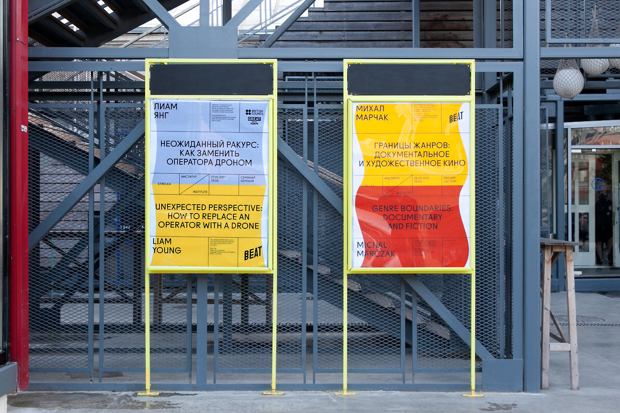
For posters that aren’t part of the weekly turnaround of party prints, but instead represent a particular lecture series or lengthy program, Kulachëk will create a fully conceptualized identity. A lot of her poster design for the Strelka has become second nature though, especially as she’s been responsible for the visual identity for so many years. Often she can rustle a poster up in an hour. It’s intuitive, an expression of her personality, one that’s now become mixed up with Strelka’s own brand.
Her work has that same quality as an illustrator with a distinctive style: you know when you’re looking at a Kulachëk, thanks to its distinctive playful simplicity. Today we speak with the designer about five recent posters for the institution, to explore the way in which she runs wild with composition while also grounding every print in a language distinct to the Strelka.