
There’s something decidedly un-flashy about the wave of flat, all caps, sans serif logo redesigns popping up in the worlds of fashion, startups, tech, banking and now, in the redesign for the Nobel Prize.
Removing serifs, contrast, a mix of letterforms, or a flourish here and there can remove any potential accusations of pretentiousness; in a way, it can also remove some of the distance between a consumer and a brand, or between an individual and an organization. While clarifying complex systems can most certainly be a good thing, flattening them out can also come off as overly simplistic, or worse, boring.

In tech startups, a minimal, modern approach can communicate notions of solidity and trustworthiness, rather than something flashy and new. For larger organizations, like the much-contested rebrand for The Met (although it’s maintained the serif), it’s a way of consolidating a variety of identities and structures into one simple form. When applied to luxury and fashion (Celine, Burberry, and Balenciaga have all hopped on the sans serif bandwagon) it feels like a particularly strange approach, as each designer is surely vying to display what makes them different. “I think it’s slightly tragic that a lot of the European fashion brands are doing the same thing and throwing out their equity,” says Hamish Smyth, designer and co-founder of Order. “YSL crushes me, because I always thought their weird old logo was so stylish! I suspect they’ll all go back to their ‘heritage’ sometime soon. It’s all trends, phases, market forces, and pressure from marketing departments to look fresh and modern.”
Smyth, who previously worked as a senior designer at Pentagram on Michael Beirut’s team when they worked (alongside Luke Hayman’s team) on the 2016 redesign for Mastercard, frames the dilemma clearly: “I’m always a fan of simplicity, but I’m not a fan of sameness.” The Mastercard redesign is an example of both the designers and the brand finding a balance between contemporary aesthetics and heritage. The identity works with the history of the brand while accounting for its continued innovation, and it manages to get all of that across without feeling chaotic. It’s in line with the nature of logos not being the center of a brand anymore. “A lot of people would say the Mastercard redesign is this ‘flat’ trend, but I don’t buy that,” says Smyth. “It’s about all the other stuff you surround it with—that’s where the fun can be had.”
“I’m always a fan of simplicity, but I’m not a fan of sameness.”
In its redesign of the identity for the Nobel Prize, design studio Stockholm Design Lab took pains to balance the brand’s history and simplicity. “We wanted the new identity to be closely connected to the heritage of the Nobel Prize, and we achieved that through the connection between the medal and our new assets: the wordmark, typography, colors, and visual elements,” says Stockholm Design Lab. By using “a modern and unique typeface on the 100-year-old medal, we see potential for it to stand the test of time, hopefully another hundred years.”
Until this redesign, each organization within the Nobel Prize had its own visual identity, but “there was an urge to simplify and unify the expression. We reasoned the best way of doing that was to have a few strong and unique assets to work with… to gain recognition in different touch points and connect them as one brand,” the studio says.


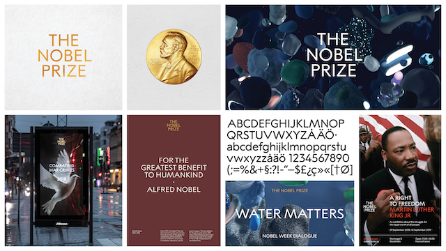

Although it drew inspiration from the medals, and used one as a type reference, the studio hasn’t used the medals themselves in the new logotype. “The organizations have tried different versions over the years, where the medals are part of logotypes, mainly with poor results, because the details, the gold color, and the complex differentiation of the medals are a huge challenge in any visual reproduction.”
The reasoning for Stockholm Design Lab’s approach is difficult to argue with. What I do question, however, is the need for an organization, especially one founded in 1895 to honor those who’ve “conferred the greatest benefit to humankind,” to communicate its message in a way that’s so simple it verges on the simplistic. Although underpinned by history, the new logo comes across with a lightness that, rather than conveying meaning, acts as a kind of mirror, allowing meaning to be placed onto it. A lot of brands and organizations benefit from seeming accessible, but if anything can go in for a bit of pomp and circumstance, surely it’s the Nobel Prize?

