
Welcome to Spotted, Eye on Design’s new column that turns an eye (ahem) on the styles and graphic trends you’re seeing everywhere. Last time we looked at “liquid metal,” the glinting 3D texture effect that gives everything it touches a futuristic shine. This time around our eye is on the neon hue of “terminal green.” Have other nominations for trends we should feature? Shoot us an email at submit@aiga.org.
What are you seeing?
Neon green is everywhere right now, illuminating posters, books, and GIFs like a glow stick at a rave. Pantone calls it “Green Gecko.” It’s also known as hex #39ff14. But our favorite descriptor by far is a callback to the color’s technological roots—terminal green, as described by the blog Ssense. The most unnatural version of the world’s most natural color comes in a variety of shades: battery acid, leaves on the edge of fall yellow-green, and deeper, flatter hues that have just a pop of brightness.
Who’s using it?
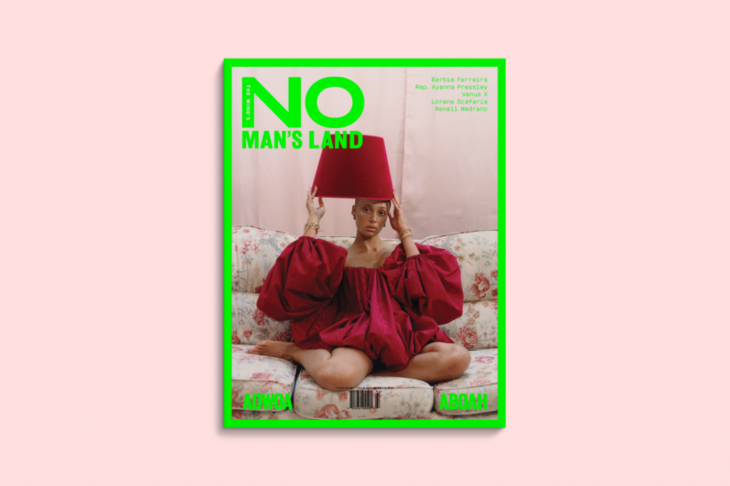
Anyone looking to capture your attention. Lately the color has been popping up on promotional posters and GIFs as a way of breaking through what feels like an endless, suffocating visual cacophony. Designers like Jiminie Ha of With Projects splashed a flat green version across the cover of a book about net art. Pentagram’s Michael Bierut and Sachi Chandiramani illuminated typography with a darker shade for the redesign of Victor Papanek’s Design For the Real World. Designer Sarah Boris gave terminal green the dotted treatment for the book Touch Wood. You’ll spot it on recent magazine drops including No Man’s Land and Bloomberg Businessweek. It’s even gotten the celebrity seal of approval.


Why do designers love it?
The fashion world’s love affair with terminal green has been well documented, but the hue was in use long before Kendall Jenner called it out on Instagram. The glowing shade of green has its roots in the early days of personal computers, when monitors produced pixels by cathode ray tubes shooting electron beams at phosphor dots behind the screen. Green was a cheap and long lasting phosphor. It also was easier on people’s eyes than looking at white type on a black background.
Though screen technology advanced quickly, green on black became synonymous with all forms of cyber life. “Maybe it’s some kind of shared cultural nostalgia for a time when technology didn’t seem so scary and complex?” says Space Practice’s Jens Schnitzler, who used the color for a recent poster. “That’s just speculation though. I personally believe that every nostalgic projection is a longing for certain values that we might miss in the present.”

It’s a good point, but today many designers are using it to communicate more than technological nostalgia. When Bierut and Chandiramani began thinking about what color to use for the type on Design For the Real World, they wanted to find an elemental hue. “While we were working, I think I just said, let’s try something like a ‘Crayola Green’—meaning the almost perfectly generic color you find in an eight-pack set of Crayola crayons,” he says. On its own, the green they chose does evoke the classic hue, but set against the deep black background, the color radiates with brightness, almost giving it an electric glow.
Compare that color to something like the green With Projects used for The Art Happens Here. The color looks like it was extracted from an early computer monitor and bottled up for use 30 years later. In fact, Ha says the color was a reference to a more modern technologies: green screen technology and chroma keys. “We also liked the idea of the book itself being a functional object that could integrate itself into any imagined scenario if desired,” Ha says.

The beauty of terminal green is that it communicates something different to everyone. For some people, it’s an ode to the old rave days—a pill in color form. For others, it speaks to nature. Though terminal green is the opposite of a neutral, it can almost function as one just the same. Its blind-your-eyes, give you a stomach ache level of saturation plays nicely against white and black. You rarely see it used in multi-colored designs, and understandably so. With that kind of brightness, what else do you need?
“The fact it has appeared a lot in recent projects, I feel is…mainly because it stands out against a plain green so it helps the projects it is featured on pop and be more visible,” says Sarah Boris, who designed a book to accompany the Touch Wood art exhibition. It’s a good theory. Her design for the book cover features bright green dots set against a white background. It’s a striking look that, yes, would be far less eye catching with another color. “If neon green helps us get the message across then it’s a winner,” she says.

