
Things are looking great, and not so great when I speak to Irish designer Kayley Kemple. She’s just graduated with her BA at TU, Dublin School of Creative Arts and scooped the Best Visual Communication Student award; but she’s also just got chicken pox (naturally, she mocked up a zine about it.)

Calamine lotion and itching aside, Kemple’s portfolio is undeniably impressive—especially considering she’s a recent undergrad. Her site blends careful, considered use of typography and layout with expressive illustration-led pieces. She has a passion for print design, and a talent for using graphic design to explore complex issues, like the frequent misdiagnosis of women with Aspergers.
“When I do a project it has to be really close to my heart,” says Kemple. “I have a lot of different interests in different areas, and I used college as a place to educate myself on various topics I didn’t know about before.”


The main vehicle for such explorations came in the form of Girls Club. Currently just a concept, Kemple envisions the club can become a physical, IRL space for women to meet, “express themselves and find friends and create a strong network.”
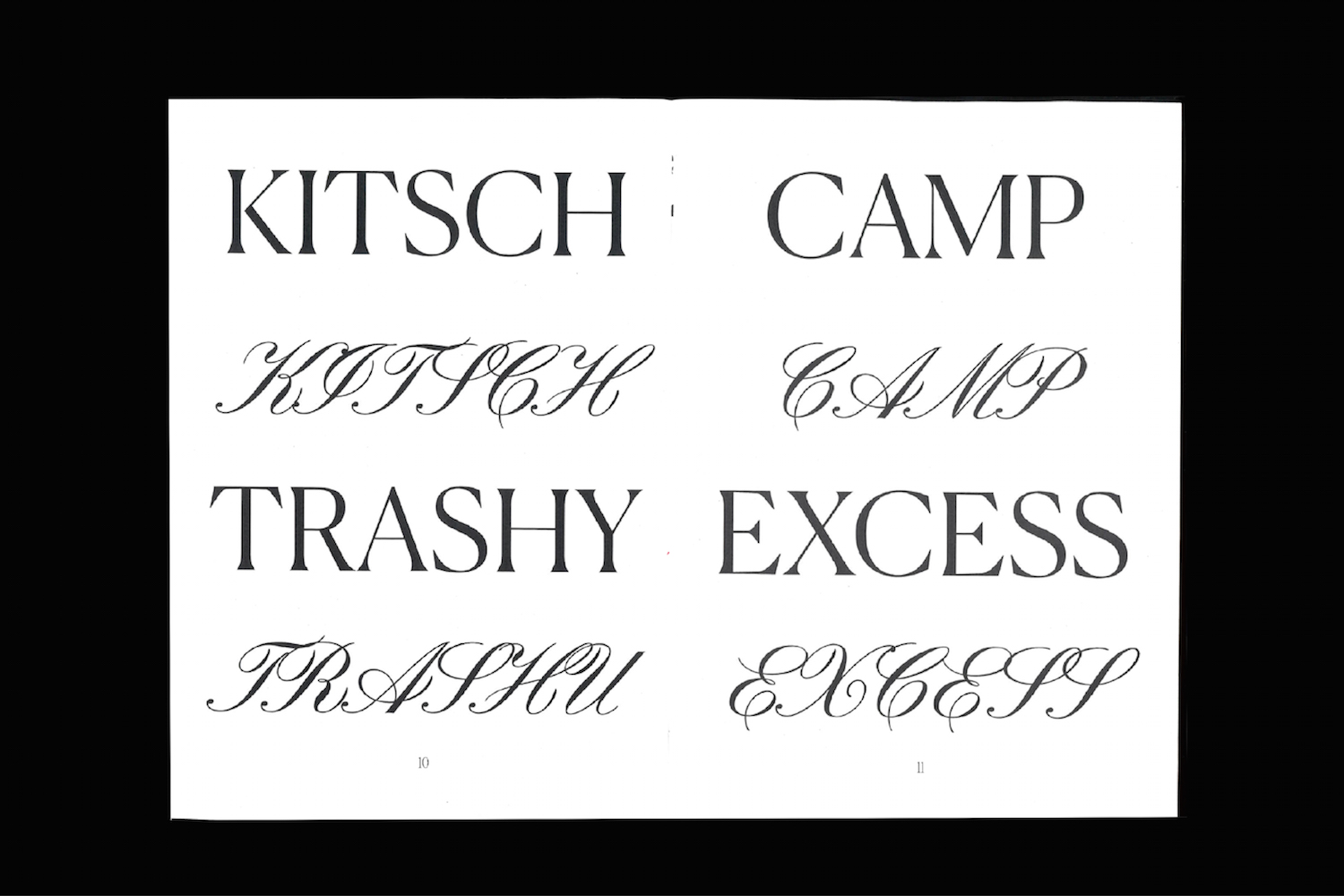
“It would be a creative space in Dublin for women to educate themselves on different topics—perhaps a talk on [Susan Sontag’s 1964 essay Notes on Camp], or looking at campiness in hip-hop,” she says. “There’s all these rappers who actually embody a lot of things that are really exaggerated or over the top that could be seen as ‘camp’ [by Sontag’s definitions]. Then alongside that I’d want to explore it as a space for things like journaling and art therapy. It would just be so cool to have somewhere for women to go and draw together, and just to relax.”
Girl Club’s graphic design manifestation is in the form of a set of zines that cover various topics relating to women and gender more widely. The topics vary from the aforementioned Notes on Camp and hip-hop culture, to Kardashian-led Instagram beauty culture and fashion. The spreads are both considered and dynamic in their approach—with the inclusion of that iconic film still of Divine in John Waters’ Pink Flamingos adding an irresistible flair.


Kemple’s illustrative work comes to the fore in Aspie, a manual/zine series she created with the aim of empowering young women with Asperger Syndrome. “Women on the spectrum are a subculture within a subculture,” says Kemple, and the idea of the zine was to “give a platform to these women and allow them to have a voice and connect with others with the same issues.” Issue one, for instance, looks at the senses through topics including romantic relationships, maintaining friendships, and sensory issues. Using typefaces Young Sans and Avenir alongside simple illustration, Kemple felt it was vital to avoid sensory overload while also making it “feminine, but not not too feminine.” The designer spoke with women Asperger’s groups in Cork and Dublin about the issues that most affected them, and came to the conclusion that “with Asperger’s, people are very regimented and structured, so a manual is perfect.”


Other projects similarly explore women-related issues but on darker themes. One of the most moving projects in Kemple’s portfolio is Home Babies–The Lost Children of Tuam. The printed book project offers a visual exploration of the Mother and Baby Home in Tuam, County Galway, a Catholic-run institution that housed unmarried mothers and babies from 1925 to 1961 and that bore shockingly high infant mortality rates. The children there, as was later revealed, were mistreated, malnourished, and buried in unconsecrated ground. The aim of Kemple’s project was not only to highlight the horrifying events that took place there—and respectfully tell the stories of the 796 infant and children victims at the center of the scandal—but to also look at “the mindset in Ireland towards babies born out of wedlock,” Kemple says.
The design aims to lead the reader through the story “at a solemn pace, gradually revealing the depth of the scandal.” It uses a cover case bound in black linen as a nod to mourning and “the opposite to the white covers we associate with children’s first holy communion books,” as Kemple puts it. The cover also uses a blind embossment of the burial site at Tuam where the remains of the babies were found, along with a surrounding rectangle that “signifies the boundaries of the home around the burial site and references the quote from the book ‘you dared not leave,’” Kemple explains.


The embossing is deliberately barely visible, “hidden just like the burial plot,” she says. The names of the 796 children who died under the care of the Bon Secour sisters are displayed on delicate, almost translucent paper stock, over which “the children’s names lay in rows on top of each other just as they were buried, one on top of the other,” she adds.
“With design, you have this amazing ability to have an impact… designers have a responsibility to make work that has depth.”
What was important about exploring such a horrific and dark story was communicating it in a way that’s both sensitive and an homage to the children and their families. “I researched so much as I didn’t want to make any mistakes,” says Kemple. “I wanted to be really respectful and not leave anything out—make sure I was telling all I could about this story of loss.” Her research across libraries, archives, and interviews uncovered documentation of nuns and priests selling children to America. “The language they used—things like ‘lovely boy for sale’— it was really shocking,” she says.
“With design, you have this amazing ability to take these topics into the world and have an impact, and pay respect to times that were really horrible and bleak. I definitely feel designers have a responsibility to make work that has depth and a societal impact. It’s the most fulfilling as a designer, as well.”


