
As editorial director at AIGA, I keep tabs on all the design news (so you don’t have to) and bring you only the best bits. Behold: my hit list of the most interesting things I’ve seen, read, and watched this week. Follow along all day every day on Instagram @AIGAdesign and Twitter @AIGAdesign.
This week I…
…upgrade up my admiration for AIGA/NY president Juliette Cezzar to girl crush status after reading her interview with The Great Discontent and her thoughts on how to take criticism, what being a leader means to her, and navigating the wiles of the NYC design community.
“I feel successful not because I’m a leader, but because I decide what I’m going to do each hour of each day, and because I get to talk to people I like about things I care about every day, all day.” —Juliette Cezzar
…never thought I’d see the day when people prefer Playboy’s redesign over The Met’s, but I can’t say I disagree with them.

…totally agree with Michael Bierut’s comment that notebooks are “just a quick (and dirty!) way of getting to the core of ideas quickly and moving forward,” which is maybe why I find Robert Fabricant’s impeccably laid out journal so intimidating.

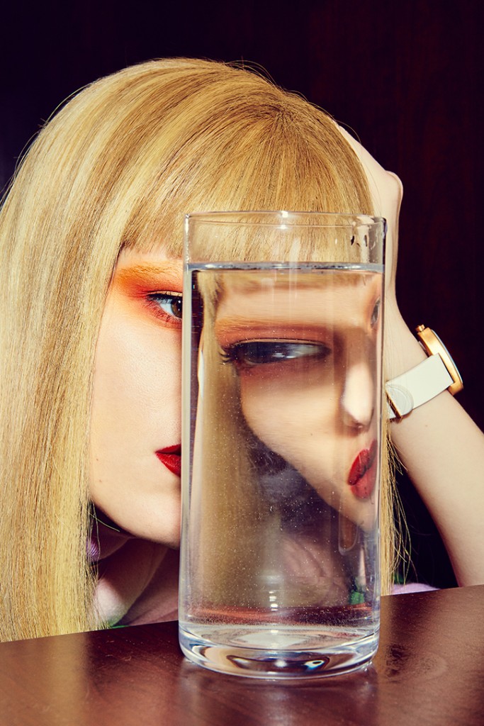
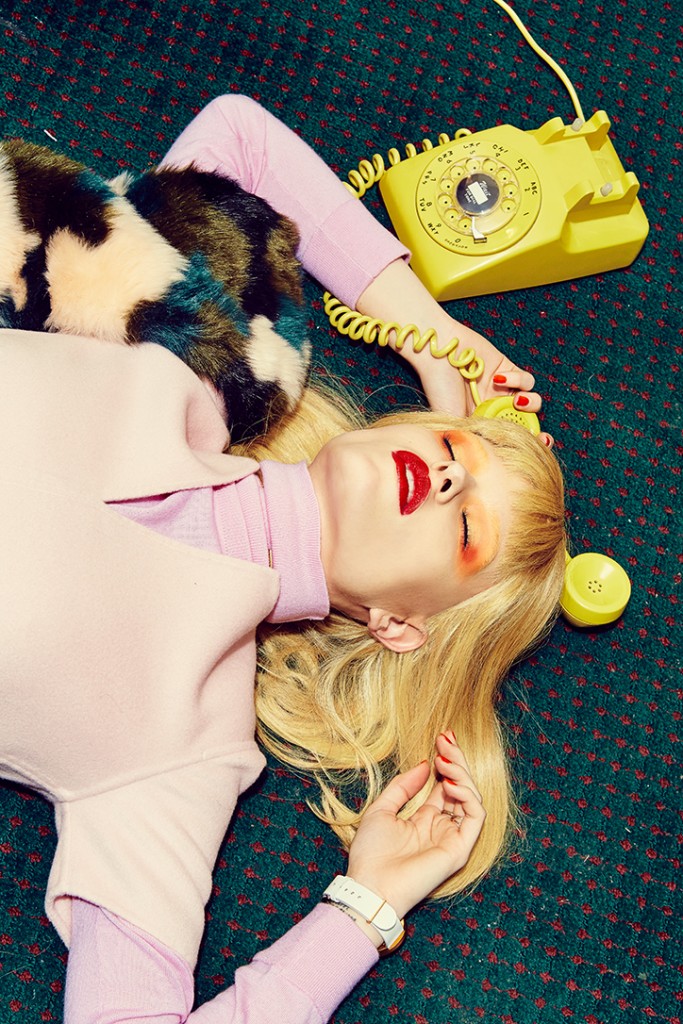
…remain beyond impressed by everything designer and art director Leta Sobierajski touches (not least of all the Eye on Design visual identity and site design). While her client list is full of fashion brands, she’s just, for the very first time, art directed a fashion shoot (with photographer Meredith Jenks and stylist Courtney Cho) that makes excellent use of her signature bold color choices. As Leta explains, in “‘Never Alone,’ our heroine enters a hotel room… after relaxing over a bath and some room service, things start to get a little strange. [She] realizes that she may not be the only person staying in this room.”


…can almost hear the collective intake of breath over at Facebook HQ when they discovered emojis this week and released Reactions, six icons that let you express when a post makes you feel: sad, angry, wow, haha, love, or like. Gizmodo breaks down all the potentially terrible and socially awkward results.

…have no excuse not to be up on all the great “lesser-known” lit classics now that Pocket Penguin has made them so darn colorful and attractive (image at very top).
…find my happy place as a design editor and fiction MFA graduate with these punctuation-based infographics that break down famous novels by their use of periods, commas, semicolons, etc. Note Cormac McCarthy’s comparatively punctuation-free Blood Meridian to Ernest Hemingway’s period-riddled A Farewell To Arms.

…lock in the early bird rate for Typographics, the 10-day “design festival for people who use type.” You have til the end of March to save $50 on the conference pass you’re probably going to buy anyway. The workshops and typography hackathon alone are worth the price of admission, to say nothing of the speaker line up.


