“We believe that type specimens often have typographers, not graphic designers in mind,” say Ismael González and Raúl Garia del Pomar of multidisciplinary Spanish studio Atipo, which goes the very impressive extra step and creates all its own typefaces for commissioned graphic design projects—and simply because it’s fun to experiment and learn through type design.
González and del Pomar’s glitzy and emphatic typeface Cassannet is built especially for the graphic designer who needs to make a statement. Its embellished details and slanted ‘S’ almost demand to be used for an Art Nouveau-esque poster. It actually emerged from another studio project called Grafilm, iconic cinema posters that Atipo recreated in the styles of famous designers.
For an A.M. Cassandre-inspired poster for The Maltese Falcon, González and del Pomar redrew the its classic, assertive letterforms and then developed an alphabet from the forms, stripping back the shapes just enough so the whole set works as a contemporary display font. “We wanted to pick up on the style of the time, but without getting too obsessed with creating a ‘vintage’ typeface,” they stress.


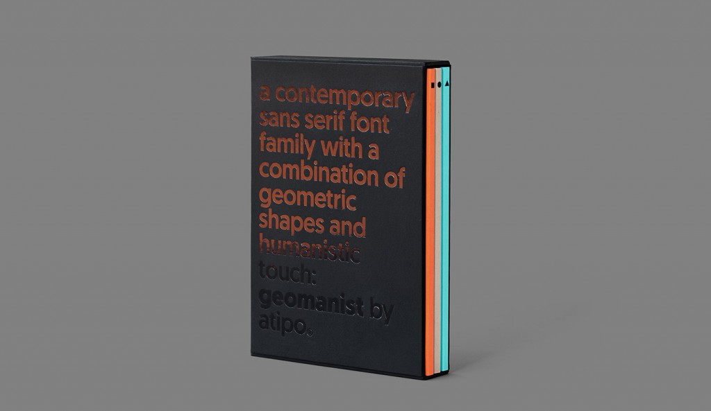
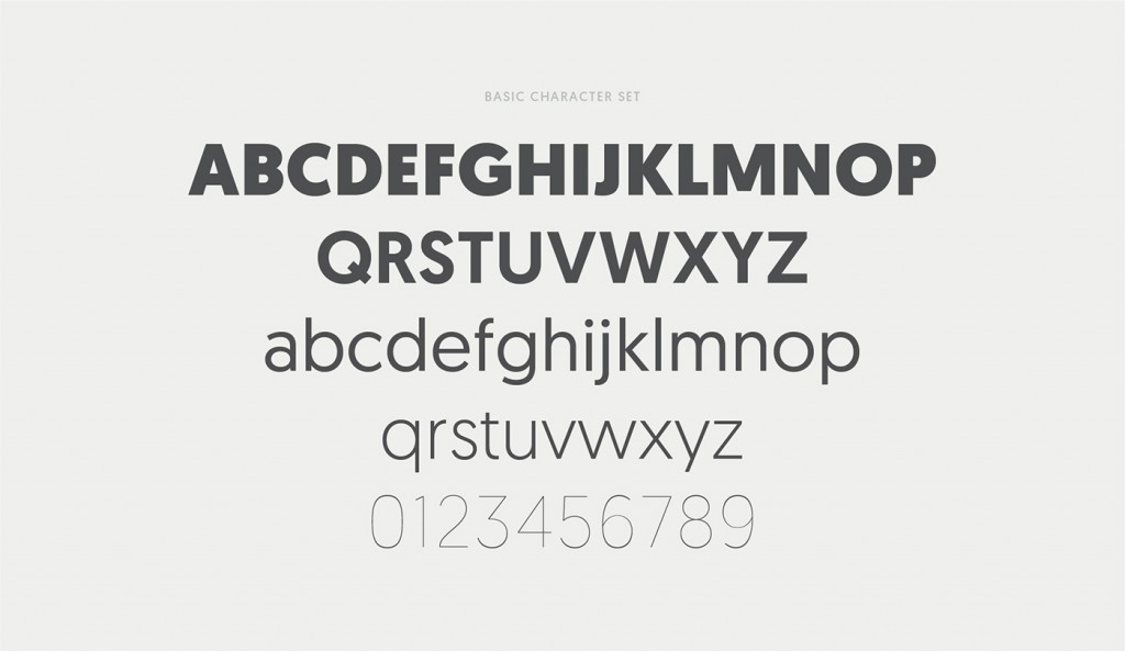
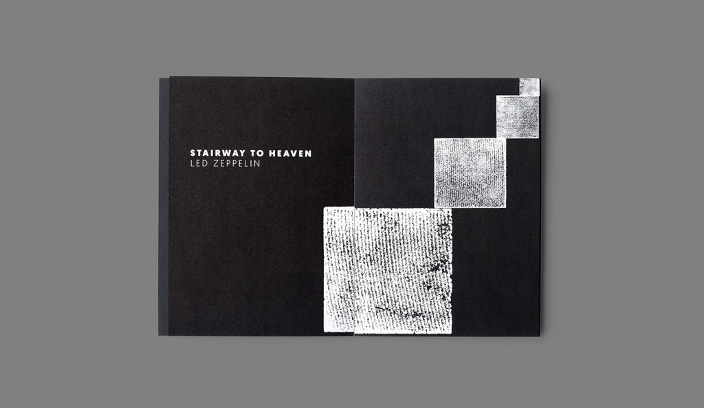
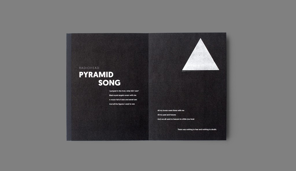
In particularly savvy move, whenever González and del Pomar design a font, they also create a platform where they can show it off, like a poster or a book where the font can live and breathe, and so designers can more easily imagine its other possible uses and contexts. For example, a minimal, hardcover, three-part booklet became the “frame” for Atipo’s typeface, Geomanist. “With the book, we can communicate the personality of the font family and show the font as a body text and display,” the designers explain.
Geomanist revists the style of fonts like Futura that are based on the simple shapes of a circle, square, and triangle. But Atipo wanted to instill it with a “humanist touch” and “friendly feeling,” so they gave it proportions similar to classical Roman capitals. The resulting sans is classical, rhythmic, and geometric, even though the characters have unequal proportions. Likewise, the Geomanist booklet explores the graphic possibilities of basic geometric shapes when linked to music and sound.
Atipo has only designed one font that was a stand-alone project. With Bariol, the studio sought to create a structure that lies somewhere between Helvetica and DIN, but with rounded ends. “At that time,” the designers say, “the market didn’t have many options and the best known rounded fonts derived from non-rounded ones.”
And since the playful part of the project didn’t lie in making a book or poster, Atipo developed Bariol icons to complement the type, using similar structures and endings for functional symbols as well as “fun icons with a wink to pop culture.”

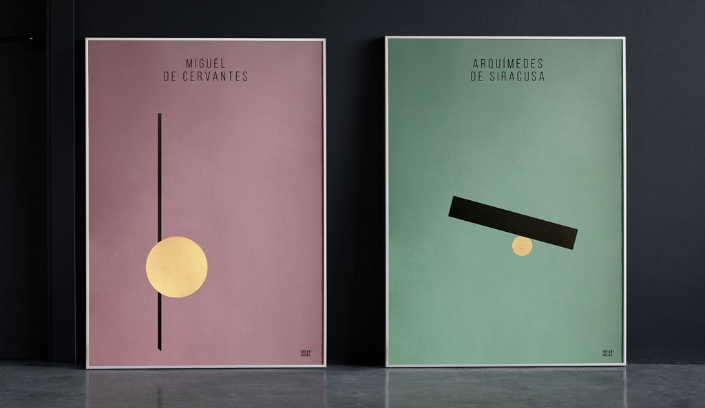
Ever since it developed Cassannet, Atipo has been promoting all its font with a Tweet-to-pay strategy. González and del Pomar have found that it’s a good marketing tool not just for their work as typographers, but also as a design studio. Because they work on branding projects, identity systems, animations, illustrations, editorial commissions, album covers, and more—often with their own typefaces integrated into the work for truly holistic results—the fact that their fonts circulate freely means that their entire portfolio is then brought to wider attention.
“Type design also helps us understand the best way to use fonts, to know what’s best for each individual project,” González and del Pomar assert. “When we create a new font, we always think about how it will fulfill our needs as graphic designers.”